.NET 4 finally has a solution to WPF's poor text rendering quality, but it is well-hidden. Set the following for every window:
TextOptions.TextFormattingMode="Display"
Default value is "Ideal" which is not at all what the name implies.
There are two other options in TextOptions, namely TextHintingMode and TextRenderingMode, but they both have sensible defaults.
There is a in-depth article about WPF Text rendering from one of the WPF Text Program Managers on windowsclient.net: Text Clarity in WPF.
The problem boils down to WPF needing a linearly scaling font-renderer for smooth animations. Pure ClearType on the other hand takes quite a bit of freedom with the font to push vertical stems into the next pixel.
The difference is obvious if one compares the classic "cascade" pattern. WinForms on the lower left side, WPF on the top right side:
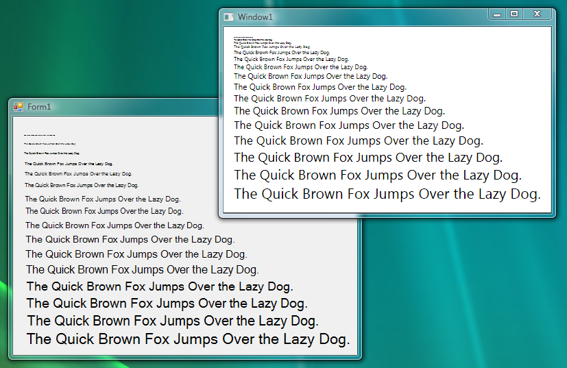
While I'm no fan of WPF's font rendering idiosyncrasies either, I can imagine the clamor if the animations would jump like they do in the Winforms cascade.
Of special interest to me was the link to the MSDN article "ClearType Registry Settings", which explains the possible user-side adjustments in the registry:
Playing around with these settings didn't really improve the underlying problem, but can help by reducing the color bleeding effect for sensitive users.
The best advice the Text Clarity article gave was increasing the font size and changing the font. Calibri works for me better than the standard Segoe UI. Due to its popularity as web font, I tried Verdana too, but it has a nasty jump in weight between 14pt and 15pt which is very visible when animating the font size.
WPF 4 will have improved support for influencing the rendering of fonts. There is an article on the WPF Text Blog explaining the changes. Most prominently, there are now (at least) three different kinds of text rendering:

<grumble>That should be enough rope for every designer.</grumble>
I encountered a problem the other day when I used a border which had a DropShadowEffect applied. The result was that all text inside that border was extremely blurry. It doesn't matter if text was inside other panels or directly under the border - any text block that is child of parent that has an Effect applied seems to be affected.
The solution to this particular case was to not put stuff inside the border that has effects, but instead use a grid (or anything else that supports putting content on top of each other) and place a rectangle in the same cell as the text (i.e. as a sibling in the visual tree) and put the effects on that.
Like so:
<!-- don't do this --->
<Border>
     <Border.Effect>
          <DropShadowEffect BlurRadius="25" ShadowDepth="0" Opacity="1"/>
     </Border.Effect>
     <TextBlock Text="This Text Will Be Blurry" />
</Border>

<!-- Do this instead -->
<Grid>
  <Rectangle>
     <Rectangle.Effect>
          <DropShadowEffect BlurRadius="25" ShadowDepth="0" Opacity="1"/>
     </Rectangle.Effect>
  </Rectangle>
  <TextBlock Text="This Text Will Be Crisp and Clear" />
</Grid>
This is going to be fixed in VS2010 (and WPF4) beta 2:

If you love us? You can donate to us via Paypal or buy me a coffee so we can maintain and grow! Thank you!
Donate Us With