 Menu
Menu
I am trying to use angular 2 material and flex-layout to create a responsive gallery of elements. After hours and hours, I still can't have my elements centered: 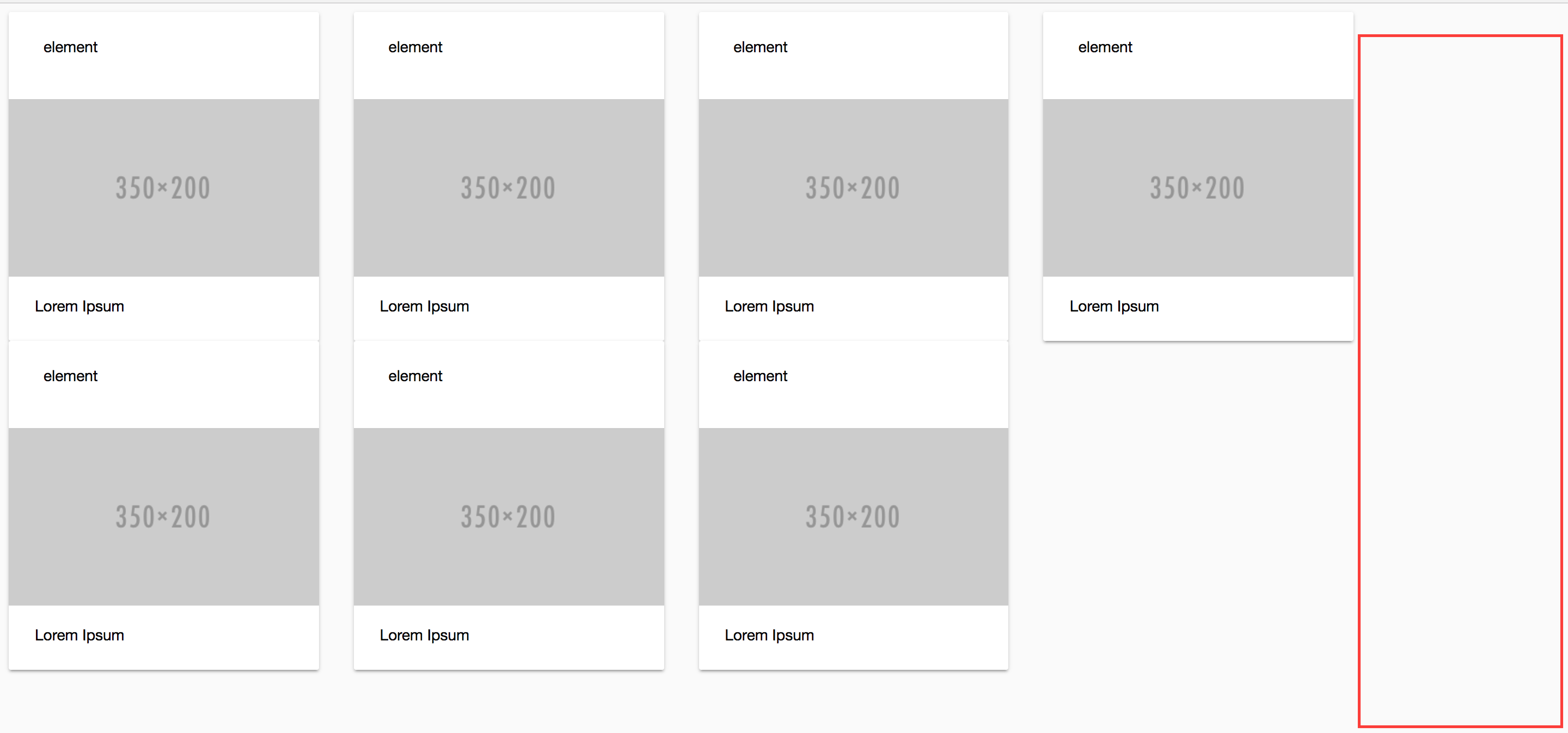
This is the source code:
<div fxLayout='row' fxLayoutWrap fxLayoutGap="2rem">
  <md-card fxFlex.gt-md="20" fxFlex.md="28"  fxFlex.sm="40" fxFlex.xs="100" *ngFor="let recipe of recipes" [routerLink]="['/details', recipe.id]" class="recipe-card">
    <md-card-header>
      <md-card-title>element</md-card-title>
    </md-card-header>
    <img md-card-image src="http://placehold.it/350x200">
    <md-card-content>
      <p>
        Lorem Ipsum
      </p>
    </md-card-content>
  </md-card>
</div>
I have tried different values for fxFlexAlign (https://github.com/angular/flex-layout/wiki/API-Documentation) but none of them achieves what I need, that is, having the elements centered or, in other words, distribute the red square space between the right and the left side.
Is there a way of achieving this?
EDIT
Unfortunately, justify-content: space-between; doesn't work if I have a dynamic number of items. Eventually, they will be wrapped in a new line, and then the item in the last row won't look as expected:
.container {
  display:flex;
  width:100%;
  flex-flow:row wrap;
  justify-content: space-between;


}
.block {
  width:100px;
  height:100px;
  border:1px solid red;
}
<div class="container">
<div class="block" fxLayout='row' fxLayoutWrap fxLayoutGap="2rem">
... you content
</div>
<div class="block" fxLayout='row' fxLayoutWrap fxLayoutGap="2rem">
... you content
</div>
<div class="block" fxLayout='row' fxLayoutWrap fxLayoutGap="2rem">
... you content
</div>
<div class="block" fxLayout='row' fxLayoutWrap fxLayoutGap="2rem">
... you content
</div>
<div class="block" fxLayout='row' fxLayoutWrap fxLayoutGap="2rem">
... you content
</div>
<div class="block" fxLayout='row' fxLayoutWrap fxLayoutGap="2rem">
... you content
</div>
<div class="block" fxLayout='row' fxLayoutWrap fxLayoutGap="2rem">
... you content
</div>
<div class="block" fxLayout='row' fxLayoutWrap fxLayoutGap="2rem">
... you content
</div>
</div> 965
965
<div fxLayout="row" fxLayoutWrap fxLayoutGap="2rem" fxLayoutAlign="center">
Adding fxLayoutAlign="center" worked out for me, the results are now positioned in center.
51
You can try this concept to acheive a similar functionality. You may have to edit css % values to get more perfect results.
.sp{
	display: flex;
	justify-content: center;
}

.i{
	width: 23%;
    height: 133px;
    background-color: grey;
    margin: 3px;
    color: #fff;

}

.p{
	  display: flex;
    flex-wrap: wrap;
    width: 56%;
}
<div class="sp">
<div class="p">
<div class="i"> content </div>
<div class="i"> content </div>
<div class="i"> content </div>
<div class="i"> content </div>
<div class="i"> content </div>
<div class="i"> content </div>
<div class="i"> content </div>
<div class="i"> content </div>
<div class="i"> content </div>
<div class="i"> content </div>
</div>
</div>If you love us? You can donate to us via Paypal or buy me a coffee so we can maintain and grow! Thank you!
Donate Us With