 Menu
Menu
I am trying to the following working with a non-table css aproach:
One of the problem I have to solve, is that the images can be different size, up to 512x512, but the whole element should keep 1:1 aspect ratio.
I tried making all images floating left, and set
.image {
  width: 33%;
  height: 33%;
}
Except for the first one which I set to width: 66%; height: 66%.
I also tried wrapping them in divs to make positioning easier:
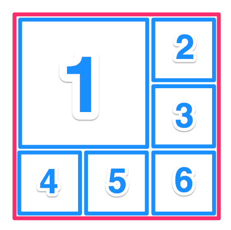
<div class="all-the-images">
  <div class="image-row1">
    <div class="image-big">
      <div class="image"><img src="http://placehold.it/498x512" /></div>
    </div>
    <div class="image-right">
      <div class="image"><img src="http://placehold.it/313x313" /></div>
      <div class="image"><img src="http://placehold.it/498x512" /></div>
    </div>
  </div>
  <div class="image-bottom">
    <div class="image"><img src="http://placehold.it/512x234" /></div>
    <div class="image"><img src="http://placehold.it/234x234" /></div>
    <div class="image"><img src="http://placehold.it/234x512" /></div>
  </div>
</div>
http://codepen.io/luckydonald/pen/dOwNGX (using less)
https://jsfiddle.net/luckydonald/96hqds80/ (generated css)
But there the different image sizes will destroy the rows.
 988
988
Here's a flexbox solution. IE11+ only, unless you use a shim.
.flex-container {
  display: flex;
  background: #eee;
  margin: 0 auto;
  flex: 1;
  width: 100%;
}
.flex-container.vert {
  flex-direction: column;
}
.flex-container.outer {
  width: 30vw;
  height: 30vw;
}
.flex-item {
  background: tomato;
  flex: 1;
}
.flex-item:nth-child(2n) {
  background: pink;
}
.flex-item img {
  width: 100%;
  height: 100%;
}
.double {
  flex: 2;
  background: lightgreen;
}
<div class="flex-container outer vert">
<div class="flex-container double">
<div class="flex-item double">
<img src="http://lorempixel.com/800/800/nature/1" />
</div>
<div class="flex-container vert">
<div class="flex-item">
<img src="http://lorempixel.com/800/800/nature/2" />
</div>
<div class="flex-item">
<img src="http://lorempixel.com/800/800/nature/3" />
</div>
</div>
</div>
<div class="flex-container">
<div class="flex-item">
<img src="http://lorempixel.com/800/800/nature/4" />
</div>
<div class="flex-item">
<img src="http://lorempixel.com/800/800/nature/5" />
</div>
<div class="flex-item">
<img src="http://lorempixel.com/800/800/nature/6" />
</div>
</div>
</div>I haven't thoroughly tested or polished, but what about using the CSS display properties of table, table-row and table-cell?
span {
	border: 1px solid blue;
}
<div style="width:200px; height: 200px; display: table;">
<div display="table-row">
<span style="width: 66%; height: 66%; display: table-cell">
<img style="width: 100%" src="http://placehold.it/498x512" />
</span>
<span style="width: 33%; display: table-cell; vertical-align: top;">
<img style="width: 100%;" src="http://placehold.it/512x512" />
<img style="width: 100%;" src="http://placehold.it/512x512" />
</span>
</div>
<div display="table-row">
<span style="width: 33%; display: table-cell; vertical-align: top;">
<img style="width: 100%;" src="http://placehold.it/512x512" />
</span>
<span style="width: 33%; display: table-cell; vertical-align: top;">
<img style="width: 100%;" src="http://placehold.it/512x512" />
</span>
<span style="width: 33%; display: table-cell; vertical-align: top;">
<img style="width: 100%;" src="http://placehold.it/512x512" />
</span>
</div>
</div>If you love us? You can donate to us via Paypal or buy me a coffee so we can maintain and grow! Thank you!
Donate Us With