 Menu
Menu
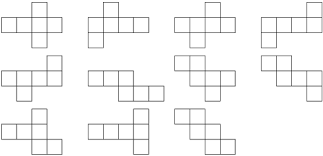
In my project, when the homepage is opened, it should run a CSS animation so that the cube's faces open. After the animation is complete the faces should be like in the picture (I need to have a result like the first opening in the picture).
This is my code,
.sk-folding-cube {
  margin: 20px auto;
  width: 40px;
  height: 40px;
  position: relative;
}
.sk-folding-cube .sk-cube {
  float: left;
  width: 50%;
  height: 50%;
  position: relative;
  -webkit-transform: scale(1.1);
  -ms-transform: scale(1.1);
  transform: scale(1.1);
}
.sk-folding-cube .sk-cube:before {
  content: '';
  position: absolute;
  top: 0;
  left: 0;
  width: 100%;
  height: 100%;
  background-color: #000000;
  -webkit-animation: sk-foldCubeAngle 2.4s 0.5 linear both;
  animation: sk-foldCubeAngle 2.4s 0.5 linear both;
  -webkit-transform-origin: 100% 100%;
  -ms-transform-origin: 100% 100%;
  transform-origin: 100% 100%;
}
.sk-folding-cube .sk-cube2 {
  -webkit-transform: scale(1.1) rotateZ(90deg);
  transform: scale(1.1) rotateZ(90deg);
}
.sk-folding-cube .sk-cube3 {
  -webkit-transform: scale(1.1) rotateZ(180deg);
  transform: scale(1.1) rotateZ(180deg);
}
.sk-folding-cube .sk-cube4 {
  -webkit-transform: scale(1.1) rotateZ(270deg);
  transform: scale(1.1) rotateZ(270deg);
}
.sk-folding-cube .sk-cube5 {
  -webkit-transform: scale(1.1) rotateZ(360deg);
  transform: scale(1.1) rotateZ(360deg);
}
.sk-folding-cube .sk-cube5 {
  -webkit-transform: scale(1.1) rotateZ(360deg);
  transform: scale(1.1) rotateZ(360deg);
}
.sk-folding-cube .sk-cube2:before {
  -webkit-animation-delay: 0.3s;
  animation-delay: 0.3s;
}
.sk-folding-cube .sk-cube3:before {
  -webkit-animation-delay: 0.6s;
  animation-delay: 0.6s;
}
.sk-folding-cube .sk-cube4:before {
  -webkit-animation-delay: 0.9s;
  animation-delay: 0.9s;
}
.sk-folding-cube .sk-cube5:before {
  -webkit-animation-delay: 1.2s;
  animation-delay: 1.2s;
}
.sk-folding-cube .sk-cube6:before {
  -webkit-animation-delay: 1.5s;
  animation-delay: 1.5s;
}
@-webkit-keyframes sk-foldCubeAngle {
  0%, 10% {
    -webkit-transform: perspective(140px) rotateX(-180deg);
    transform: perspective(140px) rotateX(-180deg);
    opacity: 0;
  }
  25%,
  75% {
    -webkit-transform: perspective(140px) rotateX(0deg);
    transform: perspective(140px) rotateX(0deg);
    opacity: 1;
  }
  90%,
  100% {
    -webkit-transform: perspective(140px) rotateY(180deg);
    transform: perspective(140px) rotateY(180deg);
    opacity: 0;
  }
}
@keyframes sk-foldCubeAngle {
  0%, 10% {
    -webkit-transform: perspective(140px) rotateX(-180deg);
    transform: perspective(140px) rotateX(-180deg);
    opacity: 0;
  }
  25%,
  75% {
    -webkit-transform: perspective(140px) rotateX(0deg);
    transform: perspective(140px) rotateX(0deg);
    opacity: 1;
  }
  90%,
  100% {
    -webkit-transform: perspective(140px) rotateY(180deg);
    transform: perspective(140px) rotateY(180deg);
    opacity: 0;
  }
}
<html>
<head>
<link href="style.css" rel="stylesheet">
<title>Open Cube</title>
<h1>Apertura Cubo</h1>
</head>
<body>
<div class="sk-folding-cube">
<a href="http://google.com"><div class="sk-cube1 sk-cube"></div></a>
<div class="sk-cube2 sk-cube"></div>
<div class="sk-cube4 sk-cube"></div>
<div class="sk-cube3 sk-cube"></div>
</div>
</body>
</html>How can I do this?
 732
732
Judging by the description, snippet and the picture provided in question it seems like you are trying to create a flat cube opening animation where each face of the cube opens one by one and ends up with the appearance as shown in the first sample within the picture.
It might be possible to achieve that effect by enhancing your current code but I found it a bit confusing and so went with my own version of a flat-cube.
Explanation:
div element for each face). I've made the front face as a child element of the left face element because the front face should eventually get opened on the left hand side of the left face.transform and transform-origin properties are set in such a way that it creates a cube..cube {
position: relative;
margin: 100px;
transform-style: preserve-3d;
}
.cube div {
position: absolute;
height: 50px;
width: 50px;
transform-style: preserve-3d;
}
.back {
background: rebeccapurple;
}
.right {
background: tomato;
transform: rotateY(90deg);
transform-origin: right;
animation: open-y 1s ease-in-out forwards;
}
.bottom {
background: crimson;
transform: rotateX(270deg);
transform-origin: bottom;
animation: open-x 1s 1s ease-in-out forwards;
}
.top {
background: indianred;
transform: rotateX(90deg);
transform-origin: top;
animation: open-x 1s 2s ease-in-out forwards;
}
.left {
background: yellowgreen;
transform: rotateY(270deg);
transform-origin: left;
animation: open-y 1s 3s ease-in-out forwards;
}
.front {
background: chocolate;
transform: rotateY(270deg);
transform-origin: right;
animation: open-y 1s 3s ease-in-out forwards;
}
@keyframes open-y {
to {
transform: rotateY(180deg);
}
}
@keyframes open-x {
to {
transform: rotateX(180deg);
}
}<div class="cube">
<div class="back"></div>
<div class="right"></div>
<div class="bottom"></div>
<div class="top"></div>
<div class="left">
<div class="front"></div>
</div>
</div>Note: It is very much possible to achieve a similar effect in other ways also and in addition make them look a lot more realistic but that would most likely involve a good amount of translate transforms, extra keyframe settings for the animations etc - in short, a lot more complex code.
93
If you love us? You can donate to us via Paypal or buy me a coffee so we can maintain and grow! Thank you!
Donate Us With

