 Menu
Menu
I'm trying to style a TabControl and have got 75% of the way there, but I'm having difficulty styling the actual TabItems:
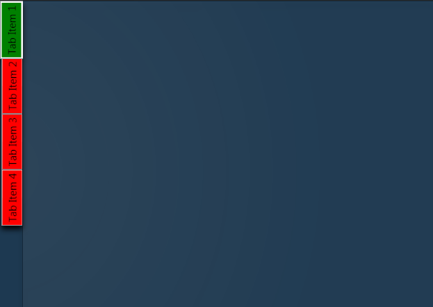
What I am trying to achieve is remove the default ContentPresenter so that I can make the tab items partially transparent with rounded edges instead of the place holder red and green i have now.
I'm sure it's probably not that difficult, but I just can't figure it out so any help would be most appreciated!
Here's the XAML for the TabControl so far:
<TabControl TabStripPlacement="Left" HorizontalAlignment="Stretch" BorderBrush="#41020202"> <TabControl.BitmapEffect> <DropShadowBitmapEffect Color="Black" Direction="270"/> </TabControl.BitmapEffect> <TabControl.Resources> <Style TargetType="{x:Type TabItem}"> <Setter Property="BorderThickness" Value="0"/> <Setter Property="Padding" Value="0" /> <Setter Property="HeaderTemplate"> <Setter.Value> <DataTemplate> <Border x:Name="grid" Background="Red"> <ContentPresenter> <ContentPresenter.Content> <TextBlock Margin="4" FontSize="15" Text="{TemplateBinding Content}"/> </ContentPresenter.Content> <ContentPresenter.LayoutTransform> <RotateTransform Angle="270" /> </ContentPresenter.LayoutTransform> </ContentPresenter> </Border> <DataTemplate.Triggers> <DataTrigger Binding="{Binding RelativeSource={RelativeSource Mode=FindAncestor,AncestorType={x:Type TabItem}},Path=IsSelected}" Value="True"> <Setter TargetName="grid" Property="Background" Value="Green"/> </DataTrigger> </DataTemplate.Triggers> </DataTemplate> </Setter.Value> </Setter> </Style> </TabControl.Resources> <TabControl.Background> <RadialGradientBrush Center="-0.047,0.553" GradientOrigin="-0.047,0.553" RadiusY="1.231" RadiusX="0.8"> <GradientStop Offset="1" Color="#06FFFFFF"/> <GradientStop Color="#14FFFFFF"/> </RadialGradientBrush> </TabControl.Background> <TabItem Header="Tab Item 1" /> <TabItem Header="Tab Item 2" /> <TabItem Header="Tab Item 3" /> <TabItem Header="Tab Item 4" /> </TabControl>  833
833
Try this style instead, it modifies the template itself. In there you can change everything you need to transparent:
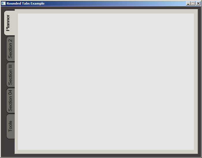
<Style TargetType="{x:Type TabItem}"> <Setter Property="Template"> <Setter.Value> <ControlTemplate TargetType="{x:Type TabItem}"> <Grid> <Border Name="Border" Margin="0,0,0,0" Background="Transparent" BorderBrush="Black" BorderThickness="1,1,1,1" CornerRadius="5"> <ContentPresenter x:Name="ContentSite" VerticalAlignment="Center" HorizontalAlignment="Center" ContentSource="Header" Margin="12,2,12,2" RecognizesAccessKey="True"> <ContentPresenter.LayoutTransform> <RotateTransform Angle="270" /> </ContentPresenter.LayoutTransform> </ContentPresenter> </Border> </Grid> <ControlTemplate.Triggers> <Trigger Property="IsSelected" Value="True"> <Setter Property="Panel.ZIndex" Value="100" /> <Setter TargetName="Border" Property="Background" Value="Red" /> <Setter TargetName="Border" Property="BorderThickness" Value="1,1,1,0" /> </Trigger> <Trigger Property="IsEnabled" Value="False"> <Setter TargetName="Border" Property="Background" Value="DarkRed" /> <Setter TargetName="Border" Property="BorderBrush" Value="Black" /> <Setter Property="Foreground" Value="DarkGray" /> </Trigger> </ControlTemplate.Triggers> </ControlTemplate> </Setter.Value> </Setter> </Style> While searching for a way to round tabs, I found Carlo's answer and it did help but I needed a bit more. Here is what I put together, based on his work. This was done with MS Visual Studio 2015.
The Code:
<Window x:Class="MainWindow" xmlns="http://schemas.microsoft.com/winfx/2006/xaml/presentation" xmlns:x="http://schemas.microsoft.com/winfx/2006/xaml" xmlns:d="http://schemas.microsoft.com/expression/blend/2008" xmlns:mc="http://schemas.openxmlformats.org/markup-compatibility/2006" xmlns:local="clr-namespace:MealNinja" mc:Ignorable="d" Title="Rounded Tabs Example" Height="550" Width="700" WindowStartupLocation="CenterScreen" FontFamily="DokChampa" FontSize="13.333" ResizeMode="CanMinimize" BorderThickness="0"> <Window.Effect> <DropShadowEffect Opacity="0.5"/> </Window.Effect> <Grid Background="#FF423C3C"> <TabControl x:Name="tabControl" TabStripPlacement="Left" Margin="6,10,10,10" BorderThickness="3"> <TabControl.Resources> <Style TargetType="{x:Type TabItem}"> <Setter Property="Template"> <Setter.Value> <ControlTemplate TargetType="{x:Type TabItem}"> <Grid> <Border Name="Border" Background="#FF6E6C67" Margin="2,2,-8,0" BorderBrush="Black" BorderThickness="1,1,1,1" CornerRadius="10"> <ContentPresenter x:Name="ContentSite" ContentSource="Header" VerticalAlignment="Center" HorizontalAlignment="Center" Margin="2,2,12,2" RecognizesAccessKey="True"/> </Border> <Rectangle Height="100" Width="10" Margin="0,0,-10,0" Stroke="Black" VerticalAlignment="Bottom" HorizontalAlignment="Right" StrokeThickness="0" Fill="#FFD4D0C8"/> </Grid> <ControlTemplate.Triggers> <Trigger Property="IsSelected" Value="True"> <Setter Property="FontWeight" Value="Bold" /> <Setter TargetName="ContentSite" Property="Width" Value="30" /> <Setter TargetName="Border" Property="Background" Value="#FFD4D0C8" /> </Trigger> <Trigger Property="IsEnabled" Value="False"> <Setter TargetName="Border" Property="Background" Value="#FF6E6C67" /> </Trigger> <Trigger Property="IsMouseOver" Value="true"> <Setter Property="FontWeight" Value="Bold" /> </Trigger> </ControlTemplate.Triggers> </ControlTemplate> </Setter.Value> </Setter> <Setter Property="HeaderTemplate"> <Setter.Value> <DataTemplate> <ContentPresenter Content="{TemplateBinding Content}"> <ContentPresenter.LayoutTransform> <RotateTransform Angle="270" /> </ContentPresenter.LayoutTransform> </ContentPresenter> </DataTemplate> </Setter.Value> </Setter> <Setter Property="Background" Value="#FF6E6C67" /> <Setter Property="Height" Value="90" /> <Setter Property="Margin" Value="0" /> <Setter Property="Padding" Value="0" /> <Setter Property="FontFamily" Value="DokChampa" /> <Setter Property="FontSize" Value="16" /> <Setter Property="VerticalAlignment" Value="Top" /> <Setter Property="HorizontalAlignment" Value="Right" /> <Setter Property="UseLayoutRounding" Value="False" /> </Style> <Style x:Key="tabGrids"> <Setter Property="Grid.Background" Value="#FFE5E5E5" /> <Setter Property="Grid.Margin" Value="6,10,10,10" /> </Style> </TabControl.Resources> <TabItem Header="Planner"> <Grid Style="{StaticResource tabGrids}"/> </TabItem> <TabItem Header="Section 2"> <Grid Style="{StaticResource tabGrids}"/> </TabItem> <TabItem Header="Section III"> <Grid Style="{StaticResource tabGrids}"/> </TabItem> <TabItem Header="Section 04"> <Grid Style="{StaticResource tabGrids}"/> </TabItem> <TabItem Header="Tools"> <Grid Style="{StaticResource tabGrids}"/> </TabItem> </TabControl> </Grid> </Window> Screenshot:
36
If you love us? You can donate to us via Paypal or buy me a coffee so we can maintain and grow! Thank you!
Donate Us With


