 Menu
Menu
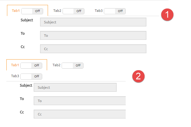
When screen size made smaller bootstrap tabs are overlapping like image.
I used col-sm and my angular HTML is like this (but any non-angular HTML solution is fine too):
<div class="col-sm-6"> <tabset> <tab>
    <tab-heading active="true">
        Tab1
        <toggle-switch ></toggle-switch>
    </tab-heading>
...
</tab>
<tab>
    <tab-heading>Tab2
        <toggle-switch ></toggle-switch></tab-heading>
    ...
</tab>
<tab>
    <tab-heading>Tab3
        <toggle-switch ></toggle-switch></tab-heading>
    ...
</tab></tabset></div>
I would like for the other tabs to stack in the background instead of the foreground.
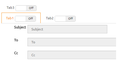
Please forgive my terrible gimp skills, but the active tab should always be up front, so if tab 3 is selected, then the other row should shift to the back.
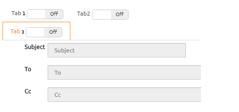
It doesn't have to be arranged specifically like this, but the point is that the active tab should not have anything in between it and its content pane, so something like this is also fine:

 950
950
There is a solution combining both Css and Javascript.
But, you need to know the tab's height and width!
Because every tab has the same width and height in your pictures, this seems to not be a problem.
// Tab width
var tabWidth = 140;
// Tab height
var tabHeight = 42;

var updateAllTabs = function(){
	$('li.active a[data-toggle="tab"]').each(function(){
		updateTabs({target : this});
	});
};

var updateTabs = function(e){
	// Get elements
	var activeItem = e.target.parentNode;
	var menu = activeItem.parentNode;
	var items = menu.getElementsByTagName("li");

	// Reset menu
	menu.style.paddingLeft = 0;
	menu.style.paddingBottom = 0;

	var menuWidth = jQuery(menu).width();

	var otherItems = [];

	// Clear old changes - make new list
	for(var i=0; i < items.length; i++){
		items[i].style.marginLeft = "0px";
		items[i].style.marginTop = "0px";

		if(items[i] != activeItem)
			otherItems.push(items[i]);
	}

	// If one line return (or only one item)
	if(menuWidth >= items.length * tabWidth || items.length <= 1)
		return;

	// Make some calculations
	var perLine = Math.floor(menuWidth / tabWidth);
	var lines = Math.ceil(items.length / perLine);

	// 1 tab per line
	if(perLine == 1){
		menu.style.paddingBottom = jQuery(activeItem).height() + "px";
		return;
	} else if(perLine + 1 == items.length){
		menu.style.paddingBottom = jQuery(activeItem).height() + "px";
	}

	var pad = jQuery(activeItem).width();

	// More than one per tab
	menu.style.paddingLeft = pad + "px";

	// For every line exept the last
	for(var i=0; i < lines-1; i++){
		// Move first of the line
		otherItems[i*perLine].style.marginLeft = ((i+1)*pad*(-1)) + "px";
		otherItems[i*perLine].style.marginTop = (i*tabHeight) + "px";
	}

	return;
};

$( window ).resize(updateAllTabs);
$('a[data-toggle="tab"]').on('shown.bs.tab', updateTabs);
updateAllTabs();
.nav-tabs > li{
width: 140px;
height: 42px;
}
@media only screen and (max-width: 840px) {
.nav-tabs{
position: relative;
}
.nav-tabs > li.active{
position: absolute;
bottom: -1px;
left: 0px;
}
}<link rel="stylesheet prefetch" href="https://maxcdn.bootstrapcdn.com/bootstrap/3.3.6/css/bootstrap.min.css">
<div>
<!-- Nav tabs -->
<ul class="nav nav-tabs" role="tablist">
<li role="presentation" class="active"><a href="#tab1" aria-controls="home" role="tab" data-toggle="tab">Tab 1</a></li>
<li role="presentation"><a href="#tab2" aria-controls="profile" role="tab" data-toggle="tab">Tab 2</a></li>
<li role="presentation"><a href="#tab3" aria-controls="messages" role="tab" data-toggle="tab">Tab 3</a></li>
<li role="presentation"><a href="#tab4" aria-controls="settings" role="tab" data-toggle="tab">Tab 4</a></li>
<li role="presentation"><a href="#tab5" aria-controls="settings" role="tab" data-toggle="tab">Tab 5</a></li>
<li role="presentation"><a href="#tab6" aria-controls="settings" role="tab" data-toggle="tab">Tab 6</a></li>
</ul>
<!-- Tab panes -->
<div class="tab-content">
<div role="tabpanel" class="tab-pane active" id="tab1">This is the tab 1</div>
<div role="tabpanel" class="tab-pane" id="tab2">This is the tab 2</div>
<div role="tabpanel" class="tab-pane" id="tab3">This is the tab 3</div>
<div role="tabpanel" class="tab-pane" id="tab4">This is the tab 4</div>
<div role="tabpanel" class="tab-pane" id="tab5">This is the tab 5</div>
<div role="tabpanel" class="tab-pane" id="tab6">This is the tab 6</div>
</div>
</div>
<script src="https://ajax.googleapis.com/ajax/libs/jquery/2.1.1/jquery.min.js"></script>
<script src="https://maxcdn.bootstrapcdn.com/bootstrap/3.3.6/js/bootstrap.min.js"></script>So, how does this work?
The basic idea is that every time a new tab is activated,
we set the active tab as position: absolute; left: 0px; bottom: -1px;
then we add on the tabs menu padding equal to the width of the tab.
Lastly, we add a margin minus the width of the tabs on the first tab of each line.
Some more info:
The code works even with more than 2 lines of tabs.
It can easily be converted to match the layout of your last image by adding fake items on the otherItems array and adding margin-right on the previus item.
(got it? or I have to code it for you? :P)
150
If you love us? You can donate to us via Paypal or buy me a coffee so we can maintain and grow! Thank you!
Donate Us With