 Menu
Menu
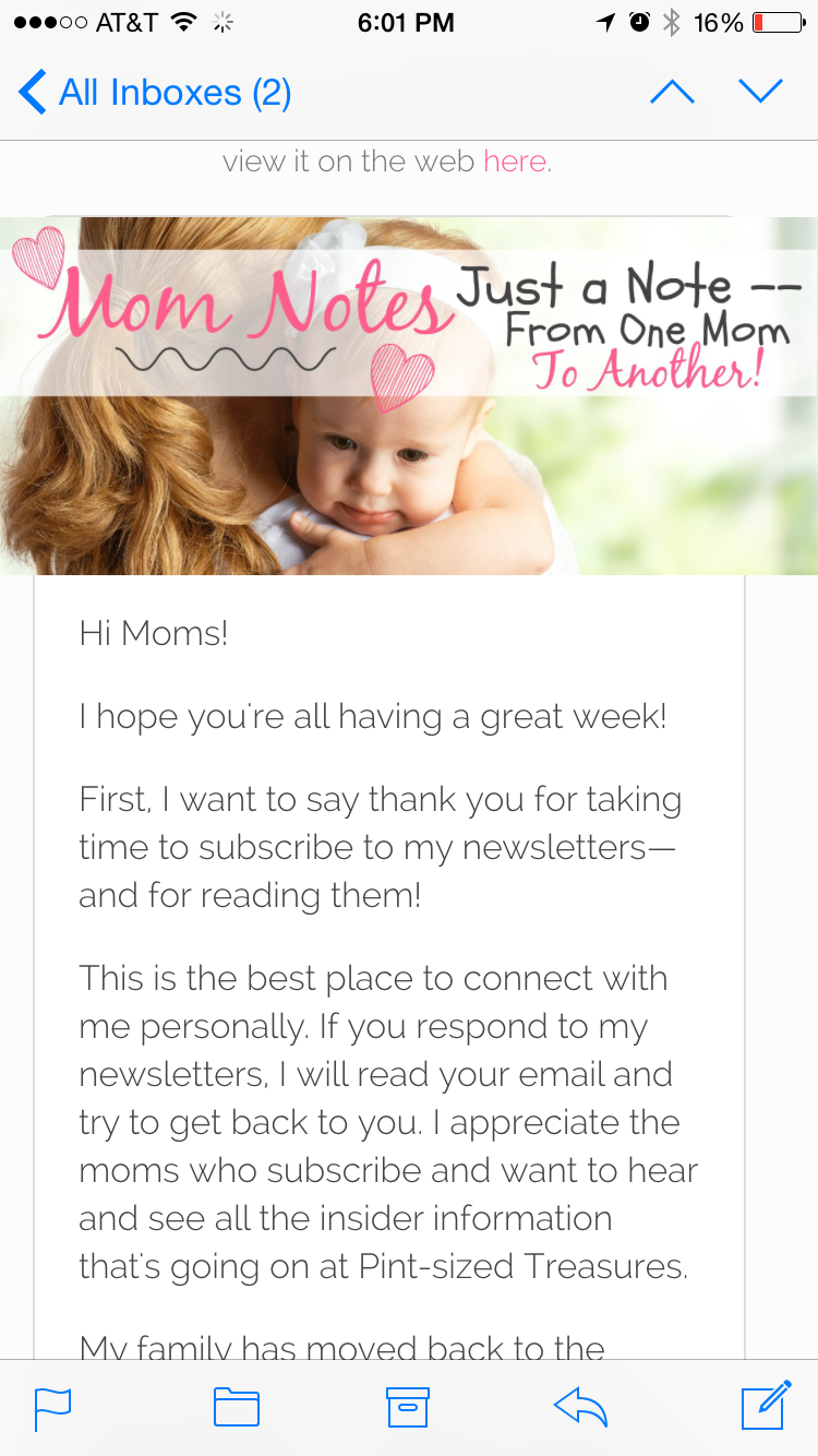
I'm using MadMimi for email promotions. So far, my emails look consistent across all browsers and devices, including iOS on iPad (in the Mail app). There is, however, a weird resizing issue with images on iOS on the iPhone (again, the Mail app). See the CSS and screenshot below. As you can see, the image bursts out of the width of its parent element. Does anyone know why this happens or how to correct it? Thanks.
CSS:
.outer-wrapper {
     width: 600px;
     max-width: 100%;
     margin: 0 auto;
}
.inner-wrapper {
     width: 100%;
     border-radius: 10px;
     overflow: hidden;
     background-color: white;
     border: 1px solid #dddddd;
}
img {
     width: 600px;
     max-width: 100%;
     height: auto;
}
HTML:
<body>
   <div class="outer-wrapper">
      <div class="browser">Email look weird? Be sure to enable images, or view it on the web <a href="[[web_link]]" target="_blank">here</a>.</div>
      <div class="inner-wrapper">
         <a href="#"><img src="http://pintsizedtreasures.com/newsletters/header-2.jpg"></a>
         <div class="body-wrapper">
            [content...]
         </div>
      </div>
   </div>
</body>
 272
272
The only way to display HTML content in Mail is to pull down “VIEW” menu to DISPLAY MESSAGE then select “BEST ALTERNATIVE”. The it pops up fine.
You can add background images—with no coding required! To try it for yourself, sign up now for free. If you have an existing HTML email template, Campaign Monitor's “Bulletproof Background Images” has the code snippets you need to create email body background images.
I found the answer by trial and error. I had reversed the values for .outer-wrapper max-width and width. The correct CSS should read:
.outer-wrapper {
     width: 100%;
     max-width: 600px;
     margin: 0 auto;
}
What I think is happening is that when the user is on an iPhone, there is less than 600 pixels in the viewport, so the renderer is falling back to max-width for .outer-wrapper. And since it is set to 100% and not a declared pixel value, the img 100% width is falling back to the viewport width, not its parent width. All other browsers have a viewport larger than 600px, which is a declared pixel value, and the problem doesn't occur (iPad, desktop, etc.). Stupid oversight of mine, apparently.
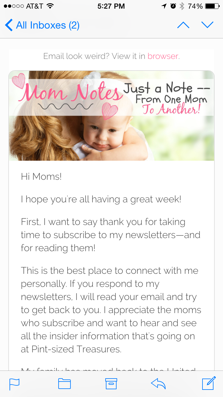
This is how it's supposed to look.
51
If you love us? You can donate to us via Paypal or buy me a coffee so we can maintain and grow! Thank you!
Donate Us With
