 Menu
Menu
I've got a basic layout like this:
   Cell 0     Cell 1      Cell 2 <!-- these are not to appear in actual render
 __________________________________
 | Image 0  | Image 1  | Image 2  |
 |----------| Image 1  |-----------
 | text here| Image 1  | text here|
 ----------------------------------
   Cell 3     Cell 4      Cell 5 <!-- these are not to appear in actual render
 __________________________________
 | Image 3  | Image 4  | Image 5  |
 |----------|----------| Image 5  |
 | text here| text here| Image 5  |
 ----------------------------------
Depending on the screen size, there should be 4 cells, 3 cells, 2 cells, or 1 cell, per row.
The image should take up the entire cell, and be aligned—in size—with images in other cells.
Some of my attempts: https://stackblitz.com/edit/angular-gk58tk
Is this an uncommon use-case for grids, mat-card, and similar?
What am I doing wrong?
 403
403
Here's a solution, I do not know exactly if that's what you're looking for:
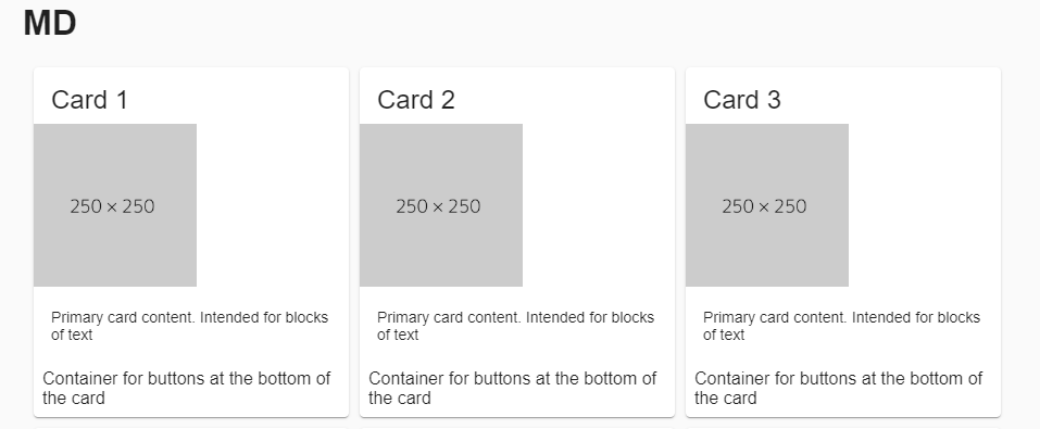
<div fxLayout.xs="column" fxLayout="row wrap" fxLayoutGap="10px" ngClass.gt-xs="ml-10">
  <mat-card fxFlex.sm="0 1 calc(50%-10px)" fxFlex.md="0 1 calc(33%-10px)" fxFlex.gt-md="0 1 calc(25%-10px)">
    <mat-card-title>Card 1</mat-card-title>
    <img mat-card-image src="https://kakiseni.org/wp-content/uploads/2018/03/250X250.png" class="image">
    <mat-card-content>Primary card content. Intended for blocks of text</mat-card-content>
    <mat-card-actions>Container for buttons at the bottom of the card</mat-card-actions>
  </mat-card>

  <mat-card>...</mat-card>
</div>
I used fxLayout="row wrap" for the list of cards and depending on the size of the screen, there is between 1 to 4 cards per line.
Stackblitz
173
If you love us? You can donate to us via Paypal or buy me a coffee so we can maintain and grow! Thank you!
Donate Us With