 Menu
Menu
I've seen the following thread which is related to my question:
WPF ComboBox: background color when disabled
The above deals with changing the Content Template for a ComboBox. I am working with WPF, am somewhat new to Styles and Templates, and I want to change the dull gray background color of a disabled TextBox to some other color. We use TextBoxes frequently in our application and we find the default color settings difficult to read.
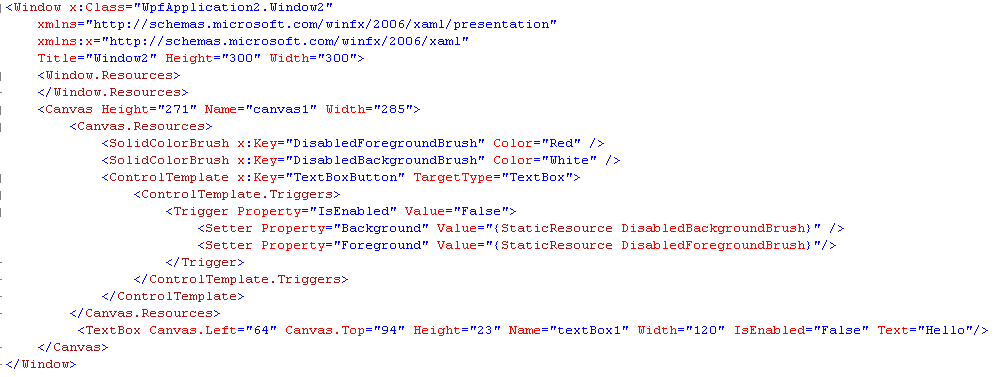
I've crafted the following solution attempt. But of course, it does not work. Can someone give me an opinion on why?
 773
773
Unfortunately for the TextBox control, it appears like it's not as simple as just adding a trigger and changing the Background color when the trigger condition is true. You have to override the entire ControlTemplate to achieve this. Below is one example on how you might do this:
<Window x:Class="StackOverflow.MainWindow" xmlns="http://schemas.microsoft.com/winfx/2006/xaml/presentation" xmlns:x="http://schemas.microsoft.com/winfx/2006/xaml" Title="MainWindow" Height="350" Width="525"> <Window.Resources> <SolidColorBrush x:Key="DisabledForegroundBrush" Color="Red" /> <SolidColorBrush x:Key="DisabledBackgroundBrush" Color="White" /> <Style TargetType="TextBox"> <Setter Property="Background" Value="White"/> <Setter Property="BorderBrush" Value="Black"/> <Setter Property="Template"> <Setter.Value> <ControlTemplate TargetType="TextBox"> <Border Name="Bd" BorderThickness="{TemplateBinding BorderThickness}" BorderBrush="{TemplateBinding BorderBrush}" Background="{TemplateBinding Background}" SnapsToDevicePixels="true"> <ScrollViewer Name="PART_ContentHost" Background="{TemplateBinding Background}" SnapsToDevicePixels="{TemplateBinding SnapsToDevicePixels}" /> </Border> <ControlTemplate.Triggers> <Trigger Property="IsEnabled" Value="False"> <Setter Value="{StaticResource DisabledBackgroundBrush}" Property="Background" /> <Setter Value="{StaticResource DisabledForegroundBrush}" Property="Foreground" /> <Setter TargetName="PART_ContentHost" Property="Background" Value="Blue"/> </Trigger> </ControlTemplate.Triggers> </ControlTemplate> </Setter.Value> </Setter> </Style> </Window.Resources> <Canvas> <TextBox Text="TextBox" IsEnabled="False"/> <TextBox Text="TextBox" IsEnabled="True" Canvas.Top="25"/> </Canvas> </Window> EDIT:
In response to your question, I tried adding the ComboBox style to my original answer above and I was able to integrate it without errors. I'm not sure though if it behaves like you wanted it to. I just copy-pasted what's in the link you specified.
<Window x:Class="StackOverflow.MainWindow" xmlns="http://schemas.microsoft.com/winfx/2006/xaml/presentation" xmlns:x="http://schemas.microsoft.com/winfx/2006/xaml" xmlns:local="clr-namespace:StackOverflow" Title="MainWindow" Height="350" Width="525" x:Name="window"> <Window.Resources> <SolidColorBrush x:Key="DisabledForegroundBrush" Color="Red" /> <SolidColorBrush x:Key="DisabledBackgroundBrush" Color="Blue" /> <LinearGradientBrush x:Key="NormalBrush" StartPoint="0,0" EndPoint="0,1"> <GradientBrush.GradientStops> <GradientStopCollection> <GradientStop Color="#FFF" Offset="0.0"/> <GradientStop Color="#CCC" Offset="1.0"/> </GradientStopCollection> </GradientBrush.GradientStops> </LinearGradientBrush> <LinearGradientBrush x:Key="HorizontalNormalBrush" StartPoint="0,0" EndPoint="1,0"> <GradientBrush.GradientStops> <GradientStopCollection> <GradientStop Color="#FFF" Offset="0.0"/> <GradientStop Color="#CCC" Offset="1.0"/> </GradientStopCollection> </GradientBrush.GradientStops> </LinearGradientBrush> <LinearGradientBrush x:Key="LightBrush" StartPoint="0,0" EndPoint="0,1"> <GradientBrush.GradientStops> <GradientStopCollection> <GradientStop Color="#FFF" Offset="0.0"/> <GradientStop Color="#EEE" Offset="1.0"/> </GradientStopCollection> </GradientBrush.GradientStops> </LinearGradientBrush> <LinearGradientBrush x:Key="HorizontalLightBrush" StartPoint="0,0" EndPoint="1,0"> <GradientBrush.GradientStops> <GradientStopCollection> <GradientStop Color="#FFF" Offset="0.0"/> <GradientStop Color="#EEE" Offset="1.0"/> </GradientStopCollection> </GradientBrush.GradientStops> </LinearGradientBrush> <LinearGradientBrush x:Key="DarkBrush" StartPoint="0,0" EndPoint="0,1"> <GradientBrush.GradientStops> <GradientStopCollection> <GradientStop Color="#FFF" Offset="0.0"/> <GradientStop Color="#AAA" Offset="1.0"/> </GradientStopCollection> </GradientBrush.GradientStops> </LinearGradientBrush> <LinearGradientBrush x:Key="PressedBrush" StartPoint="0,0" EndPoint="0,1"> <GradientBrush.GradientStops> <GradientStopCollection> <GradientStop Color="#BBB" Offset="0.0"/> <GradientStop Color="#EEE" Offset="0.1"/> <GradientStop Color="#EEE" Offset="0.9"/> <GradientStop Color="#FFF" Offset="1.0"/> </GradientStopCollection> </GradientBrush.GradientStops> </LinearGradientBrush> <SolidColorBrush x:Key="WindowBackgroundBrush" Color="#FFF" /> <SolidColorBrush x:Key="SelectedBackgroundBrush" Color="#DDD" /> <!-- Border Brushes --> <LinearGradientBrush x:Key="NormalBorderBrush" StartPoint="0,0" EndPoint="0,1"> <GradientBrush.GradientStops> <GradientStopCollection> <GradientStop Color="#CCC" Offset="0.0"/> <GradientStop Color="#444" Offset="1.0"/> </GradientStopCollection> </GradientBrush.GradientStops> </LinearGradientBrush> <LinearGradientBrush x:Key="HorizontalNormalBorderBrush" StartPoint="0,0" EndPoint="1,0"> <GradientBrush.GradientStops> <GradientStopCollection> <GradientStop Color="#CCC" Offset="0.0"/> <GradientStop Color="#444" Offset="1.0"/> </GradientStopCollection> </GradientBrush.GradientStops> </LinearGradientBrush> <LinearGradientBrush x:Key="DefaultedBorderBrush" StartPoint="0,0" EndPoint="0,1"> <GradientBrush.GradientStops> <GradientStopCollection> <GradientStop Color="#777" Offset="0.0"/> <GradientStop Color="#000" Offset="1.0"/> </GradientStopCollection> </GradientBrush.GradientStops> </LinearGradientBrush> <LinearGradientBrush x:Key="PressedBorderBrush" StartPoint="0,0" EndPoint="0,1"> <GradientBrush.GradientStops> <GradientStopCollection> <GradientStop Color="#444" Offset="0.0"/> <GradientStop Color="#888" Offset="1.0"/> </GradientStopCollection> </GradientBrush.GradientStops> </LinearGradientBrush> <SolidColorBrush x:Key="DisabledBorderBrush" Color="#AAA" /> <SolidColorBrush x:Key="SolidBorderBrush" Color="#888" /> <SolidColorBrush x:Key="LightBorderBrush" Color="#AAA" /> <!-- Miscellaneous Brushes --> <SolidColorBrush x:Key="GlyphBrush" Color="#444" /> <SolidColorBrush x:Key="LightColorBrush" Color="#DDD" /> <ControlTemplate x:Key="ComboBoxToggleButton" TargetType="ToggleButton"> <Grid> <Grid.ColumnDefinitions> <ColumnDefinition /> <ColumnDefinition Width="20" /> </Grid.ColumnDefinitions> <Border x:Name="Border" Grid.ColumnSpan="2" CornerRadius="2" Background="{StaticResource NormalBrush}" BorderBrush="{StaticResource NormalBorderBrush}" BorderThickness="1" /> <Border Grid.Column="0" CornerRadius="2,0,0,2" Margin="1" Background="{StaticResource WindowBackgroundBrush}" BorderBrush="{StaticResource NormalBorderBrush}" BorderThickness="0,0,1,0" /> <Path x:Name="Arrow" Grid.Column="1" Fill="{StaticResource GlyphBrush}" HorizontalAlignment="Center" VerticalAlignment="Center" Data="M 0 0 L 4 4 L 8 0 Z"/> </Grid> <ControlTemplate.Triggers> <Trigger Property="ToggleButton.IsMouseOver" Value="true"> <Setter TargetName="Border" Property="Background" Value="{StaticResource DarkBrush}" /> </Trigger> <Trigger Property="ToggleButton.IsChecked" Value="true"> <Setter TargetName="Border" Property="Background" Value="{StaticResource PressedBrush}" /> </Trigger> <Trigger Property="IsEnabled" Value="False"> <Setter TargetName="Border" Property="Background" Value="{StaticResource DisabledBackgroundBrush}" /> <Setter TargetName="Border" Property="BorderBrush" Value="{StaticResource DisabledBorderBrush}" /> <Setter Property="Foreground" Value="{StaticResource DisabledForegroundBrush}"/> <Setter TargetName="Arrow" Property="Fill" Value="{StaticResource DisabledForegroundBrush}" /> </Trigger> </ControlTemplate.Triggers> </ControlTemplate> <ControlTemplate x:Key="ComboBoxTextBox" TargetType="TextBox"> <Border x:Name="PART_ContentHost" Focusable="False" Background="{TemplateBinding Background}" /> </ControlTemplate> <Style x:Key="{x:Type ComboBox}" TargetType="ComboBox"> <Setter Property="SnapsToDevicePixels" Value="true"/> <Setter Property="OverridesDefaultStyle" Value="true"/> <Setter Property="ScrollViewer.HorizontalScrollBarVisibility" Value="Auto"/> <Setter Property="ScrollViewer.VerticalScrollBarVisibility" Value="Auto"/> <Setter Property="ScrollViewer.CanContentScroll" Value="true"/> <Setter Property="MinWidth" Value="120"/> <Setter Property="MinHeight" Value="20"/> <Setter Property="Template"> <Setter.Value> <ControlTemplate TargetType="ComboBox"> <Grid> <ToggleButton Name="ToggleButton" Template="{StaticResource ComboBoxToggleButton}" Grid.Column="2" Focusable="false" IsChecked="{Binding Path=IsDropDownOpen,Mode=TwoWay,RelativeSource={RelativeSource TemplatedParent}}" ClickMode="Press"> </ToggleButton> <ContentPresenter Name="ContentSite" IsHitTestVisible="False" Content="{TemplateBinding SelectionBoxItem}" ContentTemplate="{TemplateBinding SelectionBoxItemTemplate}" ContentTemplateSelector="{TemplateBinding ItemTemplateSelector}" Margin="3,3,23,3" VerticalAlignment="Center" HorizontalAlignment="Left" /> <TextBox x:Name="PART_EditableTextBox" Style="{x:Null}" Template="{StaticResource ComboBoxTextBox}" HorizontalAlignment="Left" VerticalAlignment="Center" Margin="3,3,23,3" Focusable="True" Background="Transparent" Visibility="Hidden" IsReadOnly="{TemplateBinding IsReadOnly}"/> <Popup Name="Popup" Placement="Bottom" IsOpen="{TemplateBinding IsDropDownOpen}" AllowsTransparency="True" Focusable="False" PopupAnimation="Slide"> <Grid Name="DropDown" SnapsToDevicePixels="True" MinWidth="{TemplateBinding ActualWidth}" MaxHeight="{TemplateBinding MaxDropDownHeight}"> <Border x:Name="DropDownBorder" Background="{StaticResource WindowBackgroundBrush}" BorderThickness="1" BorderBrush="{StaticResource SolidBorderBrush}"/> <ScrollViewer Margin="4,6,4,6" SnapsToDevicePixels="True"> <StackPanel IsItemsHost="True" KeyboardNavigation.DirectionalNavigation="Contained" /> </ScrollViewer> </Grid> </Popup> </Grid> <ControlTemplate.Triggers> <Trigger Property="HasItems" Value="false"> <Setter TargetName="DropDownBorder" Property="MinHeight" Value="95"/> </Trigger> <Trigger Property="IsEnabled" Value="false"> <Setter Property="Foreground" Value="{StaticResource DisabledForegroundBrush}"/> </Trigger> <Trigger Property="IsGrouping" Value="true"> <Setter Property="ScrollViewer.CanContentScroll" Value="false"/> </Trigger> <Trigger SourceName="Popup" Property="Popup.AllowsTransparency" Value="true"> <Setter TargetName="DropDownBorder" Property="CornerRadius" Value="4"/> <Setter TargetName="DropDownBorder" Property="Margin" Value="0,2,0,0"/> </Trigger> <Trigger Property="IsEditable" Value="true"> <Setter Property="IsTabStop" Value="false"/> <Setter TargetName="PART_EditableTextBox" Property="Visibility" Value="Visible"/> <Setter TargetName="ContentSite" Property="Visibility" Value="Hidden"/> </Trigger> </ControlTemplate.Triggers> </ControlTemplate> </Setter.Value> </Setter> <Style.Triggers> </Style.Triggers> </Style> <Style TargetType="TextBox"> <Setter Property="Background" Value="White"/> <Setter Property="BorderBrush" Value="Black"/> <Setter Property="Template"> <Setter.Value> <ControlTemplate TargetType="TextBox"> <Border Name="Bd" BorderThickness="{TemplateBinding BorderThickness}" BorderBrush="{TemplateBinding BorderBrush}" Background="{TemplateBinding Background}" SnapsToDevicePixels="true"> <ScrollViewer Name="PART_ContentHost" Background="{TemplateBinding Background}" SnapsToDevicePixels="{TemplateBinding SnapsToDevicePixels}" /> </Border> <ControlTemplate.Triggers> <Trigger Property="IsEnabled" Value="False"> <Setter Value="{StaticResource DisabledBackgroundBrush}" Property="Background" /> <Setter Value="{StaticResource DisabledForegroundBrush}" Property="Foreground" /> <Setter TargetName="PART_ContentHost" Property="Background" Value="{StaticResource DisabledBackgroundBrush}"/> </Trigger> </ControlTemplate.Triggers> </ControlTemplate> </Setter.Value> </Setter> </Style> </Window.Resources> <StackPanel> <TextBox IsEnabled="False">TextBox</TextBox> <ComboBox IsEnabled="False"/> </StackPanel> </Window> You can use the below snippet :
Instead of checking for IsEnable property, use IsReadonly property of TextBox control.
<Style TargetType="{x:Type TextBox}">
    <Setter Property="Background" Value="LightSkyBlue" />
    <Style.Triggers>
        <Trigger Property="IsReadOnly" Value="True">
            <Setter Property="Background" Value="Red" />
        </Trigger>
    </Style.Triggers>
</Style>
If You need to apply it for all the textbox controls, use the above code. For specific textbox, just set the key and apply the style to that Textbox.
32
For this situation I like to set Focusable=false and set the background color to my desired value (in a data-bound trigger). This is maybe a little hacky, but so is rewriting the control template for the whole TextBox. An alternative to Focusable is IsReadyOnly, but that doesn't work for as many controls. It does ensure the caret disappears, though.
26
If you love us? You can donate to us via Paypal or buy me a coffee so we can maintain and grow! Thank you!
Donate Us With


