 Menu
Menu
I just came across CSS Arrow please which helps me creating CSS triangles. However, that's not enough. It only creates an outer arrow, while I would like to create inner triangles as well.

This above was just created within Photoshop. I'm able to create the first able using CSS Arrow Please, but then the hard(er) part comes along. How do I create a block that contains both an outer (right aligned) and inner (left-aligned) arrow, where the last one only contains an inner (left-aligned) arrow.
The result of this should be a clickable proces chain.
To create the first one, this is the CSS
.arrow_box:first-child {
    position: relative;
    background: #1abc9c;
    border: 5px solid #16a085;
}

.arrow_box:first-child:after, .arrow_box:first-child:before {
    left: 100%;
    top: 50%;
    border: solid transparent;
    content: " ";
    height: 0;
    width: 0;
    position: absolute;
    pointer-events: none;
}

.arrow_box:first-child:after {
    border-color: rgba(26, 188, 156, 0);
    border-left-color: #1abc9c;
    border-width: 16px;
    margin-top: -16px;
}
.arrow_box:first-child:before {
    border-color: rgba(22, 160, 133, 0);
    border-left-color: #16a085;
    border-width: 23px;
    margin-top: -23px;
}
But then my question rises: How would I create the other two?
Thanks!
 657
657
You need 4 pseudo elements to create this properly, because triangles are created using borders, so they can't have a border and different background-color. We therefore need an inner and outer triangle for both sides. We can use both ::before and ::after, but since that only gives us two, we need at least two "real" elements.
Since this is a navigation panel, I used a series of lis and placed an a inside each one. This is a complicated setup though, so I'm going to break it down into several Fiddles showing the progression.
Edit: I've updated this so that the navigation elements are fluid, not fixed-width, per OP's comments.
First we set up the navigation boxes according to your mockup.
<nav>
    <li><a href="">Office</a></li>
    <li><a href="">Office</a></li>
    <li><a href="">Office Two</a></li>
    <li><a href="">Short</a></li>
</nav>
nav {
background: #1abc9c;
}
nav li {
display:inline-block;
position:relative;
margin:10px;
margin-right:0;
border: 5px solid #16a085;
padding:15px 30px;
}
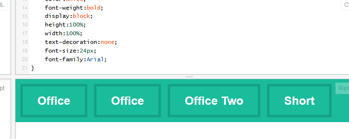
nav li a {
color:white;
font-weight:bold;
display:block;
height:100%;
width:100%;
text-decoration:none;
font-size:24px;
font-family:Arial;
}
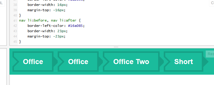
We are going to be using :before and :after, based on the code you provided in your question. Note, I've compressed this CSS based on rules that are shared across elements. Both inner triangles have the same color, both left arrows have the same position, etc.
/* Arrows */
nav li:after, nav li a:after, nav li:before, nav li a:before {
    left: 100%;
    top: 50%;
    border: solid transparent;
    content: " ";
    height: 0;
    width: 0;
    position: absolute;
    pointer-events:none; /* So that the mouse will ignore this on top of the clickable area.*/
}
nav li:before, nav li a:before {
    left: -5px;
}
nav li a:before, nav li a:after {
    border-left-color: #1abc9c;
    border-width: 16px;
    margin-top: -16px;
}
nav li:before, nav li:after {
    border-left-color: #16a085;
    border-width: 23px;
    margin-top: -23px;
}
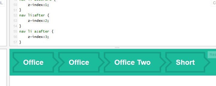
We've got an issue with the wrong triangles overriding others though. We can fix this with some judicial z-index;
nav li:before {
    z-index:0;
}
nav li a:before {
    z-index:1;
}
nav li:after {
    z-index:2;
}
nav li a:after {
    z-index:3;
}
Now we have working arrows that look right, on all elements. Success! ....almost. We have the arrows appearing on all elements, and we need to hide certain arrows for the beginning and end of the navigation panel.
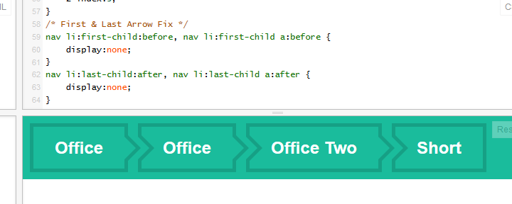
In this final step we want to remove the two arrows before the first header element, and the two arrows after the last child. The code is surprisingly simple with the structure we've set up so far. We need two selectors, and a display:none;.
/* First & Last Arrow Fix */
nav li:first-child:before, nav li:first-child a:before {
    display:none;
}
nav li:last-child:after, nav li:last-child a:after {
    display:none;
}
And we're done!
Edit: Props to disinfo for idea of using nav instead of header.
As requested by OP in comments, final code is:
<nav>
    <li><a href="">Office</a></li>
    <li><a href="">Office</a></li>
    <li><a href="">Office Two</a></li>
    <li><a href="">Short</a></li>
</nav>
nav {
    background: #1abc9c;
}
nav li {
    display:inline-block;
    position:relative;
    margin:10px;
    margin-right:0;
    border: 5px solid #16a085;
    padding:15px 30px;
}
nav li a {
    color:white;
    font-weight:bold;
    display:block;
    height:100%;
    width:100%;
    text-decoration:none;
    font-size:24px;
    font-family:Arial;
}
/* Arrows */
nav li:after, nav li a:after, nav li:before, nav li a:before {
    left: 100%;
    top: 50%;
    border: solid transparent;
    content: " ";
    height: 0;
    width: 0;
    position: absolute;
    pointer-events:none; /* So that the mouse will ignore this on top of the clickable area.*/
}
nav li:before, nav li a:before {
    left: -5px;
}
nav li a:before, nav li a:after {
    border-left-color: #1abc9c;
    border-width: 16px;
    margin-top: -16px;
}
nav li:before, nav li:after {
    border-left-color: #16a085;
    border-width: 23px;
    margin-top: -23px;
}
/* Overlapping Fix */
nav li:before {
    z-index:0;
}
nav li a:before {
    z-index:1;
}
nav li:after {
    z-index:2;
}
nav li a:after {
    z-index:3;
}
/* First & Last Arrow Fix */
nav li:first-child:before, nav li:first-child a:before {
    display:none;
}
nav li:last-child:after, nav li:last-child a:after {
    display:none;
}
Here's a pure CSS way:
HTML
 <div id="nav">
    <li><a href="#">Test</a></li>
    <li><a href="#">Test 2</a></li>
    <li><a href="#">Test 3</a></li>
</div><!--nav-->
CSS
      #nav {
    background:#4fd34e;
    height:100px;
    width:100%;
    position:relative;
}

#nav li {
    display:inline-block;
    line-height:2;
    border:3px solid #FFF;
    box-sizing:border-box;
    -moz-box-sizing:border-box;
    position:relative;
    margin-top:20px;
    margin-left:20px;
}

#nav li:before {
    content:"";
    display:block;
    position:absolute;
    width:20px;
    height:20px;
    background:#4fd34e;
    border:3px solid #FFF;
    border-width:3px 3px 0 0;
    margin-left:-12px;
    margin-top:10px;
    -ms-transform: rotate(45deg); /* IE 9 */
    -webkit-transform: rotate(45deg); /* Chrome, Safari, Opera */
    -moz-transform: rotate(45deg); /* FF */
    transform: rotate(45deg);
 }

#nav li:after {
    content:"";
    display:block;
    position:absolute;
    width:20px;
    height:20px;
    background:#4fd34e;
    border:3px solid #FFF;
    border-width:3px 3px 0 0;
    right:-14px;
    top:8px;
    -ms-transform: rotate(45deg); /* IE 9 */
    -webkit-transform: rotate(45deg); /* Chrome, Safari, Opera */
    -moz-transform: rotate(45deg); /* FF */
    transform: rotate(45deg);
    z-index:100;
 }

#nav li a {
    display:block;
    text-decoration:none;
    padding:5px 20px;

}

#nav li:first-child:before,
#nav li:last-child:after {
    display:none;

}
Here's the fiddle: http://jsfiddle.net/disinfor/8KvRp/3
32
Not a "Pure CSS" solution but perhaps much less complicated with images:
You can see it in action in this fiddle
<div class="processChain">
    <div id="start"><img src="images/home.png" height="18" /> Offerte</div>
    <a><img src="images/home.png" height="18" />Offerte</a>
    <a><img src="images/home.png" height="18" />Offerte</a>
    <a><img src="images/home.png" height="18" />Offerte</a>
    <span><img src="images/home.png" height="18" />Offerte</span>
</div>

.processChain img {
border: none;
vertical-align: text-bottom;
margin-right: 3px;
}
.processChain #start, .processChain a, .processChain span {
background:url("images/bg-chain-start-middle.png") no-repeat scroll 100% 0 transparent;
color:#663300;
display:block;
float:left;
height:22px;
line-height:22px;
padding:0 20px 0 10px;
text-decoration:none;
position:relative;
}
.processChain a:hover{text-decoration:underline;cursor: default;}
.processChain span {
background:url("images/bg-chain-end.png") no-repeat scroll 100% 0 transparent;
padding:0 13px 0 10px;
}
If you love us? You can donate to us via Paypal or buy me a coffee so we can maintain and grow! Thank you!
Donate Us With