 Menu
Menu
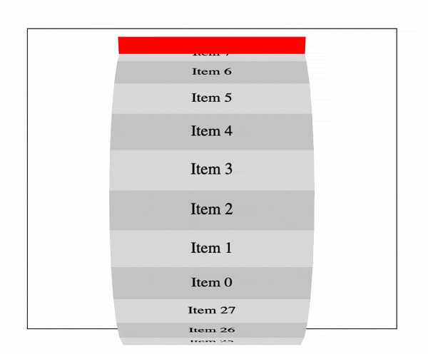
I have a 3D css wheel/cylindar animation that's rotating on the x axis. My issue is the animation appears to move up and down outside of it's container. Example GIF below...
The code for the above can be found here here: https://jsfiddle.net/thelevicole/bkt0v1mc/
(function($) {

  const $wheel = $('.wheel .wheel__inner');
  const items = 28;
  const diameter = $wheel.height();
  const radius = diameter / 2;
  const angle = 360 / items;
  const circumference = Math.PI * diameter;
  const height = circumference / items;

  for (let i = 0; i < items; i++) {
    var transform = `rotateX(${ angle * i }deg) translateZ(${ radius }px)`;

    $('<div>', {
      class: 'wheel__segment'
    }).css({
      'transform': transform,
      'height': height,
    }).html(`<span>Item ${ i }</span>`).appendTo($wheel);
  }

})(jQuery);
*,
*:before,
*:after {
box-sizing: border-box;
}
.wheel {
perspective: 1000px;
border: 1px solid #333;
margin: 50px;
}
.wheel .wheel__inner {
background-color: red;
position: relative;
width: 200px;
height: 350px;
margin: 0 auto;
transform-style: preserve-3d;
animation-iteration-count: infinite;
animation-timing-function: linear;
animation-name: spin;
animation-duration: 6s;
}
.wheel .wheel__inner .wheel__segment {
display: flex;
justify-content: center;
align-items: center;
width: 100%;
height: 40px;
position: absolute;
top: 50%;
background-color: #ccc;
}
.wheel .wheel__inner .wheel__segment:nth-child(even) {
background-color: #ddd;
}
@-webkit-keyframes spin {
0% {
transform: rotateX(360deg);
}
50% {
transform: rotateX(180deg);
}
100% {
transform: rotateX(0deg);
}
}<script src="https://cdnjs.cloudflare.com/ajax/libs/jquery/3.3.1/jquery.min.js"></script>
<div class="wheel">
<div class="wheel__inner">
</div>
</div>The red pane is the segments container, this is the element with the css animation. The red pane is staying within the container, however, the segments are offset vertically which is pushing them outside of the container.
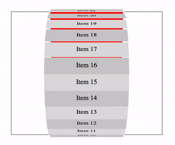
I can stop this up and down movement by adding transform-origin: 50% 0; to each of the segments but this poses a new issue. Gaps between the segments! See below...
Code for the above: https://jsfiddle.net/thelevicole/bkt0v1mc/1/
( function( $ ) {

    const $wheel = $( '.wheel .wheel__inner' );
    const items = 28;
    const diameter = $wheel.height();
    const radius = diameter / 2;
    const angle = 360 / items;
    const circumference = Math.PI * diameter;
    const height = circumference / items;

    for ( let i = 0; i < items; i++ ) {
        var transform = `rotateX(${ angle * i }deg) translateZ(${ radius }px)`;

        $( '<div>', {
            class: 'wheel__segment'
        } ).css( {
            'transform': transform,
            'height': height,
        } ).html( `<span>Item ${ i }</span>` ).appendTo( $wheel );
    }

} )( jQuery );
*, *:before, *:after {
box-sizing: border-box;
}
.wheel {
perspective: 1000px;
border: 1px solid #333;
margin: 50px;
}
.wheel .wheel__inner {
background-color: red;
position: relative;
width: 200px;
height: 350px;
margin: 0 auto;
transform-style: preserve-3d;
animation-iteration-count: infinite;
animation-timing-function: linear;
animation-name: spin;
animation-duration: 6s;
}
.wheel .wheel__inner .wheel__segment {
display: flex;
justify-content: center;
align-items: center;
width: 100%;
height: 40px;
position: absolute;
top: 50%;
background-color: #ccc;
transform-origin: 50% 0;
}
.wheel .wheel__inner .wheel__segment:nth-child(even) {
background-color: #ddd;
}
@-webkit-keyframes spin {
0% {
transform: rotateX(360deg);
}
50% {
transform: rotateX(180deg);
}
100% {
transform: rotateX(0deg);
}
}<script src="https://cdnjs.cloudflare.com/ajax/libs/jquery/3.3.1/jquery.min.js"></script>
<div class="wheel">
<div class="wheel__inner">
</div>
</div>Any help would be great!
 544
544
The animation will utilize the CSS “rotateY” property. There will be two keyframes one where the image rotation is set to “0deg” and the other where it is set to “360deg”. The tweening between the “from” and “to” points will create the animation.
CSS: 3D Transforms and Animations. 1 1. Setting up Keyframes. What are keyframes? A @-webkit-keyframes block contains rule sets called keyframes. A keyframe defines the style that will be ... 2 2. Setting the stage for our animation. 3 3. Spinning an element on the page. 4 4. Creating a photo carousel. 5 5. Photos on a rotating polygon. More items
CSS flip animation effects were never this easy and attractive before in the front-end development world. I mean, doing 3d card flip animation effects with plain and simple CSS and no JavaScript at all is amazing, isn’t it? Flip animations are around for a while now, and you must have seen them somewhere in action already.
Our first attempts at using CSS 3D Transforms to create an animated photo carousel were not entirely practical as they were limited to a small number of photos.
You can rectify this by adjusting the transform-origin of the rotated element like below:
transform-origin: 50% calc(50% + height/2);
( function( $ ) {

    const $wheel = $( '.wheel .wheel__inner' );
    const items = 28;
    const diameter = $wheel.height();
    const radius = diameter / 2;
    const angle = 360 / items;
    const circumference = Math.PI * diameter;
    const height = circumference / items;

    for ( let i = 0; i < items; i++ ) {
        var transform = `rotateX(${ angle * i }deg) translateZ(${ radius }px)`;

        $( '<div>', {
            class: 'wheel__segment'
        } ).css( {
            'transform': transform,
            'height': height,
        } ).html( `<span>Item ${ i }</span>` ).appendTo( $wheel );
    }
  $wheel.css('transform-origin','50% calc(50% + '+height/2+'px)');
  $wheel.css('margin-top','-'+height+'px'); /* negative margin here to keep the element into the center */

} )( jQuery );
*, *:before, *:after {
box-sizing: border-box;
}
.wheel {
perspective: 1000px;
border: 1px solid #333;
margin: 50px;
}
.wheel .wheel__inner {
background-color: red;
position: relative;
width: 200px;
height: 350px;
margin: 0 auto ;
transform-style: preserve-3d;
animation-iteration-count: infinite;
animation-timing-function: linear;
animation-name: spin;
animation-duration: 6s;
}
.wheel .wheel__inner .wheel__segment {
display: flex;
justify-content: center;
align-items: center;
width: 100%;
height: 40px;
position: absolute;
top: 50%;
background-color: #ccc;
}
.wheel .wheel__inner .wheel__segment:nth-child(even) {
background-color: #ddd;
}
@-webkit-keyframes spin {
0% {
transform: rotateX(360deg);
}
50% {
transform: rotateX(180deg);
}
100% {
transform: rotateX(0deg);
}
}<script src="https://cdnjs.cloudflare.com/ajax/libs/jquery/3.3.1/jquery.min.js"></script>
<div class="wheel">
<div class="wheel__inner">
</div>
</div>If you love us? You can donate to us via Paypal or buy me a coffee so we can maintain and grow! Thank you!
Donate Us With

