 Menu
Menu
I am having some issues with my Bootstrap navbar.
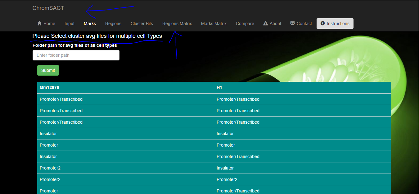
I have a lot of tabs in the navbar so the header gets on separate line and the tabs get on 2nd line which doesn't look good.
because navbar takes 2 line so it hides some content on my page, for example there is a heading above line "Please select cluster avg file...." in the attached image but you cant see it because navbar is overlapping and hiding it.
How can I fix this issue? I want the navbar to show only limited tabs , as possible in one line of navbar and hide other in the hamburger menu. So that it doesn't hide my body content and looks good as well.
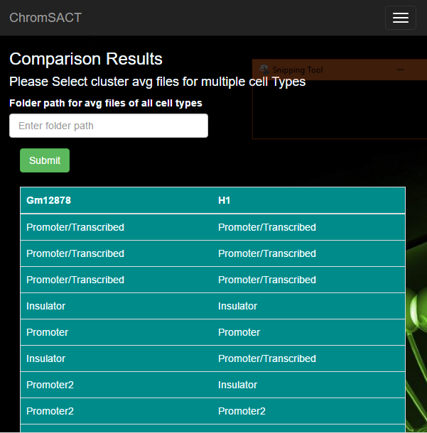
P.S: these problem don't occur when I resize window to mobile view, because hamburger menu appears.
Full Window
Mobile View
and the code for navbar is default with ASP.NET Core web application only thing I changed was its theme to "inverse"
Here's the code
<div class="navbar navbar-inverse navbar-fixed-top">
<div class="container">
<div class="navbar-header">
<button type="button" class="navbar-toggle" data-toggle="collapse" data-target=".navbar-collapse">
<span class="sr-only">Toggle navigation</span>
<span class="icon-bar"></span>
<span class="icon-bar"></span>
<span class="icon-bar"></span>
</button>
<a asp-area="" asp-controller="Home" asp-action="Index" class="navbar-brand">ChromSACT</a>
</div>
<div class="navbar-collapse collapse">
<ul class="nav navbar-nav">
<li><a asp-area="" asp-controller="Home" asp-action="Index" class="aa"><span class="glyphicon glyphicon-home" style="margin-right:6px;"></span>Home</a></li>
<li><a asp-area="" asp-controller="Home" asp-action="Cell">Input</a></li>
<li><a asp-area="" asp-controller="Home" asp-action="CellResult">Marks</a></li>
<li><a asp-area="" asp-controller="Home" asp-action="CellResultRegions">Regions</a></li>
<li><a asp-area="" asp-controller="Home" asp-action="ClusterBits">Cluster Bits</a></li>
<li><a asp-area="" asp-controller="Home" asp-action="RegionsMatrix">Regions Matrix</a></li>
<li><a asp-area="" asp-controller="Home" asp-action="MarksMatrix">Marks Matrix</a></li>
<li><a asp-area="" asp-controller="Home" asp-action="Compare">Compare</a></li>
<li><a asp-area="" asp-controller="Home" asp-action="About"><span class="glyphicon glyphicon-alert" style="margin-right:6px;"></span>About</a></li>
<li><a asp-area="" asp-controller="Home" asp-action="Contact"><span class="glyphicon glyphicon-envelope" style="margin-right:6px;"></span>Contact</a></li>
<li><button data-toggle="modal" data-target="#myModal" class="btn navbar-btn btn-group-sm"><span class="glyphicon glyphicon-info-sign" style="margin-right:6px;"></span>Instructions</button></li>
</ul>
</div>
</div>
</div>
<div class="container body-content" >
@RenderBody()
<hr />
<footer>
<p>© 2016 - ChromSACT</p>
</footer>
</div>
 232
232
Acoording to bootstrap navbar-fixed-top docs:
###Body padding required
The fixed navbar will overlay your other content, unless you add padding to the top of the
<body>. Try out your own values or use our snippet below. Tip: By default, the navbar is 50px high.
body { padding-top: 70px; }
Make sure to include this after the core Bootstrap CSS.
I think if it takes two lines on non-mobile viewport, you can set
@media screen and (min-width: 768px) {
    body { padding-top: 100px; }
}
If you love us? You can donate to us via Paypal or buy me a coffee so we can maintain and grow! Thank you!
Donate Us With