 Menu
Menu
I have a basic bootstrap panel and I want it to be 4 columns wide. I tried adding the class col-sm-4 like I would any other div:
<div class="row">
<div class="panel panel-default col-sm-4">
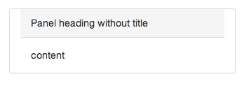
<div class="panel-heading">Panel heading without title</div>
<div class="panel-body">
Panel content
</div>
</div>
</div>
This got the width correct, but now the title bar background is messed up:
How do I get it to conform to that width but still render the header correctly?
 666
666
Rather than specifying the panel to be the width of four columns, what if you placed the panel in a column with length-four? I don't see anywhere in the documentation that says that you can apply the col-sm-* class to a panel component.
<div class="row">
  <div class="col-md-4">
    <div class="panel panel-default">
      <div class="panel-heading">Panel Heading</div>
      <div class="panel-body">Panel content</div>
    </div>
  </div>
</div>
And remember that the columns are supposed to add up to 12. So if you wanted empty space on the right and left of your panel you would do something like this:
<div class="row">
  <div class="col-md-4"></div>
  <div class="col-md-4">
    <div class="panel panel-default">
      <div class="panel-heading">Panel Heading</div>
      <div class="panel-body">Panel content</div>
    </div>
  </div>
  <div class="col-md-4"></div>
</div>
Update 1: Sionide21 noticed that the width of the column changes depending on whether or not you have nested rows. See image below.

The top row of the image is what happens when the panel is placed directly inside of the column (see first row below... this is the same as the first HTML snippet of this post). The bottom half is what happens when you insert a nested row (see second row below).
<div class="row">
  <div class="col-md-4">
    <div class="panel panel-default">
      <div class="panel-heading">Panel Heading</div>
      <div class="panel-body">Panel content</div>
    </div>
  </div>
</div>

<div class="row">
  <div class="col-md-4 bg-primary"><p>Left Column</p></div>
  <div class="col-md-4">
    <div class="row">
      <div class="panel panel-default">
        <div class="panel-heading">Panel Heading</div>
        <div class="panel-body">Panel content</div>
      </div>
    </div>
  </div>
  <div class="col-md-4 bg-primary"><p>Rightt Column</p></div>
</div>
So it appears that when the panel is placed directly inside of a column, some margin is added to the panel (or padding is added to the column), whereas when you place the panel in a nested row, the margin (or padding) is eliminated. I do not know if this is by design or just a quirk of Bootstrap.
Update 2: koala_dev pointed out that the "nested row" example is behaving as it is because the panel is a direct child of a .row element. So in essence we're countering the padding of the column with the negative margins of the row. I don't know enough about the matter, but he says that it should be fine to leave as is, or you can create custom CSS to remove the padding from the panel, or could even try adding the .row class to the panel itself! E.g. <div class="panel panel-default row">.
149
Try adding width:100% to the .panel-heading
32
If you love us? You can donate to us via Paypal or buy me a coffee so we can maintain and grow! Thank you!
Donate Us With