 Menu
Menu
I'm having some trouble trying to include an input-group and a couple of buttons on the same line using angular-material.
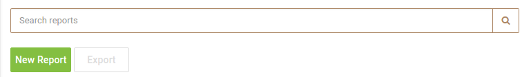
The following HTML structure produces the result you can see on the image below it, which is not what I want:
<section layout-align="end center" layout-padding flex>
    <div layout="row" layout-align="start center" flex>
        <div class="input-group">
            <input type="text" class="form-control" ng-model="monitor.query" placeholder="Search reports" aria-describedby="addon">
            <span class="input-group-addon" id="addon"><i class="fa fa-search"></i></span>
        </div>
    </div>
    <section layout-padding>
        <md-button class="md-primary" data-dismiss="modal" type="submit" id="submit" value="Submit" ng-click="monitor.newReport();">New Report</md-button>
        <md-button class="md-hollow disabled" data-dismiss="modal" type="button">Export</md-button>
    </section>
</section>
However, if I try to include all elements within the same layout="row", the input-group ends up taking all the space and pushing the buttons out of the parent div:
<section class="no-print" layout-align="end center" layout-padding flex>
    <div layout="row" layout-align="start center" flex>
        <div class="input-group">
            <input type="text" class="form-control" ng-model="monitor.query" placeholder="Search reports" aria-describedby="addon">
            <span class="input-group-addon" id="addon"><i class="fa fa-search"></i></span>
        </div>
        <md-button class="md-primary" data-dismiss="modal" type="submit" id="submit" value="Submit" ng-click="monitor.newReport();">New Report</md-button>
        <md-button class="md-hollow disabled" data-dismiss="modal" type="button">Export</md-button>
    </div>
</section>

Is there a right way of having an input group and a couple of buttons all on the same line using angular-material or do I have to create my own styles?
 418
418
Would like to provide a contemporary answer to this popular question.
1. Use [matSuffix] on the button
Angular Material got you back on that one and provide matSuffix directive to place an element at the end of the form field.
Hence, your solution would look like:
  <mat-form-field>
    <mat-placeholder>Search reports</mat-placeholder>
      <input matInput type="search">
      <button mat-button matSuffix mat-stroked-button aria-label="search">
        <mat-icon>search</mat-icon>
    </button>
  </mat-form-field>
See the full code of the example at https://stackblitz.com/edit/angular-mvndsv.
2. Make mat-form-field to fill the width
To fulfil the width of the parent element, alter the style of mat-form-field:
mat-form-field.mat-form-field {
  width: 100%;
}
3. Use CSS 'flex' properties, not @angular/flex-layout directives
For big project, I'd recommend to use flex CSS properties and avoid using flex directives from @angular/flex-layout package.
While at the first glance, it may look handy to put a flex directive, rather than writing CSS styles, it will backfire on a bigger projects once the project start growing and you build your CSS classes and mixins and start extending them in the components:
141
If you love us? You can donate to us via Paypal or buy me a coffee so we can maintain and grow! Thank you!
Donate Us With