 Menu
Menu
I use the Angular Material 2 and I want in a card-header icon buttons. How can I set the buttons to the right side?
My plan:
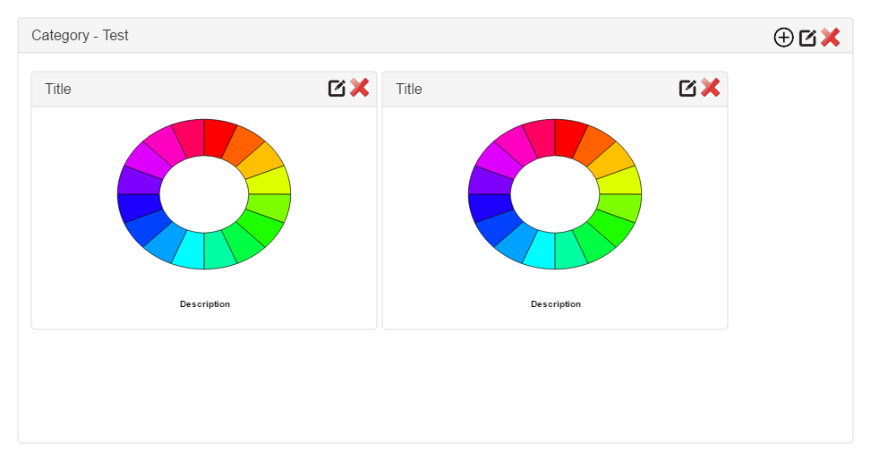
Current Website:
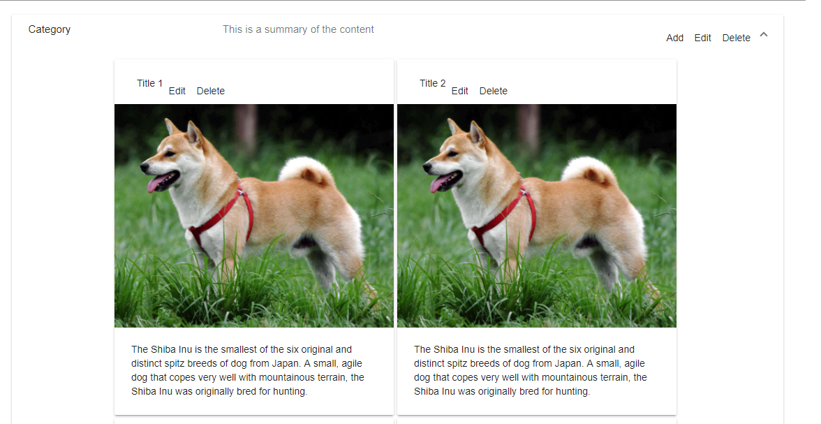
I want to set the buttons rop right in the header. How can i do it? I exlude the category code because there is no problem. In the typescript code is only a for loop to add more cards and a dummy method for click on a card.
.healthy-search {
    width: 100%
}

.healthy-card {
    margin-right: 5px;
    margin-bottom: 5px;
}
<div class="flex-container" fxLayout="row" fxLayout.xs="column" fxLayoutAlign="center center" fxLayoutAlign.xs="start">
<div class="flex-item" fxFlex="90%" fxFlex.xs="90%">
<mat-form-field class="healthy-search">
<textarea matInput placeholder="Suche"></textarea>
</mat-form-field>
</div>
</div>
<div class="flex-container" fxLayout="row" fxLayout.xs="column" fxLayoutAlign="center center" fxLayoutAlign.xs="start">
<div class="flex-item" fxFlex="85%" fxFlex.xs="85%">
<mat-expansion-panel>
<!-- Here is the Category -->
<!--Elements of Category -->
<div class="flex-container" fxLayoutWrap fxLayout="row" fxLayout.xs="column" fxLayoutAlign="center center" fxLayoutAlign.xs="start">
<div class="flex-item healthy-card" fxFlex="400px" *ngFor="let number of numbers" (click)="cardClick()">
<mat-card class="example-card">
<mat-card-header>
<mat-card-title>Title {{number}}</mat-card-title>
<button mat-icon-button fxLayoutAlign="right">
<mat-icon aria-label="Example icon-button with a heart icon">Edit</mat-icon>
</button>
<button mat-icon-button fxLayoutAlign="right">
<mat-icon aria-label="Example icon-button with a heart icon">Delete</mat-icon>
</button>
</mat-card-header>
<img mat-card-image src="https://material.angular.io/assets/img/examples/shiba2.jpg" alt="Photo of a Shiba Inu">
<mat-card-content>
<p>
The Shiba Inu is the smallest of the six original and distinct spitz breeds of dog from Japan. A small, agile dog that copes
very well with mountainous terrain, the Shiba Inu was originally bred for hunting.
</p>
</mat-card-content>
</mat-card>
</div>
</div>
</mat-expansion-panel>
</div>
</div>Lyror
 208
208
This post is quite old but maybe someone else stumble upon this as well. (As of writing this answer the current version is Angular Material 6)
I recommend using the <mat-card-title-group> attribute. From the docs (https://material.angular.io/components/card/overview):
<mat-card-title-group> can be used to combine a title, subtitle, and image into a single section.
This way the title and description will be bundled into one single div and the fxFlex container actually works. This also allows to add buttons / icons to the left.
An example could look like this:
<mat-card-header>
    <mat-icon>help</mat-icon>
    <mat-card-title-group>
        <mat-card-title>
            Title
        </mat-card-title>
        <mat-card-subtitle>
            Subtitle
        </mat-card-subtitle>
    </mat-card-title-group>
    <div fxFlex></div>
    <button mat-button>Click me!</button>
</mat-card-header>
If you love us? You can donate to us via Paypal or buy me a coffee so we can maintain and grow! Thank you!
Donate Us With
