 Menu
Menu
I'm trying to create a CSS animation where it looks like a div rotates around an image (or another div) on the X axis.
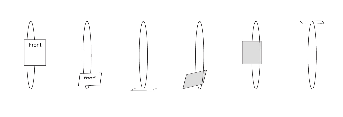
I was able to create a rough idea of it at: http://codepen.io/Kupe517/pen/zBKGev but the animated div does not have the rotation effect I am looking for. I figure I need to add in some kind of rotateX() to the transform and add perspective but I just can't figure out the right combo. I've attached a rough image of the kind of animation I am trying to achieve.
Here is my current animation code:
@keyframes moveBack {
 0%{transform:translateY(0); z-index:10;}
 25%{transform:translateY(435px); z-index:10;}
 26%{z-index:0;}
 50%{transform:translateY(0) scale(.8); z-index:0;}
 75%{transform:translateY(-435px); z-index:0;}
 76%{z-index:10;}
 100%{transform:translateY(0); z-index:10;}
}
 705
705
Here is a simple 3d transition that looks like what you are trying to achieve. The issue is that you are using translate but your aim is to rotate on the X axis. To launch the transition, hover the div:
div{
  position:relative;
  width:300px; height:200px;
  margin:10% auto;
  perspective:500px;
  transform-style:preserve-3d;
  border:1px solid #000;
}
img{width:100%;}
p{
  position:absolute;
  left:250px; top:75px;
  width:80px; height:40px;
  margin:0; padding:5px 10px;
  background:gold;
  transform: rotateX(0deg) translatez(110px);
  transition:transform 2s;
}
div:hover p{
  transform: rotateX(360deg) translatez(110px);
}
<div>
<img src="http://i.imgur.com/k8BtMvj.jpg"/>
<p>Hover the div</p>
</div>If you want the rotating div to always face the user, you can add another rotation after the translatez property like this:
div{
  position:relative;
  width:300px; height:200px;
  margin:10% auto;
  perspective:500px;
  transform-style:preserve-3d;
  border:1px solid #000;
}
img{width:100%;}
p{
  position:absolute;
  left:250px; top:75px;
  width:80px; height:40px;
  margin:0; padding:5px 10px;
  background:gold;
  transform: rotateX(0deg) translatez(130px) rotateX(0deg);
  transition:transform 5s;
}
div:hover p{
  transform: rotateX(360deg) translatez(130px) rotateX(-360deg);
}
<div>
<img src="http://i.imgur.com/k8BtMvj.jpg"/>
<p>Hover the div</p>
</div>These work because when you chain transform properties on the same declaration, the last one is made according to the presvious ones. The coordinate system moves with the previous transforms.
127
I feel bad for this answer; I'll get the animation accurate. One moment-
A bit sloppy, but here's a working example of the concept you're shooting for. Play with the numbers to get how you want it. Hard to tell from the diagrams for what type of flow you're looking for:
http://codepen.io/anon/pen/JKRxmY?editors=1100
(You had a pesky origin property that I didn't see. Threw in some TranslateZ rules to clean 'er up a bit. )
I also forked this working example after changing the orientation: http://codepen.io/anon/pen/WxGPpM?editors=0110 (and original) http://codepen.io/pukidepa/pen/nkJmv?editors=0110
The key here is with transform:rotateY(Xdeg);
Try out some of the code. Here's your animation CSS as it stands:
@keyframes moveBack {
  0% {
    transform: translateY(0) translateZ(100px) rotateX(0deg);
    z-index: 10;
  }
  25% {
    transform: translateY(125%) translateZ(-50px) rotateX(-70deg);
    z-index: 10;
  }
  50% {
    transform: translateY(0%) translateZ(-100px) rotateX(-180deg);
    z-index: 10;
  }
  75% {
    transform: translateY(-125%) translateZ(-50px) rotateX(-270deg);
    z-index: 10;
  }
  100% {
    transform: translateZ(25px) translateZ(100px) rotateX(-360deg);
    z-index: 10;
  }
}
Tip: when working with these types of rotations, it's best to remove the non-essentials like z-index at first and just get the movement down. You can always worry about that stuff later.
For a more circular rotation, you may want to stagger the effects of the rotation with the translation. In other words, try having one of the effects happen slightly before the other at different points of the animation.
31
If you love us? You can donate to us via Paypal or buy me a coffee so we can maintain and grow! Thank you!
Donate Us With


