 Menu
Menu
I'm trying to learn WPF at the moment, and looking into making the default .Net control look different through the use of style. Using C# as my preferred language although all the code below is WPF markup.
I setup gmail today with the new theme, (see image below) and thus set my self the challenge, could be done in WPF.
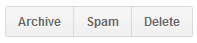
What I have managed to achieve is to create the middle button Spam through the use of a style with a control template and triggers.
The right and left buttons are very similar but with only 2 differences. They have a corner radius of 1 and margin of 15 on the left or right sides, whilst the middle button has them both set to 0.
Questions!
Q1. Rather than copying the entire style and changing just those 2 attributes, can it be done via some type of inheritance. Where by the right and left buttons are based on an existing style but it makes those 2 visual changes. I have already tried the BasedOn property when creating a new style but was unable to edit the attributes needed.
Q2. Are styles the right way to address this problem in WPF. In WinForms you would look to create a custom control, which has a visible property linked to an enum, i.e. you click on the button and the style options maybe Left, Middle, Right.
Q3. The most difficult question til last. Is it possible to make it, so if a button has my style applied to it. Then when you set its background colour to say blue. Then the button maintains the gradients but instead of them been off-white they are now a shade of blue. i.e. the background linear gradient brush is based on, rather than overwrites the background colour that has been applied to the button. Or do these need to have separate styles defined. I personally cannot see without some type of code behind that this could be achieved, that is making gradient brushes from a single brush in WPF markup.
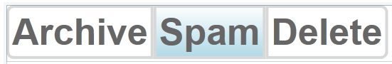
i.e. buttons as below a blue button and a grey/normal button

MyStyle
<Style x:Key="GoogleMiddleButton" TargetType="{x:Type Button}">
        <Setter Property="Background">
            <Setter.Value>
                <LinearGradientBrush StartPoint="0,1" EndPoint="0,0">
                    <GradientStop Color="#F1F1F1" Offset="0"/>
                    <GradientStop Color="#F5F5F5" Offset="1"/>
                </LinearGradientBrush>
            </Setter.Value>
        </Setter>
        <Setter Property="Foreground" Value="#666666"/>
        <Setter Property="FontFamily" Value="Arial"/>
        <Setter Property="FontSize" Value="13"/>
        <Setter Property="FontWeight" Value="Bold"/>
        <Setter Property="Template">
            <Setter.Value>
                <ControlTemplate TargetType="Button">
                    <Border Name="dropShadowBorder"
                        BorderThickness="0,0,0,1"
                        CornerRadius="1"
                        >
                        <Border.BorderBrush>
                            <SolidColorBrush Color="#00000000"/>
                        </Border.BorderBrush>
                    <Border Name="border"
                    BorderThickness="{TemplateBinding BorderThickness}"
                    Padding="{TemplateBinding Padding}"
                    CornerRadius="0"
                    Background="{TemplateBinding Background}">
                        <Border.BorderBrush>
                            <SolidColorBrush Color="#D8D8D8"/>
                        </Border.BorderBrush>
                        <ContentPresenter HorizontalAlignment="{TemplateBinding HorizontalContentAlignment}"
                                  VerticalAlignment="{TemplateBinding VerticalContentAlignment}"/>
                        </Border>
                    </Border>
                    <ControlTemplate.Triggers>
                        <Trigger Property="IsMouseOver" Value="True">
                            <Setter Property="BorderBrush" TargetName="border">
                                <Setter.Value>
                                    <SolidColorBrush Color="#939393"/>
                                </Setter.Value>
                            </Setter>
                            <Setter Property="BorderBrush" TargetName="dropShadowBorder">
                                <Setter.Value>
                                    <SolidColorBrush Color="#EBEBEB"/>
                                </Setter.Value>
                            </Setter>
                        </Trigger>
                    </ControlTemplate.Triggers>
                </ControlTemplate>
            </Setter.Value>
        </Setter>
        <Style.Triggers>
            <Trigger Property="IsMouseOver" Value="True">
                <Setter Property="Foreground" Value="#333333"/>
            </Trigger>
            <Trigger Property="IsPressed" Value="True">
                <Setter Property="Background">
                    <Setter.Value>
                        <LinearGradientBrush StartPoint="0,1" EndPoint="0,0">
                            <GradientStop Color="#F1F1F1" Offset="1"/>
                            <GradientStop Color="#F5F5F5" Offset="0"/>
                        </LinearGradientBrush>
                    </Setter.Value>
                </Setter>
            </Trigger>
        </Style.Triggers>
    </Style>
p.s. If you spot any beginner mistakes in the WPF above, feel free to point them out to me.
 601
601
I've done this in the past by defining an attached property called ExtendedProperties.CornerRadius. I can then set it in my style:
<Style TargetType="Button">
    <Setter Property="local:ExtendedProperties.CornerRadius" Value="0"/>
    ...
And use it from within the template:
<Border CornerRadius="{Binding Path=(local:ExtendedProperties.CornerRadius), RelativeSource={RelativeSource TemplatedParent}">
I might then override it locally in the same way I override any other property:
<Button Content="Archive" local:ExtendedProperties.CornerRadius="5,0,0,5"/>
<Button Content="Span"/>
<Button Content="Delete" local:ExtendedProperties.CornerRadius="0,5,5,0"/>
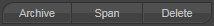
In my case, this gives me (obviously, my theme is dark):
And just by tweaking a couple of my theme's attached properties, I created this effect:
The advantage of this approach is that there's no need to subclass Button. You can also use that same attached property to define corner radii for other controls (such as TextBox). And you're not limited to just corner radius, of course. You could define attached properties for all sorts of things specific to your theme that aren't present on base controls.
The disadvantage is that it's an attached property and thus harder to discover. Documenting your theme will help in this respect.
So, to answer your specific questions:
Q1. Yes, see my answer above. You can either override locally or define new styles that override the property.
Q2. It's a gray area. In my opinion, if it's purely visual (not behavioural) then styles are the way to go. Of course, if it gets out of hand you may instead wish to subclass all the built-in controls and add your specific properties. But that makes your theme harder to re-use and your application more onerous to develop (because you need to use your control set rather than the standard ones).
Q3. I'd say it's possible in code, but not intuitive to use as a control consumer. I think you'd be better off defining extra attached properties - eg. ExtendedProperties.HoverBackground, ExtendedProperties.PressedBackground - and using those from your template in exactly the same way. Then consumers of your control then have more control over the brushes used when your control is in its various states. I've done this in the past but have used more generic property names (SecondaryBackground, TernaryBackground) so I can reuse those properties in other contexts. Again, documenting your theme is helpful.
124
Q1: Not as far as I know
Q2: I would say styles is the way to go and you can certainly make your own class that derives from button and picks the right corner radius based on if it's Left,Middle,Right.
Q3: Should be doable with a custom value converter and your own style.
In conlusion. In this case I might have been tempted to put the background gradient and corner radius on the surrounding stackpanel. The buttons would be transparent with the text. Then you wouldn't have to deal with corner radius on individual buttons.
Edit: Added code & style for Q3 answer above. To OP; I am not sure this is exactly what you were after but perhaps there's something here that can interest you.
The way I interpreted you was that you wanted to set the button background to a certain color but it should be rendered as a linear gradient based on that color. Other posters mentioned opacity masks and that's not a bad idea at all. I thought I show how to do it using custom value converters.
The idea is that I create a custom value converted that converts a solid color brush to a linear gradient brush. Then I use this converter to convert the button background color from solid color brush to a linear gradient brush.
Here is the custom value converter:
class SolidColorBrushToGradientConverter : IValueConverter
{
    const float DefaultLowColorScale = 0.95F;

    public object Convert (object value, Type targetType, object parameter, CultureInfo culture)
    {
        var solidColorBrush = value as SolidColorBrush;

        if (!targetType.IsAssignableFrom (typeof (LinearGradientBrush)) || solidColorBrush == null)
        {
            return Binding.DoNothing;
        }

        var lowColorScale = ParseParameterAsDouble (parameter);

        var highColor = solidColorBrush.Color;
        var lowColor = Color.Multiply (highColor, lowColorScale);
        lowColor.A = highColor.A;

        return new LinearGradientBrush (
            highColor,
            lowColor,
            new Point (0, 0),
            new Point (0, 1)
            );
    }

    static float ParseParameterAsDouble (object parameter)
    {
        if (parameter is float)
        {
            return (float)parameter;
        }
        else if (parameter is string)
        {
            float result;
            return float.TryParse(
                (string) parameter,
                NumberStyles.Float,
                CultureInfo.InvariantCulture,
                out result
                        )
                        ? result
                        : DefaultLowColorScale
                ;
        }
        else
        {
            return DefaultLowColorScale;
        }
    }

    public object ConvertBack (object value, Type targetType, object parameter, CultureInfo culture)
    {
        return Binding.DoNothing;
    }
}
Then I reference this in the style I copied from you (basically the same but I restructured it a bit), the important row part is this:
Background="{Binding Path=Background,Mode=OneWay,RelativeSource={RelativeSource Mode=TemplatedParent}, Converter={StaticResource SolidColorBrushToGradientConverter}, ConverterParameter=0.95}"
This means that we bind to the templated parent background (ie Button.Background), we use the converter SolidColorBrushToGradientConverter with the parameter 0.95 (this determines how much darker the "low" color should be compared to the "high" color).
The complete style:
<local:SolidColorBrushToGradientConverter x:Key="SolidColorBrushToGradientConverter" />

<Style x:Key="GoogleMiddleButton" TargetType="{x:Type Button}">
    <Setter Property="Background" Value="#F5F5F5" />
    <Setter Property="Foreground" Value="#666666"/>
    <Setter Property="FontFamily" Value="Arial"/>
    <Setter Property="FontSize" Value="13"/>
    <Setter Property="FontWeight" Value="Bold"/>
    <Setter Property="Template">
        <Setter.Value>
            <ControlTemplate TargetType="Button">
                <Border
                    Name="dropShadowBorder"
                    BorderThickness="0,0,0,1"
                    CornerRadius="1"
                    >
                    <Border.BorderBrush>
                        <SolidColorBrush Color="#00000000"/>
                    </Border.BorderBrush>
                    <Border Name="border"
                            BorderThickness="{TemplateBinding BorderThickness}"
                            Padding="{TemplateBinding Padding}"
                            CornerRadius="0"
                            Background="{Binding Path=Background,Mode=OneWay,RelativeSource={RelativeSource Mode=TemplatedParent}, Converter={StaticResource SolidColorBrushToGradientConverter}, ConverterParameter=0.95}"
                            >
                        <Border.BorderBrush>
                            <SolidColorBrush Color="#D8D8D8"/>
                        </Border.BorderBrush>
                        <ContentPresenter
                            HorizontalAlignment="{TemplateBinding HorizontalContentAlignment}"
                            VerticalAlignment="{TemplateBinding VerticalContentAlignment}"
                            />
                    </Border>
                </Border>
                <ControlTemplate.Triggers>
                    <Trigger Property="IsMouseOver" Value="True">
                        <Setter Property="BorderBrush" TargetName="border">
                            <Setter.Value>
                                <SolidColorBrush Color="#939393"/>
                            </Setter.Value>
                        </Setter>
                        <Setter Property="BorderBrush" TargetName="dropShadowBorder">
                            <Setter.Value>
                                <SolidColorBrush Color="#EBEBEB"/>
                            </Setter.Value>
                        </Setter>
                    </Trigger>
                    <Trigger Property="IsPressed" Value="True">
                        <Setter Property="Background" Value="#4A8FF7" />
                        <Setter Property="Foreground" Value="#F5F5F5" />
                        <Setter Property="BorderBrush" TargetName="border">
                            <Setter.Value>
                                <SolidColorBrush Color="#5185D8"/>
                            </Setter.Value>
                        </Setter>
                    </Trigger>
                </ControlTemplate.Triggers>
            </ControlTemplate>
        </Setter.Value>
    </Setter>
</Style>
I like the look of this challenge!
Q1: The other comments / answers are correct, templates cannot be modified or inherited. However, there are ways of passing values into your template in order to modify their appearance. A simple (yet slightly hacky way) would be to pass the border CornerRadius into the template using the Tag enter code hereproperty. A better way might be to subclass button to add a 'location' property.
Q2: Yes, you are on the right track with styles / templates
Q3: Modify your template to include an OpacityMask that has the gradient you desire. You can then either place an element behind this mask or have the masked element take the background colour itself. Complete example shown below:
<Window x:Class="WpfApplication1.MainWindow"
        xmlns="http://schemas.microsoft.com/winfx/2006/xaml/presentation"
        xmlns:x="http://schemas.microsoft.com/winfx/2006/xaml"
        Title="MainWindow" Height="350" Width="525">
  <Window.Resources>
    <Style x:Key="GoogleButton" TargetType="{x:Type Button}">
      <Setter Property="Background" Value="White"/>
      <Setter Property="Foreground" Value="#666666"/>
      <Setter Property="Tag">
        <Setter.Value>
          <CornerRadius>0</CornerRadius>
        </Setter.Value>
      </Setter>
      <Setter Property="FontFamily" Value="Arial"/>
      <Setter Property="FontSize" Value="13"/>
      <Setter Property="FontWeight" Value="Bold"/>
      <Setter Property="Template">
        <Setter.Value>
          <ControlTemplate TargetType="Button">
            <Border Name="dropShadowBorder"
                    BorderThickness="0,0,0,1"
                    CornerRadius="1"
                    BorderBrush="Transparent"
                    Background="White">
              <Grid>
                <Border Name="backgroundFill"
                        BorderBrush="Red"
                        Background="{TemplateBinding Background}"
                        CornerRadius="{TemplateBinding Tag}">
                  <Border.OpacityMask>
                    <LinearGradientBrush StartPoint="0,1" EndPoint="0,0">
                      <GradientStop Color="#FF000000" Offset="0"/>
                      <GradientStop Color="#00000000" Offset="1"/>
                    </LinearGradientBrush>
                  </Border.OpacityMask>
                </Border>
                <Border Name="border"
                    BorderThickness="{TemplateBinding BorderThickness}"
                    Padding="{TemplateBinding Padding}"
                    CornerRadius="{TemplateBinding Tag}"
                    Background="Transparent">
                  <Border.BorderBrush>
                    <SolidColorBrush Color="#D8D8D8"/>
                  </Border.BorderBrush>
                  <ContentPresenter HorizontalAlignment="{TemplateBinding HorizontalContentAlignment}"
                                  VerticalAlignment="{TemplateBinding VerticalContentAlignment}"/>
                </Border>
              </Grid>
            </Border>
            <ControlTemplate.Triggers>
              <Trigger Property="IsMouseOver" Value="True">
                <Setter Property="BorderBrush" TargetName="border">
                  <Setter.Value>
                    <SolidColorBrush Color="#939393"/>
                  </Setter.Value>
                </Setter>
                <Setter Property="BorderBrush" TargetName="dropShadowBorder">
                  <Setter.Value>
                    <SolidColorBrush Color="#EBEBEB"/>
                  </Setter.Value>
                </Setter>
              </Trigger>
            </ControlTemplate.Triggers>
          </ControlTemplate>
        </Setter.Value>
      </Setter>
      <Style.Triggers>
        <Trigger Property="IsMouseOver" Value="True">
          <Setter Property="Foreground" Value="#333333"/>
        </Trigger>
        <Trigger Property="IsPressed" Value="True">
          <Setter Property="Background">
            <Setter.Value>
              <LinearGradientBrush StartPoint="0,1" EndPoint="0,0">
                <GradientStop Color="#F1F1F1" Offset="1"/>
                <GradientStop Color="#F5F5F5" Offset="0"/>
              </LinearGradientBrush>
            </Setter.Value>
          </Setter>
        </Trigger>
      </Style.Triggers>
    </Style>
  </Window.Resources>
  <Grid>
    <StackPanel Orientation="Horizontal"
                VerticalAlignment="Top">
      <Button Style="{StaticResource GoogleButton}" Content="Archive">
        <Button.Tag>
          <CornerRadius>2,0,0,2</CornerRadius>
        </Button.Tag>
      </Button>
      <Button Style="{StaticResource GoogleButton}" Content="Spam"
              Background="LightBlue"/>
      <Button Style="{StaticResource GoogleButton}" Content="Delete">
        <Button.Tag>
          <CornerRadius>0,2,2,0</CornerRadius>
        </Button.Tag>
      </Button>
    </StackPanel>
  </Grid>
</Window>
If you love us? You can donate to us via Paypal or buy me a coffee so we can maintain and grow! Thank you!
Donate Us With


