 Menu
Menu
Is it possible to create scrollbars like in this picture?
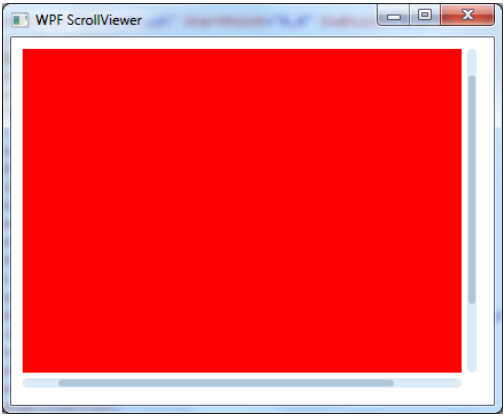
This picture was taken from this link: http://codesdirectory.blogspot.be/2013/01/wpf-scrollviewer-control-style.html.
I tried the example in the post but the result looked like this: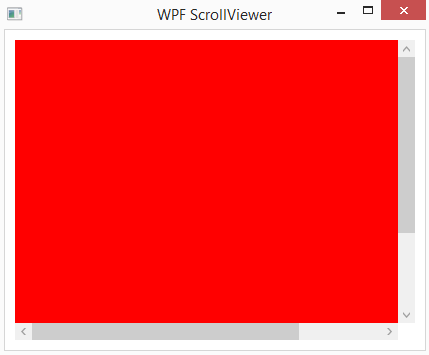
The post is 3 years old so this may be normal.
Is it possible to create scrollbars like the first picture? I have been looking for hours to find a template and this is the closest I could get. I am converting a windows form app to a WPF and the main reason for that was the scrollbars! This is the xaml from the above pictures:
<Window x:Class="iBlock.MainWindow"

        xmlns="http://schemas.microsoft.com/winfx/2006/xaml/presentation"

        xmlns:x="http://schemas.microsoft.com/winfx/2006/xaml"

        Title="WPF ScrollViewer" SizeToContent="WidthAndHeight">

    <Window.Resources>
        <ResourceDictionary>
            <ResourceDictionary.MergedDictionaries>
                <ResourceDictionary Source="ScrollBar.xaml"></ResourceDictionary>
            </ResourceDictionary.MergedDictionaries>
        </ResourceDictionary>
    </Window.Resources>

    <Grid>

        <ScrollViewer Background="#F7F7F7"

                      BorderBrush="#C7C7C7"

                      Height="300"

                      HorizontalScrollBarVisibility="Auto"

                      Margin="10"

                      Style="{DynamicResource ResourceKey=styleScrollViewer}"

                      VerticalScrollBarVisibility="Auto"

                      Width="400">

            <StackPanel Background="Red" Height="400" Width="500"></StackPanel>

        </ScrollViewer>

    </Grid>

</Window>
 509
509
How to enable scrollbar in a WPF TextBox. The simplest way to add scrolling functionality to a TextBox control is by enabling its horizontal and vertical scrolling. The HorizontalScrollBarVisibility and VerticalScrollBarVisibility properties are used to set horizontal and vertical scroll bars of a TextBox.
Got it working with a little help from some research:
<Window.Resources>
    <SolidColorBrush x:Key="StandardBorderBrush" Color="#888" />
    <SolidColorBrush x:Key="StandardBackgroundBrush" Color="Black" />
    <SolidColorBrush x:Key="HoverBorderBrush" Color="#DDD" />
    <SolidColorBrush x:Key="SelectedBackgroundBrush" Color="Gray" />
    <SolidColorBrush x:Key="SelectedForegroundBrush" Color="White" />
    <SolidColorBrush x:Key="DisabledForegroundBrush" Color="#888" />
    <SolidColorBrush x:Key="GlyphBrush" Color="#444" />
    <SolidColorBrush x:Key="NormalBrush" Color="#888" />
    <SolidColorBrush x:Key="NormalBorderBrush" Color="#888" />
    <SolidColorBrush x:Key="HorizontalNormalBrush" Color="#FF686868" />
    <SolidColorBrush x:Key="HorizontalNormalBorderBrush" Color="#888" />

    <LinearGradientBrush x:Key="ListBoxBackgroundBrush" StartPoint="0,0" EndPoint="1,0.001">
        <GradientBrush.GradientStops>
            <GradientStopCollection>
                <GradientStop Color="White" Offset="0.0" />
                <GradientStop Color="White" Offset="0.6" />
                <GradientStop Color="#DDDDDD" Offset="1.2"/>
            </GradientStopCollection>
        </GradientBrush.GradientStops>
    </LinearGradientBrush>
    <LinearGradientBrush x:Key="StandardBrush" StartPoint="0,0" EndPoint="0,1">
        <GradientBrush.GradientStops>
            <GradientStopCollection>
                <GradientStop Color="#FFF" Offset="0.0"/>
                <GradientStop Color="#CCC" Offset="1.0"/>
            </GradientStopCollection>
        </GradientBrush.GradientStops>
    </LinearGradientBrush>
    <LinearGradientBrush x:Key="PressedBrush" StartPoint="0,0" EndPoint="0,1">
        <GradientBrush.GradientStops>
            <GradientStopCollection>
                <GradientStop Color="#BBB" Offset="0.0"/>
                <GradientStop Color="#EEE" Offset="0.1"/>
                <GradientStop Color="#EEE" Offset="0.9"/>
                <GradientStop Color="#FFF" Offset="1.0"/>
            </GradientStopCollection>
        </GradientBrush.GradientStops>
    </LinearGradientBrush>

    <Style x:Key="ScrollBarLineButton" TargetType="{x:Type RepeatButton}">
        <Setter Property="Visibility" Value="Hidden"/>
        <Setter Property="SnapsToDevicePixels" Value="True"/>
        <Setter Property="OverridesDefaultStyle" Value="true"/>
        <Setter Property="Focusable" Value="false"/>
        <Setter Property="Template">
            <Setter.Value>
                <ControlTemplate TargetType="{x:Type RepeatButton}">
                    <Border Name="Border" Margin="1" CornerRadius="2" Background="{StaticResource NormalBrush}" BorderBrush="{StaticResource NormalBorderBrush}" BorderThickness="1">
                        <Path HorizontalAlignment="Center" VerticalAlignment="Center" Fill="{StaticResource GlyphBrush}" Data="{Binding Path=Content, RelativeSource={RelativeSource TemplatedParent}}" />
                    </Border>
                    <ControlTemplate.Triggers>
                        <Trigger Property="IsPressed" Value="true">
                            <Setter TargetName="Border" Property="Background" Value="{StaticResource PressedBrush}" />
                        </Trigger>
                        <Trigger Property="IsEnabled" Value="false">
                            <Setter Property="Foreground" Value="{StaticResource DisabledForegroundBrush}"/>
                        </Trigger>
                    </ControlTemplate.Triggers>
                </ControlTemplate>
            </Setter.Value>
        </Setter>
    </Style>
    <Style x:Key="ScrollBarPageButton" TargetType="{x:Type RepeatButton}">
        <Setter Property="Visibility" Value="Hidden"/>
        <Setter Property="SnapsToDevicePixels" Value="True"/>
        <Setter Property="OverridesDefaultStyle" Value="true"/>
        <Setter Property="IsTabStop" Value="false"/>
        <Setter Property="Focusable" Value="false"/>
        <Setter Property="Template">
            <Setter.Value>
                <ControlTemplate TargetType="{x:Type RepeatButton}">
                    <Border Background="Black" />
                </ControlTemplate>
            </Setter.Value>
        </Setter>
    </Style>

    <Style x:Key="ScrollBarThumb" TargetType="{x:Type Thumb}">
        <Setter Property="SnapsToDevicePixels" Value="True"/>
        <Setter Property="OverridesDefaultStyle" Value="true"/>
        <Setter Property="IsTabStop" Value="false"/>
        <Setter Property="Focusable" Value="false"/>
        <Setter Property="Template">
            <Setter.Value>
                <ControlTemplate TargetType="{x:Type Thumb}">
                    <Border CornerRadius="4" Background="{TemplateBinding Background}" BorderBrush="{TemplateBinding BorderBrush}" BorderThickness="0"  Width="8" Margin="8,0,-2,0"/>
                </ControlTemplate>
            </Setter.Value>
        </Setter>
    </Style>

    <ControlTemplate x:Key="VerticalScrollBar" TargetType="{x:Type ScrollBar}">
        <Grid>
            <Grid.RowDefinitions>
                <RowDefinition MaxHeight="0"/>
                <RowDefinition Height="0.00001*"/>
                <RowDefinition MaxHeight="0"/>
            </Grid.RowDefinitions>
            <Border Grid.RowSpan="3" CornerRadius="2" Background="Transparent" />
    <RepeatButton Grid.Row="0" Style="{StaticResource ScrollBarLineButton}" Height="18" Command="ScrollBar.LineUpCommand" Content="M 0 4 L 8 4 L 4 0 Z" />
    <Track Name="PART_Track" Grid.Row="1" IsDirectionReversed="true">
        <Track.DecreaseRepeatButton>
            <RepeatButton Style="{StaticResource ScrollBarPageButton}" Command="ScrollBar.PageUpCommand" />
        </Track.DecreaseRepeatButton>
        <Track.Thumb>
            <Thumb Style="{StaticResource ScrollBarThumb}" Margin="1,0,1,0" Background="{StaticResource HorizontalNormalBrush}" BorderBrush="{StaticResource HorizontalNormalBorderBrush}" />
        </Track.Thumb>
        <Track.IncreaseRepeatButton>
            <RepeatButton Style="{StaticResource ScrollBarPageButton}" Command="ScrollBar.PageDownCommand" />
                </Track.IncreaseRepeatButton>
            </Track>
            <RepeatButton Grid.Row="3" Style="{StaticResource ScrollBarLineButton}" Height="18" Command="ScrollBar.LineDownCommand" Content="M 0 0 L 4 4 L 8 0 Z"/>
        </Grid>
    </ControlTemplate>
    <ControlTemplate x:Key="HorizontalScrollBar" TargetType="{x:Type ScrollBar}">
        <Grid>
            <Grid.ColumnDefinitions>
                <ColumnDefinition MaxWidth="18"/>
                <ColumnDefinition Width="0.00001*"/>
                <ColumnDefinition MaxWidth="18"/>
            </Grid.ColumnDefinitions>
            <Border Grid.ColumnSpan="3" CornerRadius="2" Background="#F0F0F0"/>
            <RepeatButton Grid.Column="0"  Style="{StaticResource ScrollBarLineButton}" Width="18" Command="ScrollBar.LineLeftCommand" Content="M 4 0 L 4 8 L 0 4 Z" />
            <Track Name="PART_Track" Grid.Column="1" IsDirectionReversed="False">
                <Track.DecreaseRepeatButton>
                    <RepeatButton Style="{StaticResource ScrollBarPageButton}" Command="ScrollBar.PageLeftCommand" />
                </Track.DecreaseRepeatButton>
                <Track.Thumb>
                    <Thumb Style="{StaticResource ScrollBarThumb}" Margin="0,1,0,1" Background="{StaticResource NormalBrush}" BorderBrush="{StaticResource NormalBorderBrush}" />
                </Track.Thumb>
                <Track.IncreaseRepeatButton>
                    <RepeatButton Style="{StaticResource ScrollBarPageButton}" Command="ScrollBar.PageRightCommand" />
                </Track.IncreaseRepeatButton>
            </Track>
            <RepeatButton Grid.Column="3" Style="{StaticResource ScrollBarLineButton}" Width="18" Command="ScrollBar.LineRightCommand" Content="M 0 0 L 4 4 L 0 8 Z"/>
        </Grid>
    </ControlTemplate>
    <Style x:Key="{x:Type ScrollBar}" TargetType="{x:Type ScrollBar}">
        <Setter Property="SnapsToDevicePixels" Value="True"/>
        <Setter Property="OverridesDefaultStyle" Value="true"/>
        <Style.Triggers>
            <Trigger Property="Orientation" Value="Horizontal">
                <Setter Property="Width" Value="Auto"/>
                <Setter Property="Height" Value="18" />
                <Setter Property="Template" Value="{StaticResource HorizontalScrollBar}" />
            </Trigger>
            <Trigger Property="Orientation" Value="Vertical">
                <Setter Property="Width" Value="18"/>
                <Setter Property="Height" Value="Auto" />
                <Setter Property="Template" Value="{StaticResource VerticalScrollBar}" />
            </Trigger>
        </Style.Triggers>
    </Style>

    <Style x:Key="FavsScrollViewer" TargetType="{x:Type ScrollViewer}">
        <Setter Property="OverridesDefaultStyle" Value="True"/>
        <Setter Property="Template">
            <Setter.Value>
                <ControlTemplate TargetType="{x:Type ScrollViewer}">
                    <Grid>
                        <Grid.ColumnDefinitions>
                            <ColumnDefinition Width="Auto"/>
                            <ColumnDefinition/>
                        </Grid.ColumnDefinitions>
                        <Grid.RowDefinitions>
                            <RowDefinition/>
                            <RowDefinition Height="Auto"/>
                        </Grid.RowDefinitions>
                        <ScrollContentPresenter Grid.Column="1"/>
                        <ScrollBar Name="PART_VerticalScrollBar" Value="{TemplateBinding VerticalOffset}" Maximum="{TemplateBinding ScrollableHeight}" ViewportSize="{TemplateBinding ViewportHeight}" Visibility="{TemplateBinding ComputedVerticalScrollBarVisibility}"/>
                        <ScrollBar Name="PART_HorizontalScrollBar" Orientation="Horizontal" Grid.Row="1" Grid.Column="1" Value="{TemplateBinding HorizontalOffset}" Maximum="{TemplateBinding ScrollableWidth}" ViewportSize="{TemplateBinding ViewportWidth}" Visibility="{TemplateBinding ComputedHorizontalScrollBarVisibility}"/>
                    </Grid>
                </ControlTemplate>
            </Setter.Value>
        </Setter>
    </Style>
</Window.Resources>
If you love us? You can donate to us via Paypal or buy me a coffee so we can maintain and grow! Thank you!
Donate Us With
