 Menu
Menu
I'm using appcompat v21.0.3 for my app. I did everything like it is written here: android-developers.blogspot.com/2014/10/appcompat-v21-material-design-for-pre.html
But on Lollipop (and on older devices of course), some widget are not tinted with my accent color. For example:
SwitchCompat is tinted: 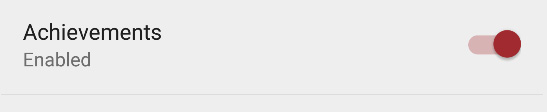
ListPreference is NOT tinted 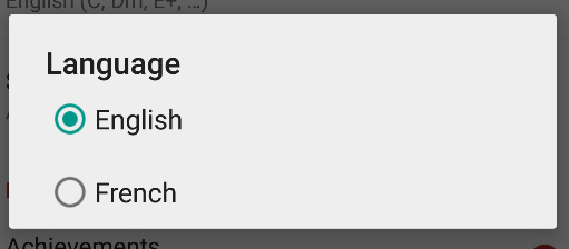
ProgressDialog is NOT tinted 
Here's my code:
build.gradle
...
compile 'com.android.support:appcompat-v7:21.0.+'
...
AndroidManifest.xml
<application
        android:allowBackup="true"
        android:icon="@drawable/ic_launcher"
        android:label="@string/app_name"
        android:theme="@style/CET"
        android:hardwareAccelerated="true"
        tools:replace="label">
themes.xml
<resources>

    <style name="CET" parent="Theme.AppCompat.Light.NoActionBar">
        <item name="windowActionBar">false</item>
        <item name="colorPrimary">@color/primary</item>
        <item name="colorPrimaryDark">@color/primary_dark</item>
        <item name="colorAccent">@color/accent</item>
    </style>

</resources>
colors.xml
<resources>

    <!-- App branding color -->
    <color name="primary">#a32b30</color>

    <!-- Darker variant for status bar and contextual app bars -->
    <color name="primary_dark">#000000</color>

    <!-- Theme UI constrols like checkboxes and text fields -->
    <color name="accent">#a32b30</color>

</resources>
Does someone have an idea?
UPDATE : as of june 2015, still doesn't work but I ended up using https://github.com/afollestad/material-dialogs. Works really nice for dialogs, including ListPreferences.
 811
811
Follow the below guide
Unless specified otherwise, all of the below tinting applies to both Lollipop and pre-Lollipop using AppCompat v21. To use the support version of these attributes, remove the android namespace. For instance, "android:colorControlNormal" becomes "colorControlNormal". These attributes will be propagated to their corresponding attributes within the android namespace for devices running Lollipop. Any exceptions to this will be noted by including the "android:" prefix.
All Clickable Views:
-----------
* ripple effect (Lollipop only) -- "colorControlHighlight"

Status Bar:
------------
* background (Lollipop only) - "colorPrimaryDark"

Navigation Bar:
----------------
* background (Lollipop only) - "android:navigationBarColor"

EditText:
----------
* underline (unfocused) -- "colorControlNormal"
* underline overlay (focus) -- "colorAccent"
* cursor -- "colorAccent"
* text color -- "android:textColorPrimary"

CheckBox:
----------
* box unchecked -- "colorControlNormal"
* box checked -- "colorAccent"

RadioButton:
-------------
* unselected -- "colorControlNormal"
* selected -- "colorAccent"
* ripple effect (Lollipop only) -- "colorControlHighlight"

SwitchCompat:
-------------
* thumb switch off -- "colorSwitchThumbNormal"
* thumb switch on -- "colorAccent"
* track overlay (when switched on) -- "colorAccent"

Spinner:
---------
* indicator (not pressed) -- "colorControlNormal"
* indicator (pressed) -- "colorAccent"
* selected entry text color (Lollipop only) -- "android:textColorPrimary"

ActionBar:
-----------
* background -- "colorPrimary"
* title color -- "android:textColorPrimary"
* overflow icon -- "android:textColorPrimary"
* up button -- "android:textColorPrimary"
* action icons -- "android:textColorPrimary" †
* overflow menu background -- "android:colorBackground"
* overflow text color -- "android:textColorPrimary"

Toolbar (Theme Overlay should be used):
----------------------------------------
* background -- must be set manually in XML. Can do (android:background="?attr/colorPrimary")
* overflow icon -- "android:textColorPrimary"
* navigation icon -- "android:textColorPrimary" †
* action icons -- "android:textColorPrimary" †
* overflow menu background -- "android:colorBackground"
* overflow text color -- "android:textColorPrimary"
P.S. tinting by default only works with whitelisted stock action icons (see TintManager source code). For instance, the back arrow icon "abc_ic_ab_back_mtrl_am_alpha" is tinted, but copying that exact file and renaming it will result in the icon not being tinted while taking a random image and renaming it to "abc_ic_ab_back_mtrl_am_alpha" will result in it being tinted. Tinting can be done in XML in Lollipop by creating a <bitmap> xml file in drawable and applying the "android:tint" attribute. This icon can be used in both Lollipop and pre-Lollipop, but it will only be tinted in Lollipop. Tinting of action icons can also be done programmatically using a ColorFilter.
Source
59
You should generally use your own progress bar instead of a dialog and then you could make a tinted version that works on both L and pre-L like so:
public class TintedProgressBar extends ProgressBar {
    public TintedProgressBar(Context context) {
        super(context);
        init();
    }

    public TintedProgressBar(Context context, AttributeSet attrs) {
        super(context, attrs);
        init();
    }

    public TintedProgressBar(Context context, AttributeSet attrs, int defStyleAttr) {
        super(context, attrs, defStyleAttr);
        init();
    }

    public void init() {
        getIndeterminateDrawable().setColorFilter(getResources().getColor(R.color.primary), PorterDuff.Mode.SRC_IN);
        getProgressDrawable().setColorFilter(getResources().getColor(R.color.primary), PorterDuff.Mode.SRC_IN);
    }
}
If you really wanted to change the color in the dialog you could find the nested progress bar probably at dialog.findViewById(android.R.id.progess)
33
To changing color of Progress Dialog drawable, I've used following workaround: I've created AppCompat alert dialog base style
    <style name="CustomAppCompatAlertDialogStyle"    parent="Theme.AppCompat.Light.Dialog.Alert">
            <item name="colorAccent">@color/defaultColor</item>
            <item name="android:indeterminateTint">?attr/colorAccent</item>
            <item name="android:indeterminateTintMode">src_in</item>
    </style>
And then apply these theme to Progress Dialog:
mProgressDialog = new ProgressDialog(this, R.style.CustomAppCompatAlertDialogStyle);
It only answers part of your question, but the progress bar style from the appcompat library doesn't pick up the accent color on lollipop yet, even outside of ProgressDialog.
You'll need to set it up yourself, for example with this style:
<style name="TintedProgressBar" parent="Widget.AppCompat.ProgressBar">
    <item name="android:indeterminate">true</item>
    <item name="android:indeterminateTint">?attr/colorAccent</item>
    <item name="android:indeterminateTintMode">src_in</item>
</style>
that you can then apply to a ProgressBar or a ContentLoadingProgressBar. (note that a parent element the progress bar is inflated in will obviously have to apply the theme defining the colorAccent attribute ; otherwise use a direct color resource)
If you want to integrate the progress bar in a dialog, since I don't think you can refer to this answer to apply the above progress-bar-related attributes to a dialog.ProgressDialog supports customization of its progress bar beyond the type and drawable, you may have to set up an AlertDialog with a progress bar applying the above theme, or simply go with a custom dialog I guess
3
If you love us? You can donate to us via Paypal or buy me a coffee so we can maintain and grow! Thank you!
Donate Us With