 Menu
Menu
Well, I'm trying to create an SVG section separator. It worked like this:
<section id="section1">
</section>
<svg width="100%" height="100" viewBox="0 0 100 102" preserveAspectRatio="none">
  <path d="M0 0 L50 100 L100 0 Z" />
</svg>
<section id="section2">
</section>
So far, so good. But now, I want to add a background to section1, including the SVG "pick", in example:

All I've accomplished is (really bad results):
Adding a
background: url(img)
to the element
And:
Justing adding a BG to section1

 429
429
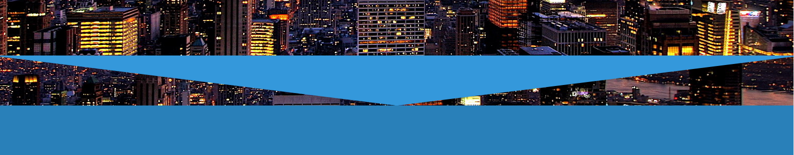
Here is an approach using the same code as your example but the svg path is changed to an inverted triangle and absolutely positioned to the bottom of the section:
#section1{
  position:relative;
  background:url('http://i.imgur.com/k8BtMvj.jpg');
  background-size:cover;
  height:200px;
}
svg{
  position:absolute;
  bottom:-10px; left:0;
  width:100%; height:100px;
  display:block;
}
<section id="section1">
<svg width="100%" height="100" viewBox="0 0 100 102" preserveAspectRatio="none">
<path d="M0 0 L50 90 L100 0 V100 H0" fill="#2A80B9" />
</svg>
</section>Variant with a gradient:
.element {
  display: block;
  position: relative;
  width: 100%;
  height: 200px;
  background: linear-gradient(-164deg, transparent 75%, #2A80B9 75%, #2A80B9 100%), linear-gradient(164deg, transparent 75%, #2A80B9 75%, #2A80B9 100%), url(http://i.imgur.com/k8BtMvj.jpg);
  background-size: auto, auto, cover;
  overflow: hidden;
}
<div class="element"></div>First of all, I'm well aware this doesn't answer the question directly, however the questioner stated in the comments that they're interested in a non-SVG solution as well, and for reasons explained later in the post, it's a much better way to tackle this problem.
section {
  background: url('http://i.imgur.com/k8BtMvj.jpg');
  background-size: cover;
  height: 200px;
  position: relative;
  width: 600px;
}
section:after {
  border-color: transparent #2a80b9;
  border-style: solid;
  border-width: 90px 300px 0; /* the first value is the height of the triangles, the second is half the width of the parent container */
  content: '';
  height: 10px; /* this is the height of the solid color underneath the triangles */
  position: absolute;
  bottom: 0;
}<section></section>This solution works by absolutely placing an element at the end of every section, overlaying that and rendering the required shapes by use of borders - by giving the top border a transparent color.
This has the following qualities compared to an SVG solution:
2
If you love us? You can donate to us via Paypal or buy me a coffee so we can maintain and grow! Thank you!
Donate Us With