 Menu
Menu
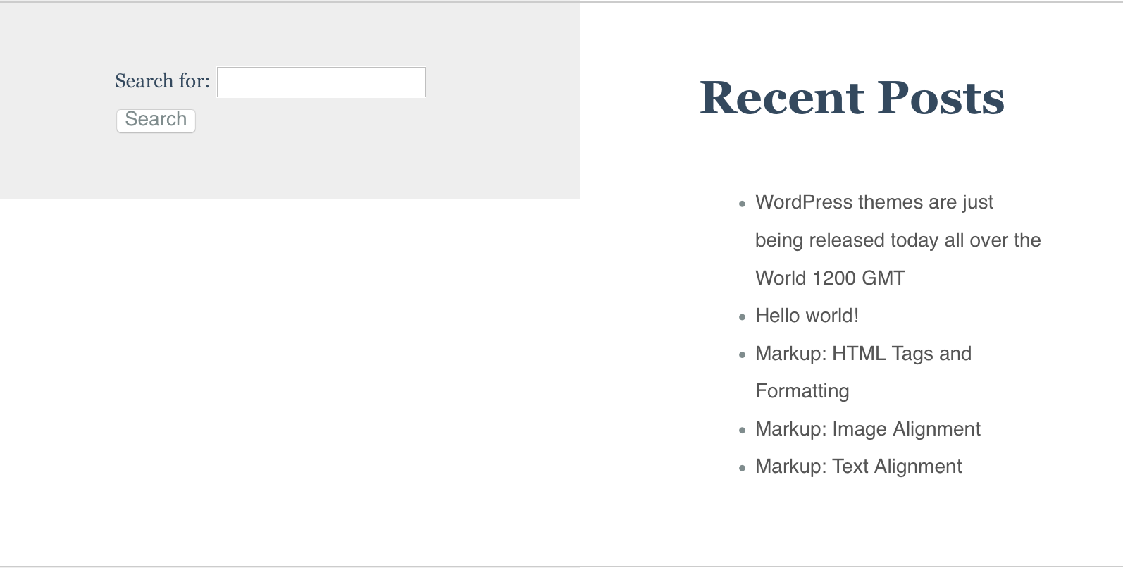
I am trying to integrate purecss (purecss.io) into wordpress and i have problems setting grid boxes 100% height. I apply a gray background (odd/even nth-child css property) and it clearly shows the problem with variable content inside the boxes.
How do i set the boxes 100% height, so that i can apply background uniformly?
In the screenshot, i want the grid box showing search form to be 100% height so that entire background is gray.
<widgets class="pure-g">
<div id="search-2" class="pure-u-1 pure-u-md-1-2 l-box widget widget_search"><form role="search" method="get" id="searchform" class="searchform" action="http://localhost/wp/">
                <div>
                    <label class="screen-reader-text" for="s">Search for:</label>
                    <input type="text" value="" name="s" id="s" />
                    <input type="submit" id="searchsubmit" value="Search" />
                </div>
            </form></div>       <div id="recent-posts-2" class="pure-u-1 pure-u-md-1-2 l-box widget widget_recent_entries">     <h2>Recent Posts</h2>       <ul>
                    <li>
                <a href="http://localhost/wp/index.php/2015/08/25/wordpress-themes-are-just-being-released-today/">WordPress themes are just being released today all over the World 1200 GMT</a>
                        </li>
                    <li>
                <a href="http://localhost/wp/index.php/2015/08/24/hello-world/">Hello world!</a>
                        </li>
                    <li>
                <a href="http://localhost/wp/index.php/2013/01/11/markup-html-tags-and-formatting/">Markup: HTML Tags and Formatting</a>
                        </li>
                    <li>
                <a href="http://localhost/wp/index.php/2013/01/10/markup-image-alignment/">Markup: Image Alignment</a>
                        </li>
                    <li>
                <a href="http://localhost/wp/index.php/2013/01/09/markup-text-alignment/">Markup: Text Alignment</a>
                        </li>
                </ul>
        </div>
</widgets>
I apply gray background color to odd widgets with this css code
/** Front page widgets ***/

.widget {   font-size: 1.7vw; }

.gray { background: #eee;  }


.widget img {
display:block;
margin: 20px;
}

.widget:nth-child(odd) { background: #eee }

.widget p { overflow:hidden; margin-left: 2em; display: block }


.widget h2 { margin:0; padding-bottom: 0.7em }
 979
979
This is an excellent use case for flexbox. Just set the display property of the parent of the grid elements to flex, like so:
.pure-g {
  display: flex;
}
And the heights of the grid elements will be normalized.
As others have suggested already, you might also be able to achieve similar results by setting the display properties of involved elements to their respective table counterparts, essentially turning your grid into a fake table.
Other than that there's no way to normalize column heights with CSS without taking (one of) the elements out the content flow, which may not be desired.
In CSS, height: 100% doesn't quite behave as one would expect. Any percentual height won't resolve to an actual height unless their direct parent has as explicit height declared, but since you have dynamic content height you cannot/should not set a static value.
You could work around this by using javascript to dynamically set the height of the parent to the height of the tallest child, thus making percentual heights work inside of it, but that's an entirely different question.
85
Here I've got a way to do this, first make those divs display: table-cell. This will make them go equal height. And for responsiveness of your website at lower mobile resolutions, you can use @media query to set the divs back to display: block
See the live example what I mean.
You will see both the divs at equal height due to display: table-cell, but when you will drag the left border of the Result window to make its width smaller then you will see at window width: 500px they break on next line. You can also fully control this behavior as you want.
#search-2, #recent-posts-2 { /* or you can simply use .widget here */
    padding: 20px;
    display: table-cell;
}

@media all and (max-width: 500px) {
    #search-2, #recent-posts-2 {
        display: block;
    }
}
widget {
  display: table;
}
#search-2, #recent-posts-2 {
  display: table-cell;
}
Working fiddle https://jsfiddle.net/bj1kqn6k/4/
29
This will Work, HTML
<div class="pure-g hellodiv">

<div id="search-2" class="pure-u-1 pure-u-md-1-2 l-box widget widget_search"><form role="search" method="get" id="searchform" class="searchform" action="http://localhost/wp/">
                <div>
                    <label class="screen-reader-text" for="s">Search for:</label>
                    <input type="text" value="" name="s" id="s" />
                    <input type="submit" id="searchsubmit" value="Search" />
                </div>
            </form>
    </div>

    <div id="recent-posts-2" class="pure-u-1 pure-u-md-1-2 l-box widget widget_recent_entries">     <h2>Recent Posts</h2>       <ul>
                    <li>
                <a href="http://localhost/wp/index.php/2015/08/25/wordpress-themes-are-just-being-released-today/">WordPress themes are just being released today all over the World 1200 GMT</a>
                        </li>
                    <li>
                <a href="http://localhost/wp/index.php/2015/08/24/hello-world/">Hello world!</a>
                        </li>
                    <li>
                <a href="http://localhost/wp/index.php/2013/01/11/markup-html-tags-and-formatting/">Markup: HTML Tags and Formatting</a>
                        </li>
                    <li>
                <a href="http://localhost/wp/index.php/2013/01/10/markup-image-alignment/">Markup: Image Alignment</a>
                        </li>
                    <li>
                <a href="http://localhost/wp/index.php/2013/01/09/markup-text-alignment/">Markup: Text Alignment</a>
                        </li>
                </ul>
        </div>
</div>
CSS
html,body{height:100%;margin:0 auto;}
.hellodiv {
  display: table;background-color:red;height:100%;
}
#search-2, #recent-posts-2 {
  display: table-cell;
}
/** Front page widgets ***/

.widget {   font-size: 1.7vw; }

.gray { background: #eee;  }


.widget img {
display:block;
margin: 20px;
}

.widget:nth-child(odd) { background: #eee }

.widget p { overflow:hidden; margin-left: 2em; display: block }


.widget h2 { margin:0; padding-bottom: 0.7em }
If you love us? You can donate to us via Paypal or buy me a coffee so we can maintain and grow! Thank you!
Donate Us With