 Menu
Menu
I have the following page:
<html>
<head>
<link href="https://maxcdn.bootstrapcdn.com/bootstrap/3.3.7/css/bootstrap.min.css" rel="stylesheet"/>
</head>
<body>
  <div class="container">
      <div class="row">
          <div class="col-xs-12 col-sm-6">
              <p>Column 1,1 in small row 1 in xs</p>
          </div>
          <div class="col-xs-12 col-sm-6">
              <p>Column 1,2 in small row 2 in xs</p>
          </div>
          <div class="col-xs-12 col-sm-6">
              <p>Column 2,1 in small row 3 in xs</p>
          </div>
          <div class="col-xs-12 col-sm-6">
              <p>Column 2,2 in small row 4 in xs</p>
          </div>
      </div>
    </div>
  </body>
</html>
This page appears as expected when viewing (i.e. there's 2 columns and 2 rows on small+ screens and 4 rows on mobile) however the problem is when trying to print.
When I do CTRL+P in Chrome I get the following preview:
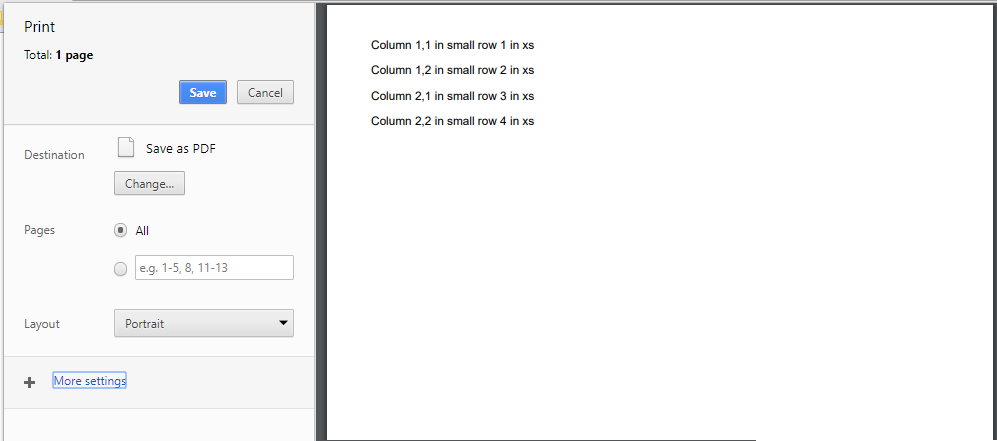
The page size is set to A4. The issue does not occur in Firefox (but does also occur in IE and Edge)
Any idea how to get the print view to render the small (or medium) layout instead of the mobile view?
 884
884
https://so51099397.surge.sh/
(I feel the fix that I have implemented is a little too much but I don't think there is any other way to fix the problem)
(If you are wondering why I hosted a site instead of something like SO snippet or jsfiddle I have explained in the comment)
Why am I getting "mobile" view in print?
width of A4 = 210mm ≈ 8.27 in ≈ 595 px (72 dpi)xs applies when width < 768px
How to fix this?
    .col-xs-12 {
        width: 100%;
    }
    @media (min-width: 768px){
        .col-sm-6 {
            width: 50%;
        }
    }
@media (min-width: 768px) only during print, my problem will be solved.@media (min-width: 768px) using document.styleSheets (don't forget to add crossorigin="anonymous" in bootstrap <link> or else you would get an error while accessing the stylesheet)<style> and append in <head> on beforeprint eventafterprint event we'll remove that <style>
Code (same as in demo) :
window.addEventListener("beforeprint", function(){
    let printStyleSheet = document.createElement("style");
    printStyleSheet.classList.add("print-stylesheet");
    document.head.appendChild(printStyleSheet)

    let printRulesText = "";
    Array.from(document.styleSheets).forEach(styleSheet => {
        Array.from(styleSheet.cssRules)
        .filter(rule => rule.media && /(min-width: 768px)/g.test(rule.media.mediaText))
        .forEach(rule => {
            Array.from(rule.cssRules).forEach(rule => printRulesText += rule.cssText)
        })
    })
    printStyleSheet.innerHTML = printRulesText;
})
window.addEventListener("afterprint", function(){
    Array.from(document.querySelectorAll(".print-stylesheet")).forEach(style => style.remove())
})
Note: This will give you the tablet view (sm) if you want the medium desktop view (md) you'll have to unwrap both, min-width: 768px as well as min-width: 992px similarly for large desktop (lg) also
Will this work?
Can I fix it by applying html, body { width: 769px } during print? (as 769 > 768)
viewport and not on width of html or bodyOkay so can I append <meta name="viewport" content="width=769"> and remove other viewport meta during print? (as 769 > 768)
Any other fixes?
Manually override xs styles like @Arex did
Get the bootstrap css source code and modify it using print media queries something like this:
 .col-xs-12 {
     width: 100%;
 }
 @media (min-width: 768px){
     .col-sm-6 {
         width: 50%;
     }
 }

 /* add such rules everywhere */
 @media print{
     .col-sm-6 {
         width: 50%;
     }
 }
Put all contents of the current page in an iframe with width: 100%; height: 100%; border: none; and make everything else display: none;. But I feel it won't work because if the iframe gets a scrollbar the contents out of the view won't get printed. Also looks much more hackish
PS: It's pretty obvious but let me explicitly say this... The fix implemented (as seen in the demo) does not fix just the grid system or the snippet in the question... But fixes the behaviour of ALL components (button, table, inputs, grid, etc) by faking a min-width: 768px media query. That's what the OP wants. Not individually fixing the components
PPS: Read Floyd's comment we can create print stylesheet during build-time itself which is better
108
If you love us? You can donate to us via Paypal or buy me a coffee so we can maintain and grow! Thank you!
Donate Us With