 Menu
Menu
I'm trying to achieve this gradient. What I don't understand is the curvature of it and I'm not sure on how to replicate it:
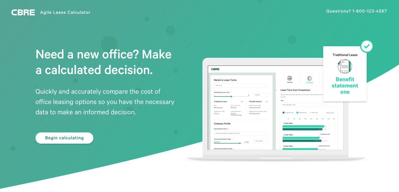
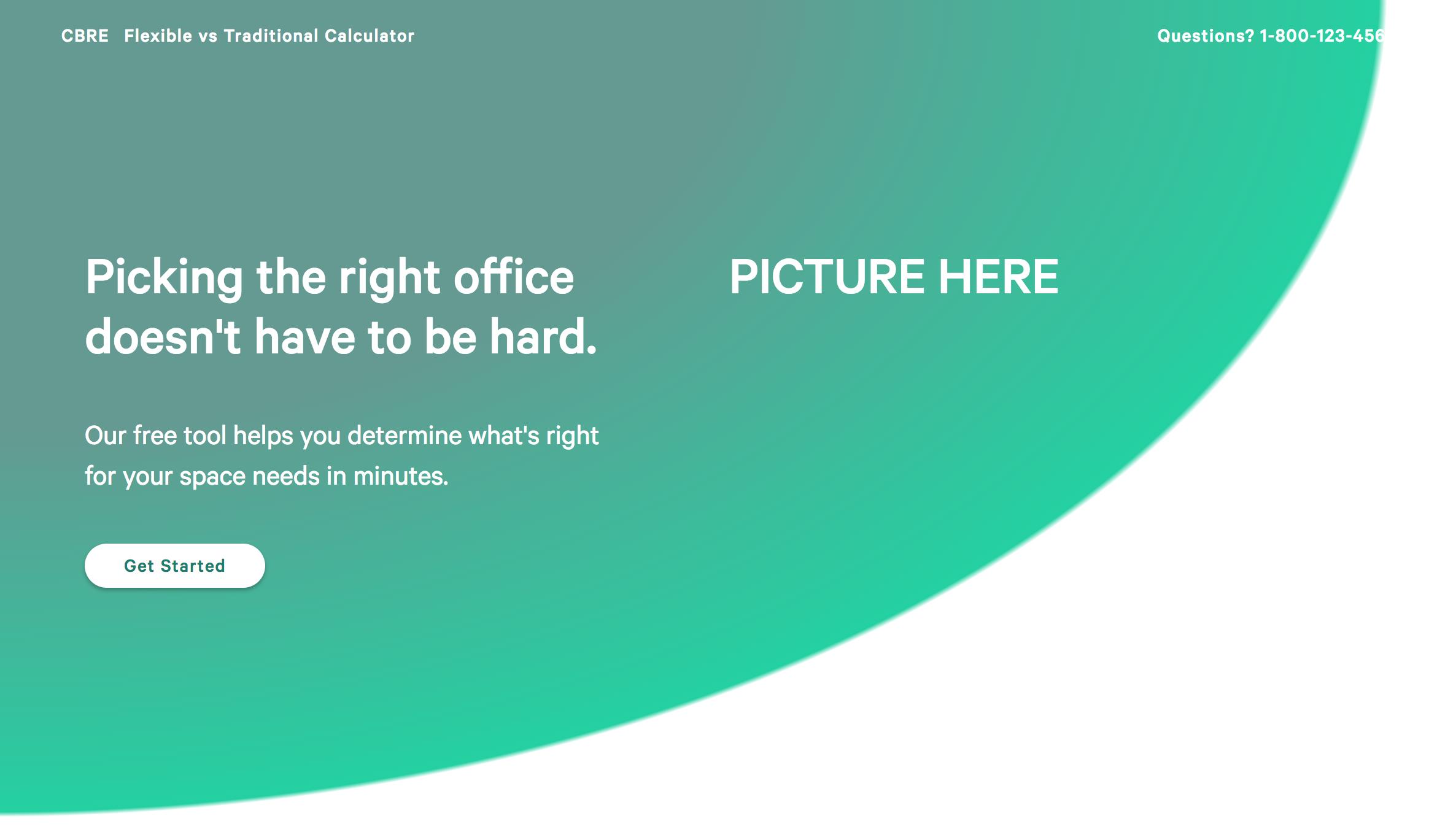
What I have so far:
and my code for the gradient:
radial-gradient(at top left,#629a92 36%,#02d2a0 67%, #fff 11%)
However I'm not sure how this gets stretched to the end of the screen. I haven't used radial-gradient much before so I feel like I'm missing something. Any help would be greatly appreciated. Thank you.
 676
676
You need to also adjust background-size of the gradient:
body {
 height:100vh;
 margin:0;
 background-image:radial-gradient(at top left,#629a92 36%,#02d2a0 67%, transparent 67.5%);
 background-size:120% 100%;
 background-repeat:no-repeat;
}
Or adjust the radius:
body {
 height:100vh;
 margin:0;
 background-image:radial-gradient(120% 100% at top left,#629a92 61%,#02d2a0 92%, transparent 92.5%);
 background-repeat:no-repeat;
}
UPDATE
If it's a linear-gradient inside a curved shape you can try to use multiple background. The idea is to create the linear-gradient and above it you add the a radial-gradient with transparent color to be able to see the first gradient.
body {
 height:100vh;
 margin:0;
 background-image:
   radial-gradient(120% 100% at top left,transparent 92%, #fff 92.5%),
   linear-gradient(135deg, #51a595 0%, #3fcfa2 100%);
}If you look carefully it is not a radial gradient. It is a linear gradient inside a radial shape. If I were you, I would do a SVG shape—mine is just for using as example—and apply it to the gradient.
Like this:
body {
  margin: 0;
}

svg {
  width: 0;
  height: 0;
  display: block;
}

.main {
  width: 100%;
  height: 100vh;
  position: relative;
}
.main:before {
  content: '';
  position: absolute;
  overflow: hidden;
  width: 100%;
  height: 100%;
  background: #51a595;
  background: linear-gradient(135deg, #51a595 0%, #3fcfa2 100%);
  filter: progid:DXImageTransform.Microsoft.gradient( startColorstr='#51a595', endColorstr='#54bb9b',GradientType=1 );
  -webkit-clip-path: url("#mask");
          clip-path: url("#mask");
}
<svg>
<defs>
<clipPath id="mask">
<ellipse cx="0" cy="-1400" rx="2200" ry="1500"></ellipse>
</clipPath>
</defs>
</svg>
<div class="main"></div>If you love us? You can donate to us via Paypal or buy me a coffee so we can maintain and grow! Thank you!
Donate Us With


