 Menu
Menu
I'm trying to do a responsive layout with css grid by getting two elements to overlap each other halfway. On wide screens they are in one row and overlapping horizontally, but on narrow screens they should be in one column and overlap vertically.
Here is an illustration of what I'm trying to achieve:
Is this behavior possible with css grid? Here is how far I got but now I'm stuck trying to get the vertical overlap.
.wrapper {
  background: white;
  display: grid;
  grid-template-columns: repeat(auto-fit, minmax(444px, 1fr));
}

.wrapper__red, .wrapper__green {
  align-self: center;
}

.wrapper__red {
  z-index: 1;
  background: red;
}

.wrapper__green {
  justify-self: end;
  height: 100%;
  background: green;
}
<div class="wrapper">
  <h1 class="wrapper__red">Title text goes here</h1>
  <img class="wrapper__green" src="/a.jpg" />
</div>
 244
244
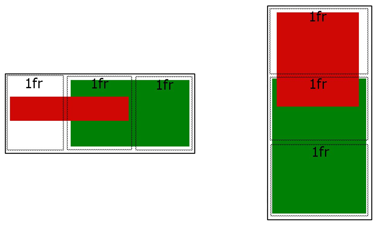
In CSS Grid you can create overlapping grid areas.
Grid makes this simple and easy with line-based placement.
From the spec:
The
grid-row-start,grid-column-start,grid-row-end, andgrid-column-endproperties determine a grid item’s size and location within the grid by contributing a line, a span, or nothing (automatic) to its grid placement, thereby specifying the inline-start, block-start, inline-end, and block-end edges of its grid area.
note: re-size demo below to transition from desktop to mobile view
article {
  display: grid;
  grid-template-columns: repeat(6, 1fr);
  grid-auto-rows: 50px;
  grid-gap: 5px;
}

section:nth-child(1) { grid-column: 1 / 4; grid-row: 1; z-index: 1; }
section:nth-child(2) { grid-column: 3 / 5; grid-row: 1; }
section:nth-child(3) { grid-column: 5 / 7; grid-row: 1; }

@media ( max-width: 500px ) {
   article { grid-template-columns: 100px; justify-content: center; }
   section:nth-child(1) { grid-row: 1 / 4; grid-column: 1; }
   section:nth-child(2) { grid-row: 3 / 5; grid-column: 1; }
   section:nth-child(3) { grid-row: 5 / 7; grid-column: 1; }
}

/* non-essential demo styles */
section:nth-child(1) { background-color: lightgreen; }
section:nth-child(2) { background-color: orange; }
section:nth-child(3) { background-color: aqua; }
section {
  display: flex;
  justify-content: center;
  align-items: center;
  font-size: 1.2em;
}
<article>
<section><span>1</span></section>
<section><span>2</span></section>
<section><span>3</span></section>
</article>If you love us? You can donate to us via Paypal or buy me a coffee so we can maintain and grow! Thank you!
Donate Us With