 Menu
Menu
What's the right way to have my first two columns have the same width total as my third column? if I am splitting them up like so:
.grid {
    display:grid;
    grid-template-columns:1fr 1fr 2fr;
    grid-gap:2em;
}
<div class="grid">
<div class="small">Col 1</div>
<div class="small">Col 2</div>
<div class="large">Col 3</div>
</div>Example here: https://codepen.io/shorty2240/pen/baGYoW
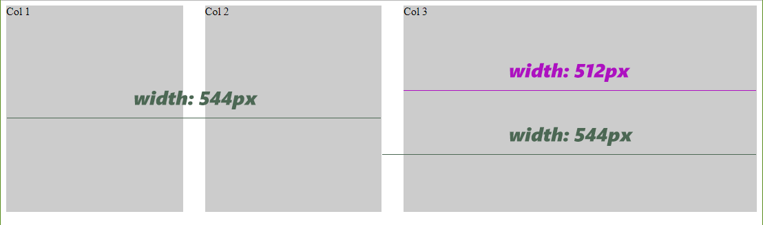
I was assuming I could make another grid below this one, with the same grid gap, and 1fr 1fr, and it would line up, but obviously it won't.
I would like to avoid nesting the first two items if possible as the actual project is outputting the three items automatically and wrapping around the first two could be problematic.
 682
682
You should make the grid 4 columns wide and define your .large to use up 2 columns.
This is actually in line with the working of columns in popular css frameworks like bootstrap and foundation.
grid-template-columns:1fr 1fr 1fr 1fr;
.large {
  grid-column-start: 3;
  grid-column-end: 5;
}
Or use any of the shorthand syntaxes for both setting 4 columns and grid-column.
90
If you love us? You can donate to us via Paypal or buy me a coffee so we can maintain and grow! Thank you!
Donate Us With