 Menu
Menu
Is it actually possible to apply a background-color over a transparent PNG image in CSS ? Here's an example:
With CSS, turning this image

into this with a CSS code like background-color: rgba(0,0,300,.5)
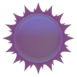
All in full CSS (and HTML of course) ?
Thanks.
 369
369
Use CSS Filters
From an article about filters by Chris Coyier:
CSS Filters are a powerful tool that authors can use to achieve varying visual effects (sort of like Photoshop filters for the browser). The CSS
filterproperty provides access to effects like blur or color shifting on an element’s rendering before the element is displayed.
- blur()
- brightness()
- contrast()
- drop-shadow()
- grayscale()
- hue-rotate()
- invert()
- opacity()
- saturate()
- sepia()
Filter samples (based on W3S):
<!DOCTYPE html>
<html>
<head>
<style>
img {
    width: 33%;
    height: auto;
    float: left;
}

.blur {-webkit-filter: blur(4px);filter: blur(4px);}
.brightness {-webkit-filter: brightness(0.30);filter: brightness(0.30);}
.contrast {-webkit-filter: contrast(180%);filter: contrast(180%);}
.grayscale {-webkit-filter: grayscale(100%);filter: grayscale(100%);}
.huerotate {-webkit-filter: hue-rotate(180deg);filter: hue-rotate(180deg);}
.invert {-webkit-filter: invert(100%);filter: invert(100%);}
.opacity {-webkit-filter: opacity(50%);filter: opacity(50%);}
.saturate {-webkit-filter: saturate(7); filter: saturate(7);}
.sepia {-webkit-filter: sepia(100%);filter: sepia(100%);}
.shadow {-webkit-filter: drop-shadow(8px 8px 10px green);filter: drop-shadow(8px 8px 10px green);}
</style>
</head>
<body>

<p><strong>Note:</strong> The filter property is not supported in Internet Explorer, Edge 12, or Safari 5.1 and earlier.</p>

<img src="https://i.stack.imgur.com/nPnsV.png"  width="300" height="300">
<img class="blur" src="https://i.stack.imgur.com/nPnsV.png"  width="300" height="300">
<img class="brightness" src="https://i.stack.imgur.com/nPnsV.png"  width="300" height="300">
<img class="contrast" src="https://i.stack.imgur.com/nPnsV.png"  width="300" height="300">
<img class="grayscale" src="https://i.stack.imgur.com/nPnsV.png"  width="300" height="300">
<img class="huerotate" src="https://i.stack.imgur.com/nPnsV.png"  width="300" height="300">
<img class="invert" src="https://i.stack.imgur.com/nPnsV.png"  width="300" height="300">
<img class="opacity" src="https://i.stack.imgur.com/nPnsV.png"  width="300" height="300">
<img class="saturate" src="https://i.stack.imgur.com/nPnsV.png"  width="300" height="300">
<img class="sepia" src="https://i.stack.imgur.com/nPnsV.png"  width="300" height="300">
<img class="shadow" src="https://i.stack.imgur.com/nPnsV.png"  width="300" height="300">

</body>
</html>
On Hover effect:
img:hover {
  filter: hue-rotate(250deg);
}
<img src="https://i.stack.imgur.com/nPnsV.png" />If you love us? You can donate to us via Paypal or buy me a coffee so we can maintain and grow! Thank you!
Donate Us With