 Menu
Menu
This usually isnt a problem but just Material 2 is very under-documented atm so im having trouble making all images the same size but properly resize with window change
All the images I have were pretty similar in size when I created then but one was abit longer height wise, but my old code just adjusted that with some bootstrap calls.
But using the image in a mat-card it is a longer length and thus looks out of place shown here:
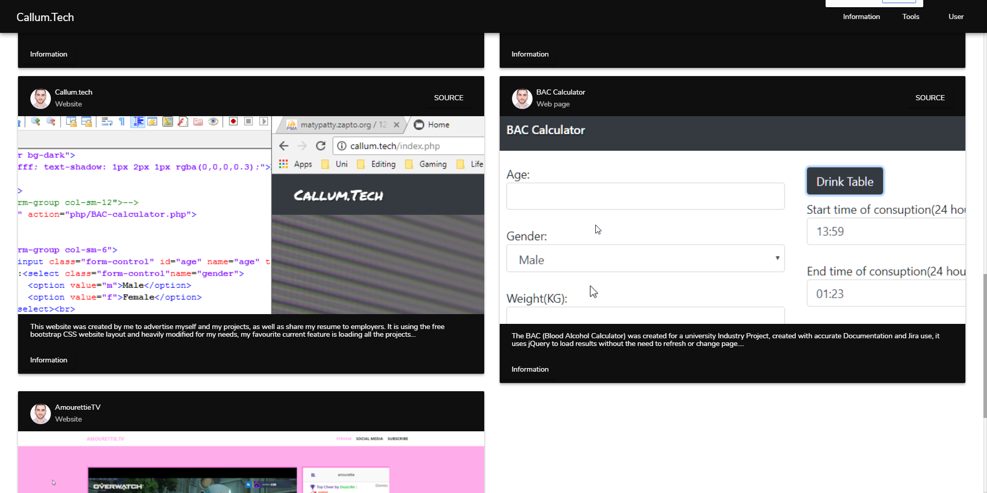
The BAC calculator's image is longer than the rest so it looks out of place and pushes others out of proportion under it or forces an empty cell, here is my call for displaying these:
<div *ngIf="data;else other_content">
    <div class="row">
      <div *ngFor="let project of data" class="col-md-6">
        <div>
          <mat-card class="mat-elevation-z4">
            <mat-card-header>
              <div mat-card-avatar class="example-header-image"></div>
              <mat-card-title>{{project.title}}</mat-card-title>
              <mat-card-subtitle>{{project.category}}</mat-card-subtitle>
              <div class="grow-empty"></div>
              <div *ngIf="project.source">
                <button mat-raised-button (click)="openSite(project.source)">SOURCE</button>
              </div>
            </mat-card-header>
            <img mat-card-image src="{{project.image}}" alt="{{project.title}}">
            <mat-card-content>
              <p>
                {{project.detail  | slice:0:250}}...
              </p>
            </mat-card-content>
            <mat-card-actions>
              <button mat-raised-button>Information</button>
            </mat-card-actions>
          </mat-card>
        </div>
        <br>
      </div>
    </div>
  </div>
If I set the height as a static like '300', it technically fixes the issue but rescaling will just ruin it
I want it to be a set scale like it is, but take any image and scale it up/down to sit and be an appropriate size for the card itself (like Callum.Tech card for example)
 885
885
Just add this style reference in your code. If you want to apply this styles to all your cards in the view, add to your style file:
mat-card img{
  object-fit: cover; /*this makes the image in src fit to the size specified below*/
  width: 100%; /* Here you can use wherever you want to specify the width and also the height of the <img>*/
  height: 80%;
}
Another solution to this issue may be using the class of bootstrap "img-responsive". Here is a brief description
89
If you love us? You can donate to us via Paypal or buy me a coffee so we can maintain and grow! Thank you!
Donate Us With

