 Menu
Menu
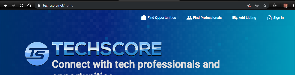
I have the following code which uses Angular Material to make my image responsive:
<picture [ngStyle.xs]="{'width': '100%'}" [ngStyle.gt-xs]="{'width': '448px', 'height': '60px'}">
  <source srcset="/assets/images/logo-text-lg.webp" type="image/webp" [ngStyle.xs]="{'width': '100%'}" [ngStyle.gt-xs]="{'width': '448px', 'height': '60px'}">
  <source srcset="/assets/images/logo-text-lg.png" type="image/png" [ngStyle.xs]="{'width': '100%'}" [ngStyle.gt-xs]="{'width': '448px', 'height': '60px'}">
  <img src="/assets/images/logo-text-lg.png" alt="TechScore" [ngStyle.xs]="{'width': '100%'}" [ngStyle.gt-xs]="{'width': '448px', 'height': '60px'}">
</picture>
The goal is to have it exactly 448x60 unless it is on an extra small screen. Then it should be 100% of the page width. This works except that, since I implemented server-side rendering via Angular Universal, I get a flash of the image at 100% even on larger screens.
If I look at the source (with caching disabled) I can see that the markup coming from the server includes style="width: 100%" which means that the server-side rendered version thinks that the screen is extra small.
How can I let Angular Universal known what the screen resolution is and how do I pass that information on to Angular Material and override what it thinks is the resolution so that it chooses the correct width?
Update
I thought I was onto something by detecting if it was a mobile browser via the user-agent string and then setting the default breakpoints as described here: https://github.com/angular/flex-layout/wiki/Using-SSR-with-Flex-Layout
FlexLayoutModule.withConfig({ssrObserveBreakpoints: [isMobile() ? 'xs' : 'md']})
but I must be doing it wrong because I'm not seeing any effect.
 776
776
You could consider using CSS media queries to handle the responsive styling of the images. Then no hardcoded inline styles will be sent to the client. The browser will determine how to initially render the images. You won't have to wait for your JavaScript to execute (flash!) before the appropriate styles are applied.
Here's an example:
<picture class="my-picture">
  <source srcset="/assets/images/logo-text-lg.webp" type="image/webp">
  <source srcset="/assets/images/logo-text-lg.png" type="image/png" >
  <img src="/assets/images/logo-text-lg.png" alt="TechScore">
</picture>
.my-picture, .my-picture img, .my-picture source {
  width: 448px;
  height: 60px;
}

@media only screen and (min-width : 480px) {
  .my-picture, .my-picture img, .my-picture source {
    width: 100%;
    height: auto;
  }
}
If you love us? You can donate to us via Paypal or buy me a coffee so we can maintain and grow! Thank you!
Donate Us With