 Menu
Menu
Is there any way to use skew only in a parent element? I need to create something like a 'diamond' as a mask and the child elements can't be affected. There is no way, in this case, to use png as a mask. Thanks in advance!
 395
395
NOTE: SPAN is NOT affected by transform CSS functionality, so you will need a DIV or change span to display: block; otherwise they will NOT be affected. So just put the TEXT inside a separate div and unskew it. Show activity on this post. You can generate your clip from here and use it in your code.
Syntax. The skew() function is specified with either one or two values, which represent the amount of skewing to be applied in each direction. If you only specify one value it is used for the x-axis and there will be no skewing on the y-axis.
Try this: To unskew the image use a nested div for the image and give it the opposite skew value. So if you had 20deg on the parent then you can give the nested (image) div a skew value of -20deg. @darthmaim's answer (below) to use a psuedo (before or after) to skew the inner border's should be the accepted answer.
It's really easy, you just need to unskew the thing for the children. Unskew means applying another skew transform, but of opposite angle this time.
.parent { transform: skewX(45deg); }
.parent > * { transform: skew(-45deg); }
In general, if you apply a number of transforms on a parent element and you want the child elements to go back to normal, then you have to apply the same transforms, only in reverse order (the order does matter in most cases!) and with a minus for angle/ length values used for skew, rotate or translate. In the case of scale, you need a scale factor of 1/scale_factor_for_parent. That is, for scale, you would do something like this:
.parent { transform: scale(4); }
.parent > * { transform: scale(.25); /* 1/4 = .25 */ }
A diamond shape with children is pretty easy.
Result:
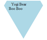
HTML:
<div class='wrapper'>
  <div class='diamond'>
    <div class='child'>Yogi Bear</div>
    <div class='child'>Boo Boo</div>
  </div>
</div>
CSS:
.wrapper {
  overflow: hidden;
  margin: 0 auto;
  width: 10em; height: 10em;
}
.diamond {
  box-sizing: border-box;
  margin: 0 auto;
  padding: 4em 1em 0;
  width: 86.6%; height: 100%;
  transform: translateY(-37.5%) rotate(30deg) skewY(30deg);
  background: lightblue;
}
.child {
  transform: skewY(-30deg) rotate(-30deg);
}
If you love us? You can donate to us via Paypal or buy me a coffee so we can maintain and grow! Thank you!
Donate Us With