 Menu
Menu
While it is easy to test different screen resolutions in Google Chrome i wonder how developers could test different device pixel ratios underlying the following CSS media queries.
/* Pixel ratio of 1. Background size is 100% (of a 100px image) */ #header { background: url(header.png); } /* Pixel ratio of 1.5. Background-size is 1/1.5 = 66.67% (of a 150px image) */ @media only screen and (-moz-min-device-pixel-ratio: 1.5), only screen and (-o-min-device-pixel-ratio: 3/2), only screen and (-webkit-min-device-pixel-ratio: 1.5), only screen and (min-device-pixel-ratio: 1.5) { #header { background: url(headerRatio1_5.png); background-size: 66.67%; } } /* Pixel ratio of 2. Background-size is 1/2 = 50% (of a 200px image) */ @media only screen and (-moz-min-device-pixel-ratio: 2), only screen and (-o-min-device-pixel-ratio: 2/1), only screen and (-webkit-min-device-pixel-ratio: 2), only screen and (min-device-pixel-ratio: 2) { #header { background: url(headerRatio2.png); background-size: 50%; } } Does there exist any way or a browser extension to mimic device pixel ratio?
 818
818
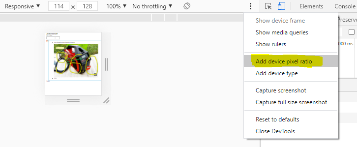
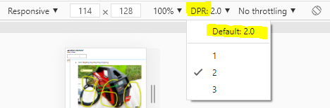
(2) Open the Chrome Developer Tools. (3) Open the Device mode (mobile/tablet 2nd icon in upper left corner of the Chrome Developer Tools panel/window). (4) In mobile emulator options bar at the top switch `Dimensions` to `Responsive`, then `DPR` (Device pixel ratio) can be manually toggled.
Dividing the physical ppi by the ideal ppi of 150, gives the device pixel ratio.
Syntax. The -webkit-device-pixel-ratio feature is specified as a <number> value. It is a range feature, meaning that you can also use the prefixed -webkit-min-device-pixel-ratio and -webkit-max-device-pixel-ratio variants to query minimum and maximum values, respectively.
about:config hack on Firefox
You actually can using Firefox:
Refresh your page - boom, your media query has now kicked in! Hats off to Firefox for being awesome for web developing!
This was done on Windows 7 with Firefox 21.0.
Zooming on Firefox & Edge
Currently on Firefox and Edge, if you zoom it triggers dppx-based media queries. So this easier approach may be sufficient, but be aware that the functionality is reported as a "won't fix" bug for Firefox, so this could change.
59
The Chrome DevTools have a feature called "Device Mode & Mobile Emulation" available in Chrome 32 and higher. It is described in detail here. Here's a video tutorial from Google's DevBytes YouTube channel.
Open DevTools by pressing F12 (or Shift+Ctrl+I / Cmd+Opt+I on Mac). In current Chrome versions, click the "smartphone" icon in the upper left corner of the DevTools window to activate Mobile Emulation. You can change most of the settings (device type, screen resolution & rotation, zoom factor...) in the toolbar on the emulation screen. For further options, click "..." on the right side of the toolbar.
In older versions of Chrome, you may have to enable the feature before you can use it: in DevTools, click the Settings icon (cogwheel), then click "Overrides" and select "Show 'Emulation' view in console drawer". Then, click the ">=" icon to the left of the Settings icon to show the "console drawer" and you should see an "Emulation" tab, where you can enable the emulation and change the settings.
23
If you love us? You can donate to us via Paypal or buy me a coffee so we can maintain and grow! Thank you!
Donate Us With