 Menu
Menu
I want to open DropDown dialog below DropdownButton like Spinner in Flutter. Right now its open over Button widget and when I select last item and re-open as down side.
Code:
import 'package:flutter/material.dart';
class DropDown extends StatefulWidget {
DropDown() : super();
final String title = "DropDown Demo";
@override
DropDownState createState() => DropDownState();
}
class Company {
int id;
String name;
Company(this.id, this.name);
static List<Company> getCompanies() {
return <Company>[
Company(1, 'Apple'),
Company(2, 'Google'),
Company(3, 'Samsung'),
Company(4, 'Sony'),
Company(5, 'LG'),
];
}
}
class DropDownState extends State<DropDown> {
//
List<Company> _companies = Company.getCompanies();
List<DropdownMenuItem<Company>> _dropdownMenuItems;
Company _selectedCompany;
@override
void initState() {
_dropdownMenuItems = buildDropdownMenuItems(_companies);
_selectedCompany = _dropdownMenuItems[0].value;
super.initState();
}
List<DropdownMenuItem<Company>> buildDropdownMenuItems(List companies) {
List<DropdownMenuItem<Company>> items = List();
for (Company company in companies) {
items.add(
DropdownMenuItem(
value: company,
child: Text(company.name),
),
);
}
return items;
}
onChangeDropdownItem(Company selectedCompany) {
setState(() {
_selectedCompany = selectedCompany;
});
}
@override
Widget build(BuildContext context) {
return new MaterialApp(
debugShowCheckedModeBanner: false,
home: new Scaffold(
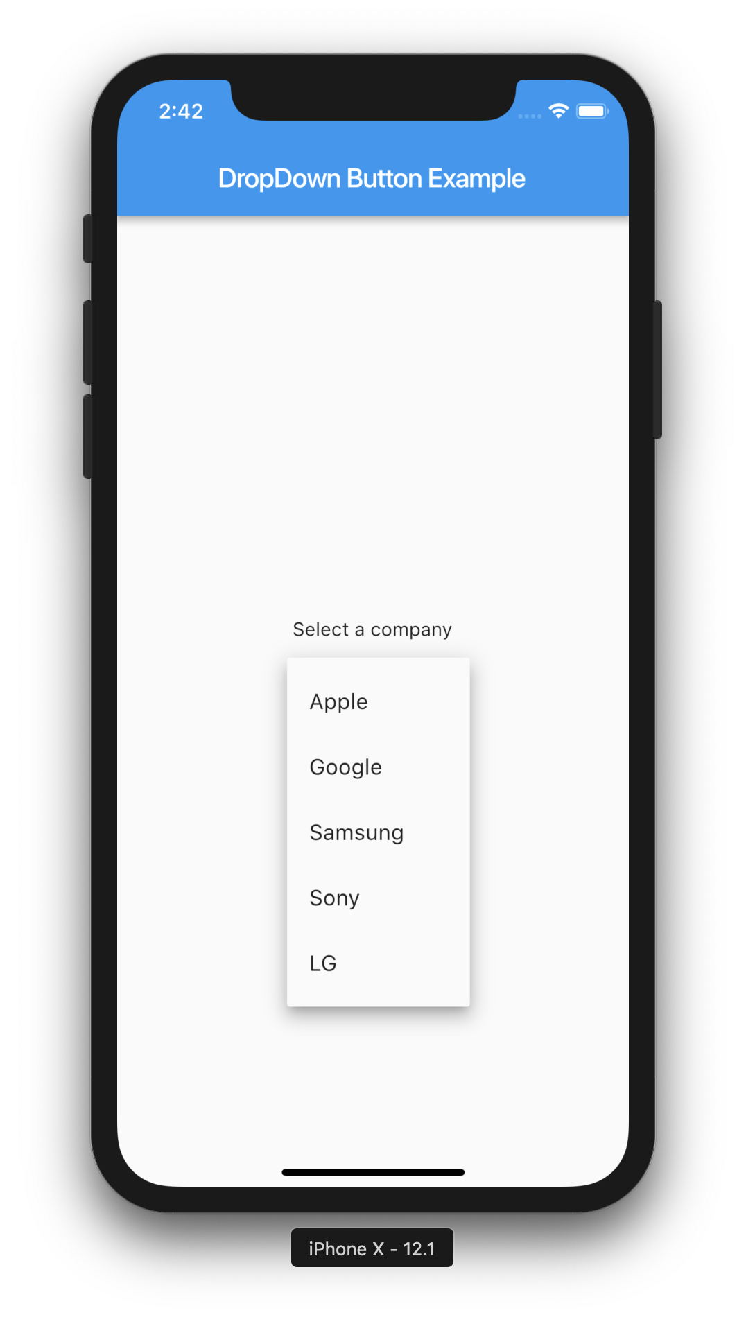
appBar: new AppBar(
title: new Text("DropDown Button Example"),
),
body: new Container(
child: Center(
child: Column(
crossAxisAlignment: CrossAxisAlignment.center,
mainAxisAlignment: MainAxisAlignment.center,
children: <Widget>[
Text("Select a company"),
SizedBox(
height: 20.0,
),
DropdownButton(
value: _selectedCompany,
items: _dropdownMenuItems,
onChanged: onChangeDropdownItem,
),
SizedBox(
height: 20.0,
),
Text('Selected: ${_selectedCompany.name}'),
],
),
),
),
),
);
}
}
Note: Example is taken from here.
 411
411
Option 1: Set DropDown. dart selectedItemOffset to -40 in then DropDownItems will always opens below the DropdownButton .

The problem with the DropdownButton is that the menu will open randomly based on the selected index and other things. Also, You can't edit its code by just trying to pass offset as the logic code of the paint work based on that and trying to hardcode the selectedItemOffset to a value won't work perfectly fine.
The problem with the PopupMenuButton if you tried to use it as a DropdownButton is that it's offset and the menu width won't work perfect with the button. You won't be able to set exact width for the menu.
Also, Both don't provide great customization and usability from my experience.
So, I've created a custom DropdownButton from current version of Flutter's DropdownButton and made it more customizable. It's easy, simple and you can have steady dropdown menu below the button "As long as it's possible" without any issues and many other features described with the package. Also, I've added the same functionality to DropdownButtonFormField2 and added a feature of using the button as a popup menu button and the ability of adding dividers after items. I've tested it very well and it works like a charm!
You can use the package or use the source file on GitHub directly. Also, I've Added custom widget with the package you can customize default DropdownButton2 widget for your entire app and use it with few lines as shown in the examples.
Package: DropdownButton2
Repository (GitHub): DropdownButton2
50
A null-safe and more customizable version of Jay patel's answer below. I've added some behaviour that the current version of the DropdownButton supports, like underline, icon, iconEnabledColor, iconDisabledColor.
import 'dart:math' as math;

import 'package:flutter/material.dart';

const Duration _kDropdownMenuDuration = Duration(milliseconds: 300);
const double _kMenuItemHeight = 48.0;
const double _kDenseButtonHeight = 24.0;
const EdgeInsets _kMenuItemPadding = EdgeInsets.symmetric(horizontal: 16.0);
const EdgeInsetsGeometry _kAlignedButtonPadding =
    EdgeInsetsDirectional.only(start: 16.0, end: 4.0);
const EdgeInsets _kUnalignedButtonPadding = EdgeInsets.zero;
const EdgeInsets _kAlignedMenuMargin = EdgeInsets.zero;
const EdgeInsetsGeometry _kUnalignedMenuMargin =
    EdgeInsetsDirectional.only(start: 16.0, end: 24.0);

class _DropdownMenuPainter extends CustomPainter {
  _DropdownMenuPainter({
    required this.color,
    required this.elevation,
    required this.selectedIndex,
    required this.resize,
  })   : _painter = BoxDecoration(
                // If you add an image here, you must provide a real
                // configuration in the paint() function and you must provide some sort
                // of onChanged callback here.
                color: color,
                borderRadius: BorderRadius.circular(2.0),
                boxShadow: kElevationToShadow[elevation])
            .createBoxPainter(),
        super(repaint: resize);

  final Color color;
  final int elevation;
  final int selectedIndex;
  final Animation<double> resize;

  final BoxPainter _painter;

  @override
  void paint(Canvas canvas, Size size) {
    final double selectedItemOffset =
        selectedIndex * _kMenuItemHeight + kMaterialListPadding.top;
    final Tween<double> top = Tween<double>(
      begin: selectedItemOffset.clamp(0.0, size.height - _kMenuItemHeight),
      end: 0.0,
    );

    final Tween<double> bottom = Tween<double>(
      begin: (top.begin ?? 0 + _kMenuItemHeight)
          .clamp(_kMenuItemHeight, size.height),
      end: size.height,
    );

    final Rect rect = Rect.fromLTRB(
      0.0,
      top.evaluate(resize),
      size.width,
      bottom.evaluate(resize),
    );

    _painter.paint(
      canvas,
      rect.topLeft,
      ImageConfiguration(size: rect.size),
    );
  }

  @override
  bool shouldRepaint(_DropdownMenuPainter oldPainter) {
    return oldPainter.color != color ||
        oldPainter.elevation != elevation ||
        oldPainter.selectedIndex != selectedIndex ||
        oldPainter.resize != resize;
  }
}

// Do not use the platform-specific default scroll configuration.
// Dropdown menus should never overscroll or display an overscroll indicator.
class _DropdownScrollBehavior extends ScrollBehavior {
  const _DropdownScrollBehavior();

  @override
  TargetPlatform getPlatform(BuildContext context) =>
      Theme.of(context).platform;

  @override
  Widget buildViewportChrome(
          BuildContext context, Widget child, AxisDirection axisDirection) =>
      child;

  @override
  ScrollPhysics getScrollPhysics(BuildContext context) =>
      const ClampingScrollPhysics();
}

class _DropdownMenu<T> extends StatefulWidget {
  const _DropdownMenu({
    Key? key,
    required this.padding,
    required this.route,
  }) : super(key: key);

  final _DropdownRoute<T> route;
  final EdgeInsets padding;

  @override
  _DropdownMenuState<T> createState() => _DropdownMenuState<T>();
}

class _DropdownMenuState<T> extends State<_DropdownMenu<T>> {
  late CurvedAnimation _fadeOpacity;
  late CurvedAnimation _resize;

  @override
  void initState() {
    super.initState();
    // We need to hold these animations as state because of their curve
    // direction. When the route's animation reverses, if we were to recreate
    // the CurvedAnimation objects in build, we'd lose
    // CurvedAnimation._curveDirection.
    _fadeOpacity = CurvedAnimation(
      parent: widget.route.animation!,
      curve: const Interval(0.0, 0.25),
      reverseCurve: const Interval(0.75, 1.0),
    );
    _resize = CurvedAnimation(
      parent: widget.route.animation!,
      curve: const Interval(0.25, 0.5),
      reverseCurve: const Threshold(0.0),
    );
  }

  @override
  Widget build(BuildContext context) {
    // The menu is shown in three stages (unit timing in brackets):
    // [0s - 0.25s] - Fade in a rect-sized menu container with the selected item.
    // [0.25s - 0.5s] - Grow the otherwise empty menu container from the center
    //   until it's big enough for as many items as we're going to show.
    // [0.5s - 1.0s] Fade in the remaining visible items from top to bottom.
    //
    // When the menu is dismissed we just fade the entire thing out
    // in the first 0.25s.
    final MaterialLocalizations localizations =
        MaterialLocalizations.of(context);
    final _DropdownRoute<T> route = widget.route;
    final double unit = 0.5 / (route.items.length + 1.5);
    final List<Widget> children = <Widget>[];
    for (int itemIndex = 0; itemIndex < route.items.length; ++itemIndex) {
      CurvedAnimation opacity;
      if (itemIndex == route.selectedIndex) {
        opacity = CurvedAnimation(
          parent: route.animation!,
          curve: const Threshold(0.0),
        );
      } else {
        final double start = (0.5 + (itemIndex + 1) * unit).clamp(0.0, 1.0);
        final double end = (start + 1.5 * unit).clamp(0.0, 1.0);
        opacity = CurvedAnimation(
          parent: route.animation!,
          curve: Interval(start, end),
        );
      }
      children.add(FadeTransition(
        opacity: opacity,
        child: InkWell(
          onTap: () => Navigator.pop(
            context,
            _DropdownRouteResult<T>(route.items[itemIndex].value!),
          ),
          child: Container(
            padding: widget.padding,
            child: route.items[itemIndex],
          ),
        ),
      ));
    }

    return FadeTransition(
      opacity: _fadeOpacity,
      child: CustomPaint(
        painter: _DropdownMenuPainter(
          color: Theme.of(context).canvasColor,
          elevation: route.elevation,
          selectedIndex: route.selectedIndex,
          resize: _resize,
        ),
        child: Semantics(
          scopesRoute: true,
          namesRoute: true,
          explicitChildNodes: true,
          label: localizations.popupMenuLabel,
          child: Material(
            type: MaterialType.transparency,
            textStyle: route.style,
            child: ScrollConfiguration(
              behavior: const _DropdownScrollBehavior(),
              child: Scrollbar(
                child: ListView(
                  controller: widget.route.scrollController,
                  padding: kMaterialListPadding,
                  itemExtent: _kMenuItemHeight,
                  shrinkWrap: true,
                  children: children,
                ),
              ),
            ),
          ),
        ),
      ),
    );
  }
}

class _DropdownMenuRouteLayout<T> extends SingleChildLayoutDelegate {
  _DropdownMenuRouteLayout({
    required this.buttonRect,
    required this.menuTop,
    required this.menuHeight,
    required this.textDirection,
  });

  final Rect buttonRect;
  final double menuTop;
  final double menuHeight;
  final TextDirection textDirection;

  @override
  BoxConstraints getConstraintsForChild(BoxConstraints constraints) {
    // The maximum height of a simple menu should be one or more rows less than
    // the view height. This ensures a tappable area outside of the simple menu
    // with which to dismiss the menu.
    //   -- https://material.google.com/components/menus.html#menus-simple-menus
    final double maxHeight =
        math.max(0.0, constraints.maxHeight - 2 * _kMenuItemHeight);
    // The width of a menu should be at most the view width. This ensures that
    // the menu does not extend past the left and right edges of the screen.
    final double width = math.min(constraints.maxWidth, buttonRect.width);
    return BoxConstraints(
      minWidth: width,
      maxWidth: width,
      maxHeight: maxHeight,
    );
  }

  @override
  Offset getPositionForChild(Size size, Size childSize) {
    assert(() {
      final Rect container = Offset.zero & size;
      if (container.intersect(buttonRect) == buttonRect) {
        // If the button was entirely on-screen, then verify
        // that the menu is also on-screen.
        // If the button was a bit off-screen, then, oh well.
        assert(menuTop >= 0.0);
        assert(menuTop + menuHeight <= size.height);
      }
      return true;
    }());
    double left;
    switch (textDirection) {
      case TextDirection.rtl:
        left = buttonRect.right.clamp(0.0, size.width) - childSize.width;
        break;
      case TextDirection.ltr:
        left = buttonRect.left.clamp(0.0, size.width - childSize.width);
        break;
    }
    return Offset(left, menuTop);
  }

  @override
  bool shouldRelayout(_DropdownMenuRouteLayout<T> oldDelegate) {
    return buttonRect != oldDelegate.buttonRect ||
        menuTop != oldDelegate.menuTop ||
        menuHeight != oldDelegate.menuHeight ||
        textDirection != oldDelegate.textDirection;
  }
}

class _DropdownRouteResult<T> {
  const _DropdownRouteResult(this.result);

  final T result;

  @override
  bool operator ==(dynamic other) {
    if (other is! _DropdownRouteResult<T>) {
      return false;
    }
    final _DropdownRouteResult<T> typedOther = other;
    return result == typedOther.result;
  }

  @override
  int get hashCode => result.hashCode;
}

class _DropdownRoute<T> extends PopupRoute<_DropdownRouteResult<T>> {
  _DropdownRoute({
    required this.items,
    required this.padding,
    required this.buttonRect,
    required this.selectedIndex,
    required this.theme,
    required this.style,
    required this.barrierLabel,
    this.elevation = 8,
  });

  final List<DropdownMenuItem<T>> items;
  final EdgeInsetsGeometry padding;
  final Rect buttonRect;
  final int selectedIndex;
  final int elevation;
  final ThemeData theme;
  final TextStyle style;

  ScrollController? scrollController;

  @override
  Duration get transitionDuration => _kDropdownMenuDuration;

  @override
  bool get barrierDismissible => true;

  @override
  Color? get barrierColor => null;

  @override
  final String barrierLabel;

  @override
  Widget buildPage(BuildContext context, Animation<double> animation,
      Animation<double> secondaryAnimation) {
    assert(debugCheckHasDirectionality(context));
    final double screenHeight = MediaQuery.of(context).size.height;
    final double maxMenuHeight = screenHeight - 2.0 * _kMenuItemHeight;
    final double preferredMenuHeight =
        (items.length * _kMenuItemHeight) + kMaterialListPadding.vertical;
    final double menuHeight = math.min(maxMenuHeight, preferredMenuHeight);

    final double buttonTop = buttonRect.top;
    final double selectedItemOffset =
        selectedIndex * _kMenuItemHeight + kMaterialListPadding.top;
    double menuTop = (buttonTop - selectedItemOffset) -
        (_kMenuItemHeight - buttonRect.height) / 2.0;
    const double topPreferredLimit = _kMenuItemHeight;
    if (menuTop < topPreferredLimit) {
      menuTop = math.min(buttonTop, topPreferredLimit);
    }
    double bottom = menuTop + menuHeight;
    final double bottomPreferredLimit = screenHeight - _kMenuItemHeight;
    if (bottom > bottomPreferredLimit) {
      bottom = math.max(buttonTop + _kMenuItemHeight, bottomPreferredLimit);
      menuTop = bottom - menuHeight;
    }

    if (scrollController == null) {
      double scrollOffset = 0.0;
      if (preferredMenuHeight > maxMenuHeight) {
        scrollOffset = selectedItemOffset - (buttonTop - menuTop);
      }
      scrollController = ScrollController(initialScrollOffset: scrollOffset);
    }

    final TextDirection textDirection = Directionality.of(context);
    Widget menu = _DropdownMenu<T>(
      route: this,
      padding: padding.resolve(textDirection),
    );

    menu = Theme(data: theme, child: menu);

    return MediaQuery.removePadding(
      context: context,
      removeTop: true,
      removeBottom: true,
      removeLeft: true,
      removeRight: true,
      child: Builder(
        builder: (BuildContext context) {
          return CustomSingleChildLayout(
            delegate: _DropdownMenuRouteLayout<T>(
              buttonRect: buttonRect,
              menuTop: menuTop,
              menuHeight: menuHeight,
              textDirection: textDirection,
            ),
            child: menu,
          );
        },
      ),
    );
  }

  void _dismiss() {
    navigator?.removeRoute(this);
  }
}

class CustomDropdownButton<T> extends StatefulWidget {
  /// Creates a dropdown button.
  ///
  /// The [items] must have distinct values and if [value] isn't null it must be among them.
  ///
  /// The [elevation] and [iconSize] arguments must not be null (they both have
  /// defaults, so do not need to be specified).
  CustomDropdownButton({
    Key? key,
    required this.items,
    this.hint,
    this.onChanged,
    this.style,
    this.elevation = 8,
    this.icon,
    this.iconDisabledColor,
    this.iconEnabledColor,
    this.iconSize = 24.0,
    this.isDense = false,
    this.underline,
    this.value,
    this.dropdownColor,
  })  : assert(value == null ||
            items
                    .where((DropdownMenuItem<T> item) => item.value == value)
                    .length ==
                1),
        super(key: key);

  /// The list of possible items to select among.
  final List<DropdownMenuItem<T>> items;

  /// The currently selected item, or null if no item has been selected. If
  /// value is null then the menu is popped up as if the first item was
  /// selected.
  final T? value;

  /// Displayed if [value] is null.
  final Widget? hint;

  /// Custom underline Widget, allowing you to change the default
  final Widget? underline;

  /// Called when the user selects an item.
  final ValueChanged<T>? onChanged;

  /// The z-coordinate at which to place the menu when open.
  ///
  /// The following elevations have defined shadows: 1, 2, 3, 4, 6, 8, 9, 12, 16, 24
  ///
  /// Defaults to 8, the appropriate elevation for dropdown buttons.
  final int elevation;

  /// The text style to use for text in the dropdown button and the dropdown
  /// menu that appears when you tap the button.
  ///
  /// Defaults to the [TextTheme.subhead] value of the current
  /// [ThemeData.textTheme] of the current [Theme].
  final TextStyle? style;

  /// The widget to use for the drop-down button's icon.
  ///
  /// Defaults to an [Icon] with the [Icons.arrow_drop_down] glyph.
  final Widget? icon;

  final Color? dropdownColor;

  /// The color of any [Icon] descendant of [icon] if this button is disabled,
  /// i.e. if [onChanged] is null.
  ///
  /// Defaults to [MaterialColor.shade400] of [Colors.grey] when the theme's
  /// [ThemeData.brightness] is [Brightness.light] and to
  /// [Colors.white10] when it is [Brightness.dark]
  final Color? iconDisabledColor;

  /// The color of any [Icon] descendant of [icon] if this button is enabled,
  /// i.e. if [onChanged] is defined.
  ///
  /// Defaults to [MaterialColor.shade700] of [Colors.grey] when the theme's
  /// [ThemeData.brightness] is [Brightness.light] and to
  /// [Colors.white70] when it is [Brightness.dark]
  final Color? iconEnabledColor;

  /// The size to use for the drop-down button's down arrow icon button.
  ///
  /// Defaults to 24.0.
  final double iconSize;

  /// Reduce the button's height.
  ///
  /// By default this button's height is the same as its menu items' heights.
  /// If isDense is true, the button's height is reduced by about half. This
  /// can be useful when the button is embedded in a container that adds
  /// its own decorations, like [InputDecorator].
  final bool isDense;

  @override
  _DropdownButtonState<T> createState() => _DropdownButtonState<T>();
}

class _DropdownButtonState<T> extends State<CustomDropdownButton<T>>
    with WidgetsBindingObserver {
  int? _selectedIndex;
  _DropdownRoute<T>? _dropdownRoute;

  @override
  void initState() {
    super.initState();

    /// Comment line below out if you don't want your dropdown to have an initial
    /// value upon initial build
    _updateSelectedIndex();
    WidgetsBinding.instance!.addObserver(this);
  }

  @override
  void dispose() {
    WidgetsBinding.instance!.removeObserver(this);
    _removeDropdownRoute();
    super.dispose();
  }

  // Typically called because the device's orientation has changed.
  // Defined by WidgetsBindingObserver
  @override
  void didChangeMetrics() {
    _removeDropdownRoute();
  }

  void _removeDropdownRoute() {
    _dropdownRoute?._dismiss();
    _dropdownRoute = null;
  }

  @override
  void didUpdateWidget(CustomDropdownButton<T> oldWidget) {
    super.didUpdateWidget(oldWidget);

    _updateSelectedIndex();
  }

  void _updateSelectedIndex() {
    assert(widget.value == null ||
        widget.items
                .where((DropdownMenuItem<T> item) => item.value == widget.value)
                .length ==
            1);
    _selectedIndex = 0;
    for (int itemIndex = 0; itemIndex < widget.items.length; itemIndex++) {
      if (widget.items[itemIndex].value == widget.value) {
        _selectedIndex = itemIndex;
        return;
      }
    }
  }

  TextStyle get _textStyle =>
      widget.style ?? Theme.of(context).textTheme.subtitle1!;

  void _handleTap() {
    final RenderBox itemBox = context.findRenderObject()! as RenderBox;
    final Rect itemRect = itemBox.localToGlobal(Offset.zero) & itemBox.size;
    final TextDirection textDirection = Directionality.of(context);
    final EdgeInsetsGeometry menuMargin =
        ButtonTheme.of(context).alignedDropdown
            ? _kAlignedMenuMargin
            : _kUnalignedMenuMargin;

    assert(_dropdownRoute == null);
    _dropdownRoute = _DropdownRoute<T>(
      items: widget.items,
      buttonRect: menuMargin.resolve(textDirection).inflateRect(itemRect),
      padding: _kMenuItemPadding.resolve(textDirection),
      selectedIndex: -1,
      elevation: widget.elevation,
      theme: Theme.of(context),
      style: _textStyle,
      barrierLabel: MaterialLocalizations.of(context).modalBarrierDismissLabel,
    );

    Navigator.push(context, _dropdownRoute!)
        .then<void>((_DropdownRouteResult<T>? newValue) {
      _dropdownRoute = null;
      if (!mounted || newValue == null) {
        return;
      }
      if (widget.onChanged != null) {
        widget.onChanged!(newValue.result);
      }
    });
  }

  // When isDense is true, reduce the height of this button from _kMenuItemHeight to
  // _kDenseButtonHeight, but don't make it smaller than the text that it contains.
  // Similarly, we don't reduce the height of the button so much that its icon
  // would be clipped.
  double get _denseButtonHeight {
    return math.max(
        _textStyle.fontSize!, math.max(widget.iconSize, _kDenseButtonHeight));
  }

  @override
  Widget build(BuildContext context) {
    assert(debugCheckHasMaterial(context));

    // The width of the button and the menu are defined by the widest
    // item and the width of the hint.
    final List<Widget> items = List<Widget>.from(widget.items);
    int? hintIndex;
    if (widget.hint != null) {
      hintIndex = items.length;
      items.add(DefaultTextStyle(
        style: _textStyle.copyWith(
          color: Theme.of(context).hintColor,
        ),
        child: IgnorePointer(
          ignoringSemantics: false,
          child: widget.hint,
        ),
      ));
    }

    final EdgeInsetsGeometry padding = ButtonTheme.of(context).alignedDropdown
        ? _kAlignedButtonPadding
        : _kUnalignedButtonPadding;

    Widget result = DefaultTextStyle(
      style: _textStyle,
      child: Container(
        padding: padding.resolve(Directionality.of(context)),
        height: widget.isDense ? _denseButtonHeight : null,
        child: Row(
          mainAxisAlignment: MainAxisAlignment.spaceBetween,
          mainAxisSize: MainAxisSize.min,
          children: <Widget>[
            // If value is null (then _selectedIndex is null) then we display
            // the hint or nothing at all.
            IndexedStack(
              index: _selectedIndex ?? hintIndex,
              alignment: AlignmentDirectional.centerStart,
              children: items,
            ),
            IconTheme(
              data: IconThemeData(
                color: Theme.of(context).brightness == Brightness.light
                    ? Colors.grey.shade700
                    : Colors.white70,
                size: widget.iconSize,
              ),
              child: widget.icon ?? const Icon(Icons.arrow_drop_down),
            ),
          ],
        ),
      ),
    );

    if (!DropdownButtonHideUnderline.at(context)) {
      final double bottom = widget.isDense ? 0.0 : 8.0;
      result = Stack(
        children: <Widget>[
          result,
          Positioned(
            left: 0.0,
            right: 0.0,
            bottom: bottom,
            child: widget.underline ??
                Container(
                  height: 1.0,
                  decoration: const BoxDecoration(
                      border: Border(
                          bottom: BorderSide(
                              color: Color(0xFFBDBDBD), width: 0.0))),
                ),
          ),
        ],
      );
    }

    return Semantics(
      button: true,
      child: GestureDetector(
        onTap: _handleTap,
        behavior: HitTestBehavior.opaque,
        child: result,
      ),
    );
  }
}
If you love us? You can donate to us via Paypal or buy me a coffee so we can maintain and grow! Thank you!
Donate Us With