 Menu
Menu
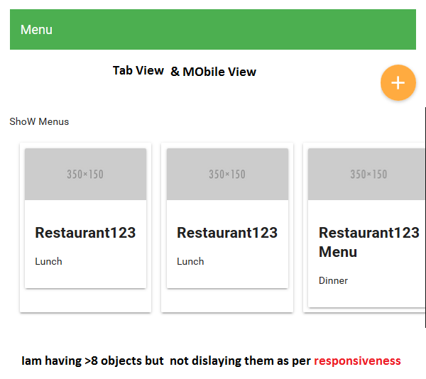
I'm displaying dynamic content by looping with <md-card> and <image> tags. My output is not responsive on tablet or mobile screens, showing a scrollbar instead of the next line. What's wrong with my code and how can I make it responsive?
<p>Show Menus</p>
<div layout="row" layout-margin >
  <md-card  ng-repeat="menu in sampleMenus">
   <md-card>
   <img src="http://placehold.it/350x150" class="md-card-image" alt="image caption"/>
    <md-card-content >
     <h2>{{menu.displayName}}</h2>
     <p>{{menu.type}}</p>
    </md-card-content>
       </md-card >
  </md-card>
</div>
Screenshots: 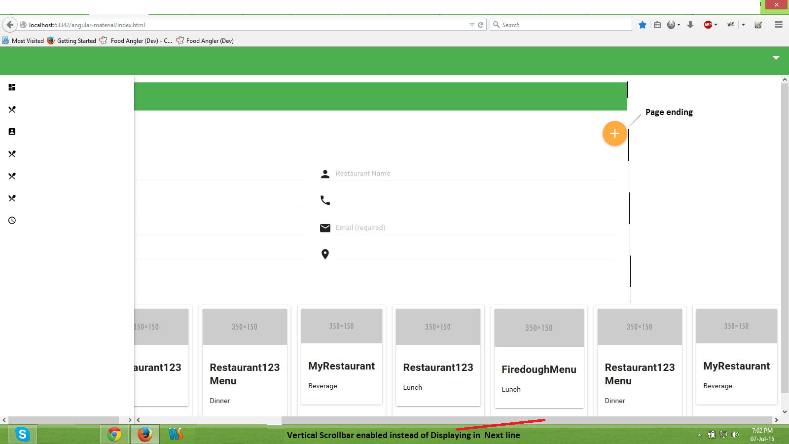
 211
211
This may help your cause.
http://codepen.io/sstorie/pen/myJWxQ
The key is those two classes added to the parent and the img in each card
.parent {
  overflow: hidden;
}

.card img {
  width: 100%;
  height: auto;
}
You can use the flex(width for row, height for column) attribute to declare md-card size and layout-wrap on the parent container. Layout-align might help your cause as well.
<div layout="row" layout-margin layout-wrap layout-align="center center">
     <md-card flex="25"> //25% of parent
                //content
     </md-card>
</div>
Check out the documentation for more options.
33
If you love us? You can donate to us via Paypal or buy me a coffee so we can maintain and grow! Thank you!
Donate Us With