 Menu
Menu
I'm working on a css animation that uses 'cogs and chains', but am unable to create a 'smooth' border rotation sequence.
You can see in this fiddle How (currently) I'm using a pseudo element to generate a 'rotation' effect. This is done by 'switching' between a dashed white and dashed gold colored border, making it seem like the 'border is rotating'.
What I have
#one{
  -webkit-animation: rotateClockwiseAnimation 5s linear infinite; /* Safari 4+ */
  -moz-animation:    rotateClockwiseAnimation 5s linear infinite; /* Fx 5+ */
  -o-animation:      rotateClockwiseAnimation 5s linear infinite; /* Opera 12+ */
  animation:         rotateClockwiseAnimation 5s linear infinite; /* IE 10+, Fx 29+ */

}
#two{
  -webkit-animation: rotateAntiClockwiseAnimation 5s linear infinite; /* Safari 4+ */
  -moz-animation:    rotateAntiClockwiseAnimation 5s linear infinite; /* Fx 5+ */
  -o-animation:      rotateAntiClockwiseAnimation 5s linear infinite; /* Opera 12+ */
  animation:         rotateAntiClockwiseAnimation 5s linear infinite; /* IE 10+, Fx 29+ */

 position:absolute;
    top:30px;
    left:42px;
    width:80px;
}

@-webkit-keyframes rotateClockwiseAnimation {
  0%   { transform: rotate(0deg); }
  100% { transform: rotate(360deg); }
}
@-moz-keyframes rotateClockwiseAnimation{
  0%   { transform: rotate(0deg); }
  100% { transform: rotate(360deg); }
}
@-o-keyframes rotateClockwiseAnimation {
  0%   { transform: rotate(0deg); }
  100% { transform: rotate(360deg); }
}
@keyframes rotateClockwiseAnimation {
  0%   { transform: rotate(0deg); }
  100% { transform: rotate(360deg); }
}

@-webkit-keyframes rotateAntiClockwiseAnimation {
  0%   { transform: rotate(0deg); }
  100% { transform: rotate(-360deg); }
}
@-moz-keyframes rotateAntiClockwiseAnimation {
  0%   { transform: rotate(0deg); }
  100% { transform: rotate(-360deg); }
}
@-o-keyframes rotateAntiClockwiseAnimation {
  0%   { transform: rotate(0deg); }
  100% { transform: rotate(-360deg); }
}
@keyframes rotateAntiClockwiseAnimation {
  0%   { transform: rotate(0deg); }
  100% { transform: rotate(-360deg); }
}

/******************************************************************************/

.chain{
    height:70px;
    width:80%;
    border:5px dashed gold;
    border-radius:30px;
    position:absolute;
    top:30px;
    left:40px;
          -webkit-animation: switchGoldBlackBorder 0.8s infinite; /* Safari 4+ */
  -moz-animation:    switchGoldBlackBorder 0.8s infinite; /* Fx 5+ */
  -o-animation:      switchGoldBlackBorder 0.8s infinite; /* Opera 12+ */
  animation:         switchGoldBlackBorder 0.8s infinite; /* IE 10+, Fx 29+ */
}


@-webkit-keyframes switchBlackGoldBorder {
    0%   { border: 5px dashed transparent; }
    49%   { border: 5px dashed transparent; }
    50%   { border: 5px dashed gold; }
    100%   { border: 5px dashed gold; }
}
@-moz-keyframes switchBlackGoldBorder{
    0%   { border: 5px dashed transparent; }
    49%   { border: 5px dashed transparent; }
    50%   { border: 5px dashed gold; }
    100%   { border: 5px dashed gold; }
}
@-o-keyframes switchBlackGoldBorder {
    0%   { border: 5px dashed transparent; }
    49%   { border: 5px dashed transparent; }
    50%   { border: 5px dashed gold; }
    100%   { border: 5px dashed gold; }
}
@keyframes switchBlackGoldBorder {
    0%   { border: 5px dashed transparent; }
    49%   { border: 5px dashed transparent; }
    50%   { border: 5px dashed gold; }
    100%   { border: 5px dashed gold; }
}


.chain:after{
    content:"";
    position:absolute;
    height:70px;
    border-radius:30px;
    width:100%;
    top:-5px;
    left:-5px;
    border:5px solid gold;
    z-index:-1;
          -webkit-animation: switchBlackGoldBorder 0.8s infinite; /* Safari 4+ */
  -moz-animation:    switchBlackGoldBorder 0.8s infinite; /* Fx 5+ */
  -o-animation:      switchBlackGoldBorder 0.8s infinite; /* Opera 12+ */
  animation:         switchBlackGoldBorder 0.8s infinite; /* IE 10+, Fx 29+ */
}

@-webkit-keyframes switchGoldBlackBorder {
  0%   { border: 5px solid gold; }
    49%   { border: 5px solid gold; }
    50%   { border: 5px solid white; }
    100%   { border: 5px solid white; }
}
@-moz-keyframes switchGoldBlackBorder{
  0%   { border: 5px solid gold; }
    49%   { border: 5px solid gold; }
    50%   { border: 5px solid white; }
    100%   { border: 5px solid white; }
}
@-o-keyframes switchGoldBlackBorder {
  0%   { border: 5px solid gold; }
    49%   { border: 5px solid gold; }
    50%   { border: 5px solid white; }
    100%   { border: 5px solid white; }
}
@keyframes switchGoldBlackBorder {
    0%   { border: 5px solid gold; }
    49%   { border: 5px solid gold; }
    50%   { border: 5px solid white; }
    100%   { border: 5px solid white; }
}
<svg id="one" style="width:50px" xmlns="http://www.w3.org/2000/svg" viewbox="0 0 100 100">
<defs>
<circle id="c" cx="50" cy="50" r="30" stroke="#808080" fill="none" stroke-width="25"/>
<path id="d" stroke="#808080" stroke-width="16" d="M50 0, V15 M50 100, V85 M0 50, H15 M100 50, H85"/>
</defs>
<use xlink:href="#c"/>
<use xlink:href="#d"/>
<use xlink:href="#d" transform="rotate(45, 50, 50)"/>
</svg>
<svg id="two" xmlns="http://www.w3.org/2000/svg" viewbox="0 0 100 100">
<use xlink:href="#one"/>
</svg>
<div class="chain"></div>So, the lower section of the snippet, you can see how I've generated the 'rotating chain effect' through using keyframes.
What I would like
My overall wish would be to generate something like:
Think of a cross section of a conveyor belt, and how the 'gears at the end drive the belt'. I'm trying to reproduce that. (i.e. the dashed border's gold bits should be within the troughs of the gear, and 'be pulled' by it)
#one{
  -webkit-animation: rotateClockwiseAnimation 5s linear infinite; /* Safari 4+ */
  -moz-animation:    rotateClockwiseAnimation 5s linear infinite; /* Fx 5+ */
  -o-animation:      rotateClockwiseAnimation 5s linear infinite; /* Opera 12+ */
  animation:         rotateClockwiseAnimation 5s linear infinite; /* IE 10+, Fx 29+ */
border:5px dashed gold;
  border-radius:50%;
}

@-webkit-keyframes rotateClockwiseAnimation {
  0%   { transform: rotate(0deg); }
  100% { transform: rotate(360deg); }
}
@-moz-keyframes rotateClockwiseAnimation{
  0%   { transform: rotate(0deg); }
  100% { transform: rotate(360deg); }
}
@-o-keyframes rotateClockwiseAnimation {
  0%   { transform: rotate(0deg); }
  100% { transform: rotate(360deg); }
}
@keyframes rotateClockwiseAnimation {
  0%   { transform: rotate(0deg); }
  100% { transform: rotate(360deg); }
}
<svg id="one" style="width:50px" xmlns="http://www.w3.org/2000/svg" viewbox="0 0 100 100">
<defs>
<circle id="c" cx="50" cy="50" r="30" stroke="#808080" fill="none" stroke-width="25"/>
<path id="d" stroke="#808080" stroke-width="16" d="M50 0, V15 M50 100, V85 M0 50, H15 M100 50, H85"/>
</defs>
<use xlink:href="#c"/>
<use xlink:href="#d"/>
<use xlink:href="#d" transform="rotate(45, 50, 50)"/>
</svg>but with the gold dashes to fit within the gear's troughs, as well as being 80% width of the screen (if that makes sense).
In the end, I would like to generate something like this image portrays:
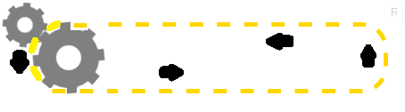
See how i want the chain to 'rotate'?
My Current Issues
 946
946
I totaly refactored the code (CSS and HTML), it is now :
DEMO
The approach is the same, animating the rotation angle for the cogs and dash-offset for the chain path. I tweaked the timing between both animations to make it look as if the cogs are pulling the chain.
As IE doesn't support the svg animate element I also made this version of the animation with the snap.svg library that also supports IE9 and over (tested in IE9 with crossbrowsertesting).
DEMO with IE support
var cont   = new Snap('#svg'),
    chain  = cont.select('#chain'),
    cogAcw = cont.select('#cog_acw'),
    cogCw  = cont.select('#cog_cw'),
    speed  = 500;  // Lower this number to make the animation faster

function infChain(el) {
    var len = el.getTotalLength();
    el.attr({"stroke-dasharray": len/62,"stroke-dashoffset": 0});
    el.animate({"stroke-dashoffset": -len/31}, speed, mina.linear, infChain.bind(null, el));
}
function rotateAcw(el) {
    el.transform('r22.5,20,20');
    el.animate({ transform: 'r-22.5,20,20' }, speed, mina.linear, rotateAcw.bind( null, el));
}
function rotateCw(el) {
    el.transform('r0,20,20');
    el.animate({ transform: 'r45,20,20' }, speed, mina.linear, rotateCw.bind( null, el));
}
infChain(chain);
rotateAcw(cogAcw);
rotateCw(cogCw);
svg {
width:100%;
}<script src="http://thisisa.simple-url.com/js/snapsvg.js"></script>
<svg id="svg" xmlns="http://www.w3.org/2000/svg" viewbox="0 0 100 30">
<defs>
<circle id="c" cx="20" cy="20" r="4" stroke="#808080" fill="none" stroke-width="4" />
<path id="d" stroke="#808080" stroke-width="2" d="M20 13 V16 M27 20 H24 M20 27 V24 M13 20 H16" />
<g id="cog_acw">
<use xlink:href="#c" /><use xlink:href="#d" />
<use xlink:href="#d" transform="rotate(45 20 20)" />
</g>
<g id="cog_cw">
<use xlink:href="#c" /><use xlink:href="#d" />
<use xlink:href="#d" transform="rotate(45 20 20)" />
</g>
</defs>
<path id="chain" stroke-width="1" stroke="#000" fill="transparent"
d="M21.3 13.5 H20 C11.4 13.5 11.4 26.5 20 26.5 H80 C89.4 26.5 89.4 13.5 80.8 13.5z" />
<use xlink:href="#cog_acw" />
<use transform="translate(60.5 0), rotate(19,20,20)" xlink:href="#cog_acw" />
<use transform="translate(-4.5 -4.5),scale(.8), rotate(0,20,20)" xlink:href="#cog_cw" />
</svg>svg{width:100%;}
#chain_st{
-webkit-animation: dash 1s infinite linear;
-moz-animation: dash 1s infinite linear;
-o-animation: dash 1s infinite linear;
animation: dash 1s infinite linear;
}
@-webkit-keyframes dash {
to { stroke-dashoffset: -5; }
}
@-moz-keyframes dash {
to { stroke-dashoffset: -5; }
}
@-o-keyframes dash {
to { stroke-dashoffset: -5; }
}
@keyframes dash {
to { stroke-dashoffset: -5; }
}<svg id="one" xmlns="http://www.w3.org/2000/svg" viewbox="0 0 100 30">
<defs>
<circle id="c" cx="20" cy="20" r="4" stroke="#808080" fill="none" stroke-width="4"/>
<path id="d" stroke="#808080" stroke-width="2" d="M20 13 V16 M27 20 H24 M20 27 V24 M13 20 H16"/>
<g id="cog">
<use xlink:href="#c"/>
<use xlink:href="#d"/>
<use xlink:href="#d" transform="rotate(45 20 20)"/>
</g>
</defs>
<g transform="translate(0,-7), scale(0.8), rotate(22.5 8 8)">
<use xlink:href="#cog">
<animateTransform attributeType="xml" attributeName="transform" type="rotate" from="-22.5 20 20" to="337.5 20 20" dur="8s" repeatCount="indefinite"/>
</use>
</g>
<path id="chain_st" stroke-width="1" stroke="#000" fill="transparent" stroke-dasharray="2.6 2.45" d="M21.3 13.5 H20 C11.4 13.5 11.4 26.5 20 26.5 H80 C89 26.5 89 13.5 80.8 13.5z" />
<use class="rot" xlink:href="#cog">
<animateTransform attributeType="xml" attributeName="transform" type="rotate"from="22.5 20 20" to="-337.5 20 20" dur="8s" repeatCount="indefinite"/>
</use>
<g transform="translate(60.3 0)">
<use class="" xlink:href="#cog">
<animateTransform attributeType="xml" attributeName="transform" type="rotate" from="22.5 20 20" to="-337.5 20 20" dur="8s" repeatCount="indefinite"/>
</use>
</g>
</svg>Original answer :
You could use an other svg dashed path and animate the dash-offset property with a keyframe animation.
This can and should be simplified/tweaked for a "real world" use :
<svg> tag (this would make it simpler and both cogs + chain could resize together)#one {
-webkit-animation: rotateClockwiseAnimation 5s linear infinite;
/* Safari 4+ */
-moz-animation: rotateClockwiseAnimation 5s linear infinite;
/* Fx 5+ */
-o-animation: rotateClockwiseAnimation 5s linear infinite;
/* Opera 12+ */
animation: rotateClockwiseAnimation 5s linear infinite;
/* IE 10+, Fx 29+ */
}
#two {
-webkit-animation: rotateAntiClockwiseAnimation 5s linear infinite;
/* Safari 4+ */
-moz-animation: rotateAntiClockwiseAnimation 5s linear infinite;
/* Fx 5+ */
-o-animation: rotateAntiClockwiseAnimation 5s linear infinite;
/* Opera 12+ */
animation: rotateAntiClockwiseAnimation 5s linear infinite;
/* IE 10+, Fx 29+ */
position: absolute;
top: 30px;
left: 42px;
width: 80px;
}
@-webkit-keyframes rotateClockwiseAnimation {
0% {
transform: rotate(0deg);
}
100% {
transform: rotate(360deg);
}
}
@-moz-keyframes rotateClockwiseAnimation {
0% {
transform: rotate(0deg);
}
100% {
transform: rotate(360deg);
}
}
@-o-keyframes rotateClockwiseAnimation {
0% {
transform: rotate(0deg);
}
100% {
transform: rotate(360deg);
}
}
@keyframes rotateClockwiseAnimation {
0% {
transform: rotate(0deg);
}
100% {
transform: rotate(360deg);
}
}
@-webkit-keyframes rotateAntiClockwiseAnimation {
0% {
transform: rotate(0deg);
}
100% {
transform: rotate(-360deg);
}
}
@-moz-keyframes rotateAntiClockwiseAnimation {
0% {
transform: rotate(0deg);
}
100% {
transform: rotate(-360deg);
}
}
@-o-keyframes rotateAntiClockwiseAnimation {
0% {
transform: rotate(0deg);
}
100% {
transform: rotate(-360deg);
}
}
@keyframes rotateAntiClockwiseAnimation {
0% {
transform: rotate(0deg);
}
100% {
transform: rotate(-360deg);
}
}
/******************************************************************************/
#chain {
width: 650px;
position: absolute;
top: 24px;
left: 35px;
}
.chain_st {
stroke-dasharray: 1.5;
stroke-dashoffset: 10;
-webkit-animation: dash 18s infinite linear;
-moz-animation: dash 18s infinite linear;
-o-animation: dash 18s infinite linear;
animation: dash 18s infinite linear;
}
@-webkit-keyframes dash {
to {
stroke-dashoffset: 100;
}
}
@-moz-keyframes dash {
to {
stroke-dashoffset: 100;
}
}
@-o-keyframes dash {
to {
stroke-dashoffset: 100;
}
}
keyframes dash {
to {
stroke-dashoffset: 100;
}
}<svg id="one" style="width:50px" xmlns="http://www.w3.org/2000/svg" viewbox="0 0 100 100">
<defs>
<circle id="c" cx="50" cy="50" r="30" stroke="#808080" fill="none" stroke-width="25" />
<path id="d" stroke="#808080" stroke-width="16" d="M50 0, V15 M50 100, V85 M0 50, H15 M100 50, H85" />
</defs>
<use xlink:href="#c" />
<use xlink:href="#d" />
<use xlink:href="#d" transform="rotate(45, 50, 50)" />
</svg>
<svg id="two" xmlns="http://www.w3.org/2000/svg" viewbox="0 0 100 100">
<use xlink:href="#one" />
</svg>
<svg id="chain" xmlns="http://www.w3.org/2000/svg" viewbox="0 0 70 10">
<path class="chain_st" stroke-width="0.5" stroke="#000" fill="transparent" d="M60 1 Q65 1 65 5 Q65 9 60 9 H6 Q1 9 1 5 Q1 1 6 1z" />
</svg>How about this approach? I'm using SVG for both the gears and the conveyor. The gears rotate as per your example, but I am using stroke-dasharray and animating stroke-dash-offset to make the conveyor belt move.
It took a bit of fiddling to get the conveyor length and dash timing right, which you would need to tweak again if you change the gear size or conveyor length.
#one{
  -webkit-animation: rotateClockwiseAnimation 4s linear infinite; /* Safari 4+ */
  -moz-animation:    rotateClockwiseAnimation 4s linear infinite; /* Fx 5+ */
  -o-animation:      rotateClockwiseAnimation 4s linear infinite; /* Opera 12+ */
  animation:         rotateClockwiseAnimation 4s linear infinite; /* IE 10+, Fx 29+ */

}
#two{
  -webkit-animation: rotateAntiClockwiseAnimation 4s linear infinite; /* Safari 4+ */
  -moz-animation:    rotateAntiClockwiseAnimation 4s linear infinite; /* Fx 5+ */
  -o-animation:      rotateAntiClockwiseAnimation 4s linear infinite; /* Opera 12+ */
  animation:         rotateAntiClockwiseAnimation 4s linear infinite; /* IE 10+, Fx 29+ */

 position:absolute;
    top:30px;
    left:42px;
    width:80px;
}

@-webkit-keyframes rotateClockwiseAnimation {
  0%   { transform: rotate(0deg); }
  100% { transform: rotate(360deg); }
}
@-moz-keyframes rotateClockwiseAnimation{
  0%   { transform: rotate(0deg); }
  100% { transform: rotate(360deg); }
}
@-o-keyframes rotateClockwiseAnimation {
  0%   { transform: rotate(0deg); }
  100% { transform: rotate(360deg); }
}
@keyframes rotateClockwiseAnimation {
  0%   { transform: rotate(0deg); }
  100% { transform: rotate(360deg); }
}

@-webkit-keyframes rotateAntiClockwiseAnimation {
  0%   { transform: rotate(0deg); }
  100% { transform: rotate(-360deg); }
}
@-moz-keyframes rotateAntiClockwiseAnimation {
  0%   { transform: rotate(0deg); }
  100% { transform: rotate(-360deg); }
}
@-o-keyframes rotateAntiClockwiseAnimation {
  0%   { transform: rotate(0deg); }
  100% { transform: rotate(-360deg); }
}
@keyframes rotateAntiClockwiseAnimation {
  0%   { transform: rotate(0deg); }
  100% { transform: rotate(-360deg); }
}


/******************************************************************************/

#chain
{
  -webkit-animation: conveyor 0.5s linear infinite; /* Safari 4+ */
  -moz-animation:    conveyor 0.5s linear infinite; /* Fx 5+ */
  -o-animation:      conveyor 0.5s linear infinite; /* Opera 12+ */
  animation:         conveyor 0.5s linear infinite; /* IE 10+, Fx 29+ */
}


@-webkit-keyframes conveyor {
    0%   { stroke-dashoffset: -9; }
    100% { stroke-dashoffset: 20.06; }
}
@-moz-keyframes conveyor {
    0%   { stroke-dashoffset: -9; }
    100% { stroke-dashoffset: 20.06; }
}
@-o-keyframes conveyor {
    0%   { stroke-dashoffset: -9; }
    100% { stroke-dashoffset: 20.06; }
}
@keyframes conveyor {
    0%   { stroke-dashoffset: -9; }
    100% { stroke-dashoffset: 20.06; }
}
<svg width="100%" xmlns="http://www.w3.org/2000/svg" viewbox="0 0 800 100">
<defs>
<circle id="c" cx="0" cy="0" r="30" stroke="#808080" fill="none" stroke-width="25"/>
<path id="d" stroke="#808080" stroke-width="16" d="M0,-50 v15 M0,50 v-15 M-50,0 h15 M50,0 h-15"/>
<g id="gear">
<use xlink:href="#c"/>
<use xlink:href="#d"/>
<use xlink:href="#d" transform="rotate(45)"/>
</g>
</defs>
<rect id="chain2"
x="43" y="23" width="598" height="74" rx="37"
stroke="gold" stroke-width="2" fill="none"/>
<g transform="translate(27,27) scale(0.5)">
<g id="one">
<use xlink:href="#gear"/>
</g>
</g>
<g transform="translate(80,60) scale(0.8)">
<g id="two">
<use xlink:href="#gear"/>
</g>
</g>
<rect id="chain"
x="43" y="23" width="598" height="74" rx="37"
stroke="gold" stroke-width="5" fill="none"
stroke-dasharray="14 15.06"/>
</svg>Note: I have remade the whole animation in box-shadow, because using dashed borders doesn't have consistent output on all the browsers.
.. and Works cross-browser.
FF 5+, GC 4+, IE9+, Safari 4+, Opera 12.1+
You can try this using box-shadow :
To make the gears teeth, use box-shadow with negative spread radius. The size of my gear was 50px for example, so to get round box-shadow with d=8px, I used -46px as spread radius.
I positioned the teeth using coordinate geo, and only used 8 teeth to simplify.
Now for the straight conveyor, we need to know the distance between the teeth. We get that by the following :
2*pi*(gear radius) / no. of teeth = (pi * r) / 4
Mine = (55 * 3.1415) / 4 = 43 (approx.)
I took the radius as 55 because the teeth have 4px radius and are lying 1px away from gear circumference.
For aligning the top and bottom straight conveyors, they need to be translated by any multiple of their distance. For my gear, I translate them by 43px.
FIDDLE
body {
    background: rgba(25,80,175, 0.4);
}
.rect {
    height: 116px;
    width: 401px;
    border-radius: 58px;
    position: relative;
    overflow: hidden;
}

.rect:before, .rect:after {
    content: '';
    position: absolute;
    left: 46px; /*50-half width*/
    height: 8px;
    width: 8px;
    border-radius: 50%;
    background: transparent;
    box-shadow: 43px 0 0 0 white, 86px 0 0 0 white, 129px 0 0 0 white, 172px 0 0 0 white, 215px 0 0 0 white, 258px 0 0 0 white, 301px 0 0 0 white;
    -webkit-animation: apple 0.3s linear infinite;
    -moz-animation: apple 0.3s linear infinite;
    animation: apple 0.3s linear infinite;
}
.rect:before {
    top: 0px;
}
.rect:after {
    bottom: 0px;
    -webkit-animation-direction: reverse;
    -moz-animation-direction: reverse;
    animation-direction: reverse;
}
@-webkit-keyframes apple {
    0% {-webkit-transform: translatex(0px);}
    100% {-webkit-transform: translateX(-43px);}
}
@-moz-keyframes apple {
    0% {-moz-transform: translatex(0px);}
    100% {-moz-transform: translateX(-43px);}
}
@keyframes apple {
    0% {transform: translatex(0px);}
    100% {transform: translateX(-43px);}
}
.left, .right {
    content: '';
    position: relative;
    height: 100px;
    width: 100px;
    border-radius: 50px;
    background-color: #222;
    box-shadow: 0 55px 0 -46px white, 55px 0 0 -46px white, 0 -55px 0 -46px white, -55px 0 0 -46px white,
        39px 39px 0 -46px white, -39px -39px 0 -46px white, 39px -39px 0 -46px white, -39px 39px 0 -46px white;
    -webkit-animation: mango 2.4s linear infinite;
    -moz-animation: mango 2.4s linear infinite;
    animation: mango 2.4s linear infinite;
}
.left {
    top: -108px;
    left: 0px;
}
.right {
    top: -208px;
    left: 301px;
}
@-webkit-keyframes mango {
    0% {-webkit-transform: rotate(0deg);}
    100% {-webkit-transform: rotate(-360deg);}
}
@-moz-keyframes mango {
    0% {-moz-transform: rotate(0deg);}
    100% {-moz-transform: rotate(-360deg);}
}
@keyframes mango {
    0% {transform: rotate(0deg);}
    100% {transform: rotate(-360deg);}
}
<div class="rect"></div>
<div class="left"></div>
<div class="right"></div>... with gears. The chain currently is dotted dashed!
FIDDLE
body {
    background-color: white;
}
.rect {
    height: 120px;
    width: 401px;
    border-radius: 58px;
    position: relative;
}

.rect:before, .rect:after {
    content: '';
    position: absolute;
    left: 40px; /*50-half width*/
    height: 10px;
    width: 20px;
    background: transparent;
    box-shadow: 43px 0 0 0 gold, 86px 0 0 0 gold, 129px 0 0 0 gold, 172px 0 0 0 gold, 215px 0 0 0 gold, 258px 0 0 0 gold, 301px 0 0 0 gold, 344px 0 0 0 gold; /*keep adding 43 to x-axis*/
    -webkit-animation: apple 0.6s linear infinite;
    -moz-animation: apple 0.6s linear infinite;
    animation: apple 0.6s linear infinite;
    overflow: hidden;
}
.rect:before {
    top: 0px;
}
.rect:after {
    bottom: 0px;
    -webkit-animation-direction: reverse;
    -moz-animation-direction: reverse;
    animation-direction: reverse;
}
@-webkit-keyframes apple {
    0% {-webkit-transform: translatex(0px);}
    100% {-webkit-transform: translateX(-43px);}
}
@-moz-keyframes apple {
    0% {-moz-transform: translatex(0px);}
    100% {-moz-transform: translateX(-43px);}
}
@keyframes apple {
    0% {transform: translatex(0px);}
    100% {transform: translateX(-43px);}
}
.left, .right {
    content: '';
    position: relative;
    height: 100px;
    width: 100px;
    border-radius: 50px;
    -webkit-animation: mango 4.8s linear infinite;
    -moz-animation: mango 4.8s linear infinite;
    animation: mango 4.8s linear infinite;
}
.left {
    top: -110px;
    left: 0px;
}
.right {
    top: -210px;
    left: 344px;
}
.left:before, .left:after, .right:before, .right:after {
    height: 20px;
    width: 20px;
    content: '';
    position: absolute;
    background-color: gold;
}
.left:before, .right:before {
    box-shadow: 50px 50px 0 0 gold, -50px 50px 0 0 gold, 0 100px 0 0 gold;
    top: -10px;
    left: 40px;
}
.left:after, .right:after {
    transform: rotate(45deg);
    top: 5px;
    left: 76px;
    box-shadow: 0px 100px 0 0 gold, 50px 50px 0 0 gold, -50px 50px 0 0 gold;
}
@-webkit-keyframes mango {
    0% {-webkit-transform: rotate(0deg);}
    100% {-webkit-transform: rotate(-360deg);}
}
@-moz-keyframes mango {
    0% {-moz-transform: rotate(0deg);}
    100% {-moz-transform: rotate(-360deg);}
}
@keyframes mango {
    0% {transform: rotate(0deg);}
    100% {transform: rotate(-360deg);}
}
.cover {
    height: 104px;
    width: 446px;
    border-radius: 50px;
    position: relative;
    background: rgba(255,255,255,1);
    top: -312px;
    left; -2px;

}
.gear, .gear2 {
    height: 100px;
    width: 100px;
    background: dimgray;
    border-radius: 50%;
    position: relative;
    -webkit-animation: gear 4.8s linear infinite;
    -moz-animation: gear 4.8s linear infinite;
    animation: gear 4.8s linear infinite;
}
.gear {
    top: -414px;

}
.gear2 {
    top: -514px;
    left: 345px;
}
.gear:before, .gear:after, .gear2:before, .gear2:after {
    height: 20px;
    width: 20px;
    content: '';
    position: absolute;
    background-color: dimgray;

}
.gear:before, .gear2:before {
    box-shadow: 50px 50px 0 0 dimgray, -50px 50px 0 0 dimgray, 0 100px 0 0 dimgray;
    top: -10px;
    left: 40px;
}
.gear:after, .gear2:after {
    transform: rotate(45deg);
    top: 5px;
    left: 76px;
    box-shadow: 0px 100px 0 0 dimgray, 50px 50px 0 0 dimgray, -50px 50px 0 0 dimgray;
}
@-webkit-keyframes gear {
    0% {-webkit-transform: rotate(22.5deg);}
    100% {-webkit-transform: rotate(-337.5deg);}
}
@-moz-keyframes gear {
    0% {-moz-transform: rotate(22.5deg);}
    100% {-moz-transform: rotate(-337.5deg);}
}
@keyframes gear {
    0% {transform: rotate(22.5deg);}
    100% {transform: rotate(-337.5deg);}
}
<div class="rect"></div>
<div class="left"></div>
<div class="right"></div>
<div class="cover"></div>
<div class="gear"></div>
<div class="gear2"></div>.rect {
height: 120px;
width: 401px;
border-radius: 58px;
position: relative;
}
.rect:before, .rect:after {
content: '';
position: absolute;
left: 40px; /*50-half width*/
height: 10px;
width: 20px;
box-shadow: 43px 0 0 0 gold, 86px 0 0 0 gold, 129px 0 0 0 gold, 172px 0 0 0 gold, 215px 0 0 0 gold, 258px 0 0 0 gold, 301px 0 0 0 gold, 344px 0 0 0 gold; /*keep adding 43 to x-axis*/
-webkit-animation: translate 0.6s linear infinite;
-moz-animation: translate 0.6s linear infinite;
animation: translate 0.6s linear infinite;
overflow: hidden;
}
.rect:before {top: 0px;}
.rect:after {
bottom: 0px;
-webkit-animation-direction: reverse;
-moz-animation-direction: reverse;
animation-direction: reverse;
}
@-webkit-keyframes translate {
0% {-webkit-transform: translatex(0px);}
100% {-webkit-transform: translateX(-43px);}
}
@-moz-keyframes translate {
0% {-moz-transform: translatex(0px);}
100% {-moz-transform: translateX(-43px);}
}
@keyframes translate {
0% {transform: translatex(0px);}
100% {transform: translateX(-43px);}
}
.left, .right {
position: relative;
height: 100px;
width: 100px;
border-radius: 50px;
-webkit-animation: rotate 4.8s linear infinite;
-moz-animation: rotate 4.8s linear infinite;
animation: rotate 4.8s linear infinite;
}
.left {
top: -110px; left: 0px;
}
.right {
top: -210px; left: 344px;
}
.left:before, .left:after, .right:before, .right:after {
height: 20px;
width: 20px;
content: '';
position: absolute;
background: gold;
}
.left:before, .right:before {
box-shadow: 50px 50px 0 0 gold, -50px 50px 0 0 gold, 0 100px 0 0 gold;
top: -10px;
left: 40px;
}
.left:after, .right:after {
transform: rotate(45deg);
top: 5px;
left: 76px;
box-shadow: 0px 100px 0 0 gold, 50px 50px 0 0 gold, -50px 50px 0 0 gold;
}
@-webkit-keyframes rotate {
0% {-webkit-transform: rotate(0deg);}
100% {-webkit-transform: rotate(-360deg);}
}
@-moz-keyframes rotate {
0% {-moz-transform: rotate(0deg);}
100% {-moz-transform: rotate(-360deg);}
}
@keyframes rotate {
0% {transform: rotate(0deg);}
100% {transform: rotate(-360deg);}
}
.cover {
height: 104px;
width: 446px;
border-radius: 50px;
position: relative;
background: rgba(255,255,255,1);
top: -312px;
left; -2px;
}
.gear, .gear2, .gear3 {
height: 100px;
width: 100px;
background: transparent;
box-shadow: inset 0 0 0px 35px dimgray, inset 0 0 0px 40px #444;
border-radius: 50%;
position: relative;
-webkit-animation: rotate 4.8s linear infinite;
-moz-animation: rotate 4.8s linear infinite;
animation: rotate 4.8s linear infinite;
-webkit-animation-delay: 0.3s;
-moz-animation-delay: 0.3s;
animation-delay: 0.3s;
}
.gear {top: -414px;}
.gear2 {top: -514px; left: 345px;}
.gear:before, .gear:after, .gear2:before, .gear2:after, .gear3:before, .gear3:after {
height: 20px;
width: 20px;
content: '';
border-radius: 20%;
position: absolute;
background: dimgray;
}
.gear:before, .gear2:before, .gear3:before {
box-shadow: 50px 50px 0 0 dimgray, -50px 50px 0 0 dimgray, 0 100px 0 0 dimgray;
top: -10px; left: 40px;
}
.gear:after, .gear2:after, .gear3:after {
transform: rotate(45deg);
top: 5px; left: 76px;
box-shadow: 0px 100px 0 0 dimgray, 50px 50px 0 0 dimgray, -50px 50px 0 0 dimgray;
}
.gear3 {
-webkit-animation-direction: reverse;
-moz-animation-direction: reverse;
animation-direction: reverse;
top: -504px;
-webkit-animation-delay: 0s;
-moz-animation-delay: 0s;
animation-delay: 0s;
}<div class="rect"></div>
<div class="left"></div>
<div class="right"></div>
<div class="cover"></div>
<div class="gear"></div>
<div class="gear2"></div>
<div class="gear3"></div>FIDDLE - ROUNDED TEETH
NOTE : To increase the speed of animation, you simply have to decrease the animation duration of each element proportionally.
Fiddle (fast)
18
Here is a different method on how to achieve cog animation using CSS. This method has been tested in IE11, IE10, Firefox, Chrome, Opera and Safari.
box-shadow to produce the inner circle. The teeth are produced by child elements (normal + pseudo) which are rotated around the axis..chain {
margin: 45px auto;
height: 100px;
width: 310px;
position: relative;
background: -webkit-linear-gradient(0deg, gold 50%, transparent 50%), -webkit-linear-gradient(0deg, gold 50%, transparent 50%), white;
background: -moz-linear-gradient(90deg, gold 50%, transparent 50%), -moz-linear-gradient(90deg, gold 50%, transparent 50%), white;
background: linear-gradient(90deg, gold 50%, transparent 50%), linear-gradient(90deg, gold 50%, transparent 50%), white;
background-size: 41px 5px;
background-repeat: repeat-x;
background-position: 20px 0px, 20px 95px;
-webkit-animation: bgPos 1s infinite linear;
-moz-animation: bgPos 1s infinite linear;
animation: bgPos 1s infinite linear;
}
.belt, .belt-after, .belt .spokes, .belt .spokes:before, .belt .spokes:after, .belt-after .spokes, .belt-after .spokes:before, .belt-after .spokes:after {
position: absolute;
content:'';
height: 90px;
width:15px;
top: 0px;
border-top: 5px solid gold;
border-bottom: 5px solid gold;
z-index: -1;
}
.belt, .belt-after {
-webkit-animation: borderAnim 8s infinite linear;
-moz-animation: borderAnim 8s infinite linear;
animation: borderAnim 8s infinite linear;
}
.belt .spokes, .belt-after .spokes {
top: -5px;
-webkit-transform: rotate(45deg);
-moz-transform: rotate(45deg);
transform: rotate(45deg);
}
.belt .spokes:before, .belt-after .spokes:before {
top: -5px;
-webkit-transform: rotate(90deg);
-moz-transform: rotate(90deg);
transform: rotate(90deg);
}
.belt .spokes:after, .belt-after .spokes:after {
top: -5px;
-webkit-transform: rotate(45deg);
-moz-transform: rotate(45deg);
transform: rotate(45deg);
}
.belt {
left: -16px;
}
.belt-after {
right: -16px;
}
.gear {
content:'';
position: absolute;
top: 5px;
height: 90px;
width: 90px;
border-radius: 50%;
-webkit-animation: borderAnim 8s infinite linear;
-moz-animation: borderAnim 8s infinite linear;
animation: borderAnim 8s infinite linear;
box-shadow: inset 0px 0px 0px 30px gray;
z-index: 4;
}
.gear:before, .gear .spokes, .gear .spokes:before, .gear .spokes:after {
position: absolute;
content:'';
height: 88px;
width:15px;
top: -5px;
border-top: 6px solid gray;
border-bottom: 6px solid gray;
}
.gear:before {
left: 37px;
-webkit-transform: rotate(22.5deg);
-moz-transform: rotate(22.5deg);
transform: rotate(22.5deg);
}
.gear .spokes {
left: 37px;
-webkit-transform: rotate(67.5deg);
-moz-transform: rotate(67.5deg);
transform: rotate(67.5deg);
}
.gear .spokes:before {
top: -6px;
-webkit-transform: rotate(45deg);
-moz-transform: rotate(45deg);
transform: rotate(45deg);
}
.gear .spokes:after {
-webkit-transform: rotate(90deg);
-moz-transform: rotate(90deg);
transform: rotate(90deg);
}
.chain .belt + .gear {
left:-52px;
}
.chain .belt-after + .gear {
right: -52.5px;
}
.gear-small {
content:'';
position: absolute;
left: -92px;
top: -20px;
height: 50px;
width: 50px;
border-radius: 50%;
-webkit-animation: borderAnim 6s infinite linear reverse;
-moz-animation: borderAnim 6s infinite linear reverse;
animation: borderAnim 6s infinite linear reverse;
box-shadow: inset 0px 0px 0px 20px gray;
z-index: -2;
}
.gear-small:before {
position: absolute;
content:'';
left: 21px;
top: -3px;
height: 48px;
width: 10px;
border-top:4px solid gray;
border-bottom: 4px solid gray;
}
.gear-small .spokes, .gear-small .spokes:before, .gear-small .spokes:after {
position: absolute;
content:'';
left: 21px;
top: -3px;
height: 48px;
width: 10px;
border-top:4px solid gray;
border-bottom: 4px solid gray;
}
.gear-small .spokes {
-webkit-transform: rotate(45deg);
-moz-transform: rotate(45deg);
transform: rotate(45deg);
}
.gear-small .spokes:before {
left: 0px;
-webkit-transform: rotate(90deg);
-moz-transform: rotate(90deg);
transform: rotate(90deg);
}
.gear-small .spokes:after {
left: 0px;
-webkit-transform: rotate(45deg);
-moz-transform: rotate(45deg);
transform: rotate(45deg);
}
@-webkit-keyframes borderAnim {
0% {
-webkit-transform: rotate(360deg);
}
100% {
-webkit-transform: rotate(0deg);
}
}
@-moz-keyframes borderAnim {
0% {
-moz-transform: rotate(360deg);
}
100% {
-moz-transform: rotate(0deg);
}
}
@keyframes borderAnim {
0% {
transform: rotate(360deg);
}
100% {
transform: rotate(0deg);
}
}
@-webkit-keyframes bgPos {
0% {
background-position: 20px 0px, -20px 95px;
}
100% {
background-position: -20px 0px, 20px 95px;
}
}
@-moz-keyframes bgPos {
0% {
background-position: 20px 0px, -20px 95px;
}
100% {
background-position: -20px 0px, 20px 95px;
}
}
@keyframes bgPos {
0% {
background-position: 20px 0px, -20px 95px;
}
100% {
background-position: -20px 0px, 20px 95px;
}
}<div class="chain">
<div class="gear-small">
<div class="spokes"></div>
</div>
<div class="belt">
<div class="spokes"></div>
</div>
<div class="gear">
<div class="spokes"></div>
</div>
<div class="belt-after">
<div class="spokes"></div>
</div>
<div class="gear">
<div class="spokes"></div>
</div>
</div>Bonus: Here is the whole animation with an on/off switch :) Click (pull) the chain handle to switch the animation on or off.
.container {
position: relative;
}
.chain {
margin: 45px 100px;
height: 100px;
width: 310px;
position: relative;
background: -webkit-linear-gradient(0deg, gold 50%, transparent 50%), -webkit-linear-gradient(0deg, gold 50%, transparent 50%), white;
background: -moz-linear-gradient(90deg, gold 50%, transparent 50%), -moz-linear-gradient(90deg, gold 50%, transparent 50%), white;
background: linear-gradient(90deg, gold 50%, transparent 50%), linear-gradient(90deg, gold 50%, transparent 50%), white;
background-size: 41px 5px;
background-repeat: repeat-x;
background-position: 20px 0px, 20px 95px;
-webkit-animation: bgPos 1s infinite linear;
-moz-animation: bgPos 1s infinite linear;
animation: bgPos 1s infinite linear;
}
.belt,
.belt-after,
.belt .spokes,
.belt .spokes:before,
.belt .spokes:after,
.belt-after .spokes,
.belt-after .spokes:before,
.belt-after .spokes:after {
position: absolute;
height: 90px;
width: 15px;
top: 0px;
border-top: 5px solid gold;
border-bottom: 5px solid gold;
z-index: -1;
}
.belt,
.belt-after {
-webkit-animation: borderAnim 8s infinite linear;
-moz-animation: borderAnim 8s infinite linear;
animation: borderAnim 8s infinite linear;
}
.belt .spokes,
.belt-after .spokes {
top: -5px;
-webkit-transform: rotate(45deg);
-moz-transform: rotate(45deg);
transform: rotate(45deg);
}
.belt .spokes:before,
.belt .spokes:after,
.belt-after .spokes,
.belt-after .spokes:before,
.belt-after .spokes:after {
content: '';
}
.belt .spokes:before,
.belt-after .spokes:before {
top: -5px;
-webkit-transform: rotate(90deg);
-moz-transform: rotate(90deg);
transform: rotate(90deg);
}
.belt .spokes:after,
.belt-after .spokes:after {
top: -5px;
-webkit-transform: rotate(45deg);
-moz-transform: rotate(45deg);
transform: rotate(45deg);
}
.belt {
left: -16px;
}
.belt-after {
right: -16px;
}
.gear {
position: absolute;
top: 5px;
height: 90px;
width: 90px;
border-radius: 100%;
-webkit-animation: borderAnim 8s infinite linear;
-moz-animation: borderAnim 8s infinite linear;
animation: borderAnim 8s infinite linear;
box-shadow: inset 0px 0px 0px 30px gray, inset 0px 0px 0px 40px white, inset 0px 0px 0px 50px tomato;
z-index: 4;
}
.gear:before,
.gear .spokes,
.gear .spokes:before,
.gear .spokes:after {
position: absolute;
content: '';
height: 88px;
width: 15px;
top: -5px;
border-top: 6px solid gray;
border-bottom: 6px solid gray;
}
.gear:before {
left: 37px;
-webkit-transform: rotate(22.5deg);
-moz-transform: rotate(22.5deg);
transform: rotate(22.5deg);
}
.gear .spokes {
left: 37px;
-webkit-transform: rotate(67.5deg);
-moz-transform: rotate(67.5deg);
transform: rotate(67.5deg);
}
.gear .spokes:before {
top: -6px;
-webkit-transform: rotate(45deg);
-moz-transform: rotate(45deg);
transform: rotate(45deg);
}
.gear .spokes:after {
-webkit-transform: rotate(90deg);
-moz-transform: rotate(90deg);
transform: rotate(90deg);
}
.chain .belt + .gear {
left: -52px;
}
.chain .belt-after + .gear {
right: -52.5px;
}
.gear-small {
position: absolute;
left: -91px;
top: -20px;
height: 50px;
width: 50px;
border-radius: 50%;
-webkit-animation: borderAnim 8s 0.4s infinite linear;
-moz-animation: borderAnim 6s infinite linear;
animation: borderAnim 6s infinite linear;
-webkit-animation-direction: reverse;
-moz-animation-direction: reverse;
animation-direction: reverse;
box-shadow: inset 0px 0px 0px 20px gray;
z-index: -2;
}
.gear-small:before {
position: absolute;
content: '';
left: 21px;
top: -3px;
height: 48px;
width: 10px;
border-top: 4px solid gray;
border-bottom: 4px solid gray;
}
.gear-small .spokes,
.gear-small .spokes:before,
.gear-small .spokes:after {
position: absolute;
content: '';
left: 21px;
top: -3px;
height: 48px;
width: 10px;
border-top: 4px solid gray;
border-bottom: 4px solid gray;
}
.gear-small .spokes {
-webkit-transform: rotate(45deg);
-moz-transform: rotate(45deg);
transform: rotate(45deg);
}
.gear-small .spokes:before {
left: 0px;
-webkit-transform: rotate(90deg);
-moz-transform: rotate(90deg);
transform: rotate(90deg);
}
.gear-small .spokes:after {
left: 0px;
-webkit-transform: rotate(45deg);
-moz-transform: rotate(45deg);
transform: rotate(45deg);
}
@-webkit-keyframes borderAnim {
0% {
-webkit-transform: rotate(360deg);
}
100% {
-webkit-transform: rotate(0deg);
}
}
@-moz-keyframes borderAnim {
0% {
-moz-transform: rotate(360deg);
}
100% {
-moz-transform: rotate(0deg);
}
}
@keyframes borderAnim {
0% {
transform: rotate(360deg);
}
100% {
transform: rotate(0deg);
}
}
@-webkit-keyframes bgPos {
0% {
background-position: 20px 0px, -20px 95px;
}
100% {
background-position: -20px 0px, 20px 95px;
}
}
@-moz-keyframes bgPos {
0% {
background-position: 20px 0px, -20px 95px;
}
100% {
background-position: -20px 0px, 20px 95px;
}
}
@keyframes bgPos {
0% {
background-position: 20px 0px, -20px 95px;
}
100% {
background-position: -20px 0px, 20px 95px;
}
}
#pull-switch {
display: none;
/* no need to display checkbox */
}
#switch {
position: absolute;
left: 77px;
top: 50px;
border-right: 2px dotted tomato;
height: 200px;
width: 15px;
-webkit-transition: height 0.5s;
-moz-transition: height 0.5s;
transition: height 0.5s;
z-index: 10;
}
#handle {
display: block;
position: absolute;
/* left: width of chain div (15px) + half of border (1px) - radius of handle (8px)*/
left: 8px;
bottom: 0%;
background-color: tomato;
width: 16px;
height: 16px;
border-radius: 50%;
cursor: pointer
}
#pull-switch:checked + #switch > #handle {
background-color: seagreen;
}
#pull-switch:checked + #switch {
height: 225px;
border-color: seagreen;
}
#pull-switch ~ .chain .gear-small,
#pull-switch ~ .chain .belt,
#pull-switch ~ .chain .belt-after,
#pull-switch ~ .chain .gear,
#pull-switch ~ .chain {
-webkit-animation-play-state: paused;
-moz-animation-play-state: paused;
animation-play-state: paused;
}
#pull-switch:checked ~ .chain .gear-small,
#pull-switch:checked ~ .chain .belt,
#pull-switch:checked ~ .chain .belt-after,
#pull-switch:checked ~ .chain .gear,
#pull-switch:checked ~ .chain {
-webkit-animation-play-state: running;
-moz-animation-play-state: running;
animation-play-state: running;
}
#pull-switch:checked ~ .chain .belt + .gear,
#pull-switch:checked ~ .chain .belt-after + .gear {
box-shadow: inset 0px 0px 0px 30px gray, inset 0px 0px 0px 40px white, inset 0px 0px 0px 50px seagreen;
}<div class="container">
<input type="checkbox" id="pull-switch" />
<div id="switch">
<label for="pull-switch" id="handle"></label>
</div>
<div class="chain">
    <div class="gear-small">
        <div class="spokes"></div>
    </div>
    <div class="belt">
        <div class="spokes"></div>
    </div>
    <div class="gear">
        <div class="spokes"></div>
    </div>
    <div class="belt-after">
        <div class="spokes"></div>
    </div>
    <div class="gear">
        <div class="spokes"></div>
    </div>
</div>
</div>Original Answer: (Doesn't work on Firefox due to dashed border bug and dashes are more closer in IE making it look ugly).
You could achieve the border rotation animation by using a combination of the following:
border-radius: 50%) with dashed border on either side to form the curved part of the border.linear-gradient. The background of this element (other than the gradient on top and bottom) is a solid color which is sort of a drawback. This solid color is used to hide half of the circular element on either side.background-position of the gradient backgrounds.box-shadow. The cog is rotated in such a way that the chain's border is always in between the cog's border..chain {
margin: 45px auto;
height: 100px;
width: 300px;
position: relative;
background: -webkit-linear-gradient(0deg, gold 50%, transparent 50%), -webkit-linear-gradient(0deg, gold 50%, transparent 50%), white;
background: -moz-linear-gradient(90deg, gold 50%, transparent 50%), -moz-linear-gradient(90deg, gold 50%, transparent 50%), white;
background: linear-gradient(90deg, gold 50%, transparent 50%), linear-gradient(90deg, gold 50%, transparent 50%), white;
background-size: 30px 5px;
background-repeat: repeat-x;
background-position: 0px 0px, 5px 95px;
-webkit-animation: bgPos 4s infinite linear;
-moz-animation: bgPos 4s infinite linear;
animation: bgPos 4s infinite linear;
}
.chain .before,
.chain .after {
position: absolute;
content: '';
height: 90px;
width: 90px;
top: 0px;
border-radius: 50%;
border: 5px dashed gold;
-webkit-animation: borderAnim 2s infinite linear;
-moz-animation: borderAnim 2s infinite linear;
animation: borderAnim 2s infinite linear;
z-index: -2;
}
.chain .before {
left: -45px;
}
.chain .after {
right: -45px;
}
.chain .gear {
content: '';
position: absolute;
top: 0px;
height: 90px;
width: 90px;
border-radius: 50%;
border: 5px dashed gray;
-webkit-transform: rotate(16deg);
-moz-transform: rotate(16deg);
transform: rotate(16deg);
-webkit-animation: gearAnim 2s infinite linear;
-moz-animation: gearAnim 2s infinite linear;
animation: gearAnim 2s infinite linear;
box-shadow: inset 0px 0px 0px 30px gray;
z-index: 4;
}
.chain .before + .gear {
left: -45px;
}
.chain .after + .gear {
right: -45px;
}
.gear-small {
content: '';
position: absolute;
left: -95px;
top: -23px;
height: 60px;
width: 60px;
border-radius: 50%;
border: 3px dashed gray;
-webkit-transform: rotate(16deg);
-moz-transform: rotate(16deg);
transform: rotate(16deg);
-webkit-animation: gearAnim 6s infinite linear reverse;
-moz-animation: gearAnim 6s infinite linear reverse;
animation: gearAnim 6s infinite linear reverse;
box-shadow: inset 0px 0px 0px 20px gray;
z-index: -2;
}
@-webkit-keyframes borderAnim {
0% {
-webkit-transform: rotate(360deg);
}
100% {
-webkit-transform: rotate(0deg);
}
}
@-moz-keyframes borderAnim {
0% {
-moz-transform: rotate(360deg);
}
100% {
-moz-transform: rotate(0deg);
}
}
@keyframes borderAnim {
0% {
transform: rotate(360deg);
}
100% {
transform: rotate(0deg);
}
}
@-webkit-keyframes bgPos {
0% {
background-position: 610px 0px, 0px 95px;
}
100% {
background-position: 0px 0px, 600px 95px;
}
}
@-moz-keyframes bgPos {
0% {
background-position: 610px 0px, 0px 95px;
}
100% {
background-position: 0px 0px, 600px 95px;
}
}
@keyframes bgPos {
0% {
background-position: 610px 0px, 0px 95px;
}
100% {
background-position: 0px 0px, 600px 95px;
}
}
@-webkit-keyframes gearAnim {
0% {
-webkit-transform: rotate(376deg);
}
100% {
-webkit-transform: rotate(16deg);
}
}
@-moz-keyframes gearrAnim {
0% {
-moz-transform: rotate(376deg);
}
100% {
-moz-transform: rotate(16deg);
}
}
@keyframes gearAnim {
0% {
transform: rotate(376deg);
}
100% {
transform: rotate(16deg);
}
}<div class="chain">
<div class="gear-small"></div>
<div class="before"></div>
<div class="gear"></div>
<div class="after"></div>
<div class="gear"></div>
</div>Last but not least, I would still recommend using the SVG approach for this because beyond a certain point such animations with CSS would become very messy :)
15
If you love us? You can donate to us via Paypal or buy me a coffee so we can maintain and grow! Thank you!
Donate Us With


