 Menu
Menu
I have a list of fruits with 10 entries. I want to make it so that the fruit name text (next to a mat-chip) are displayed in two columns with 5 in each column. The chips I am using are here: https://material.angular.io/components/chips/api
My CSS:
.flexp {
    display: flex;
    flex-wrap:wrap;
}

.flexc {
    flex-grow: 1;
    display: inline-block;
}
HTML
       <div class="flexp" *ngFor="let fruit of fruits">
              <div class="flexc">
                <mat-chip>
                  {{fruit.typeOfFruit}}
                </mat-chip>
                {{fruit.name}}
              </div>
          </div>
How can I do this? Right now my flexbox is going from top to bottom.
I want to make to so that it looks like a table, but without having to create the structure. If there was a way for the ngFor to be smart enough to make it display in this way... that is what I am looking for:
<table>
<tr>
<td>Fruit 1</td><td>Fruit 6</td>
<td>Fruit 2</td><td>Fruit 7</td>
<td>Fruit 3</td><td>Fruit 8</td>
<td>Fruit 4</td><td>Fruit 9</td>
<td>Fruit 5</td><td>Fruit 10</td></tr>
</table>
If it is not possible, please state.
 272
272
Approach: To create a two-column layout, first we create a <div> element with property display: flex, it makes that a div flexbox and then add flex-direction: row, to make the layout column-wise. Then add the required div inside the above div with require width and they all will come as columns.
I am assuming that the table code you gave as an example is wrong, since you mentionned that you want 2 columns with 5 rows, which is equivalent to this. The answer below is to have a display similar to the table here
<table>
<tr><td>Fruit 1</td><td>Fruit 6</td></tr>
<tr><td>Fruit 2</td><td>Fruit 7</td></tr>
<tr><td>Fruit 3</td><td>Fruit 8</td></tr>
<tr><td>Fruit 4</td><td>Fruit 9</td></tr>
<tr><td>Fruit 5</td><td>Fruit 10</td></tr>
</table>
If you want to use flex, you need to set flow-direction to column and have a max-height on the container, equal to 5 times the height of a row
scss
$rowHeight: 40px;
.flexp {
    display: flex;
    flex-wrap:wrap;
    flex-direction: column;
    max-height: calc(5 * #{$rowHeight});
}

.flexc {
    height: $rowHeight;
    flex-grow: 1;
    display: inline-block;
}
html
<mat-chip-list>
    <div class="flexp">
     <div class="flexc" *ngFor="let fruit of fruits">

        <mat-chip>
          {{fruit.typeOfFruit}}
        </mat-chip>
        {{fruit.name}}
      </div>
    </div>
</mat-chip-list>
Other solution not using flex
You can use the column-count property
scss
$rowHeight: 40px;
.fruitContainer {
    column-count: 2;
    max-height: calc(5 * #{$rowHeight});
}

.fruit {
    height: $rowHeight;
}
html
<mat-chip-list>
    <div class="fruitContainer">
     <div class="fruit" *ngFor="let fruit of fruits">
        <mat-chip>
            {{fruit.typeOfFruit}}
                    </mat-chip>
                    {{fruit.name}}
    </div>

</div>
</mat-chip-list>
Stackblitz demo
Below is the result
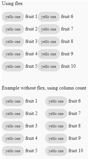
150
MatGridList is provided for this very reason.
<mat-grid-list cols="2" rowHeight="48px">
    <mat-grid-tile *ngFor="let fruit of fruits">
        <div class="flexc">
            <mat-chip>
                {{fruit.typeOfFruit}}
            </mat-chip>
            {{fruit.name}}
        </div>
    </mat-grid-tile>
</mat-grid-list>
See stackblitz example.
38
You can use CSS columns to define adaptive column layouts within a containing element. For example...
#container {
    -webkit-columns: 2 200px;
    -moz-columns: 2 200px;
    columns: 2 200px;
}
The first value (2) declares the number of columns and the second value (200px) declares their minimum width, such that the browser will collapse the columns if the container isn't wide enough. Vendor prefixing might not be strictly necessary but is still recommended.
See this CSS-Tricks post, which also deals with column gutters etc, for more info.
:)
27
If you love us? You can donate to us via Paypal or buy me a coffee so we can maintain and grow! Thank you!
Donate Us With