 Menu
Menu
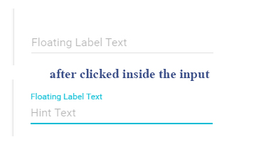
I want to display the label of an input inside its input, so that when I click the input, the label will animate and go above the input and change the styles of the input's border.
Like so:
* { margin: 0; padding: 0; } form { width: 100%; max-width: 500px; margin: 0 auto; outline: 1px solid lightgrey; padding: 10px; } label, input[type='text'], input[type='password'] { font-size: 12pt; padding: 8px; } label { color: grey; } input { border: none; outline: none; border-bottom: 1px solid grey; }<form> <label for="username">Username</label> <input id="username" name="username" type="text"/> <br/> <label for="password">Password</label> <input id="password" name="password" type="password"/> <br/> <input type="submit" value"login"/> </form>How can I achieve this with CSS?
 583
583
You just need to set a placeholder=" " (with a space) to your inputs (see this pen for live example) it works just like the required method but it's way more convenient since it works also with non required fields.
This looks a lot like the Google new material design inputs.
I created custom inputs for you that look like what you are looking for.
.input-group { position: relative; margin: 40px 0 20px; } input { font-size: 18px; padding: 10px 10px 10px 5px; display: block; width: 300px; border: none; border-bottom: 1px solid #757575; } input:focus { outline: none; } label { color: #999; font-size: 18px; font-weight: normal; position: absolute; pointer-events: none; left: 5px; top: 10px; transition: 0.2s ease all; -moz-transition: 0.2s ease all; -webkit-transition: 0.2s ease all; } input:focus ~ label, input:valid ~ label { top: -20px; font-size: 14px; color: #4285f4; } .bar { position: relative; display:block; width:315px; } .bar:before, .bar:after { content: ''; height: 2px; width: 0; bottom: 1px; position: absolute; background: #4285f4; transition: 0.2s ease all; -moz-transition: 0.2s ease all; -webkit-transition: 0.2s ease all; } .bar:before { left: 50%; } .bar:after { right: 50%; } input:focus ~ .bar:before, input:focus ~ .bar:after { width: 50%; } .highlight { position: absolute; height: 60%; width: 100px; top: 25%; left: 0; pointer-events: none; opacity: 0.5; } input:focus ~ .highlight { -webkit-animation: inputHighlighter 0.3s ease; -moz-animation: inputHighlighter 0.3s ease; animation: inputHighlighter 0.3s ease; } /* animations */ @-webkit-keyframes inputHighlighter { from { background: #4285f4; } to { width: 0; background: transparent; } } @-moz-keyframes inputHighlighter { from { background: #4285f4; } to { width: 0; background: transparent; } } @keyframes inputHighlighter { from { background: #4285f4; } to { width: 0; background: transparent; } }<div class="input-group"> <input type="text" required> <span class="highlight"></span> <span class="bar"></span> <label>Username</label> </div> <div class="input-group"> <input type="password" required> <span class="highlight"></span> <span class="bar"></span> <label>Password</label> </div>If you love us? You can donate to us via Paypal or buy me a coffee so we can maintain and grow! Thank you!
Donate Us With