 Menu
Menu
After searching everywhere i couldnt see exactly how i can design an inline form that has the following design: (using bootstrap 3 classes instead of css customizations when possible)
When the user has a wide screen:
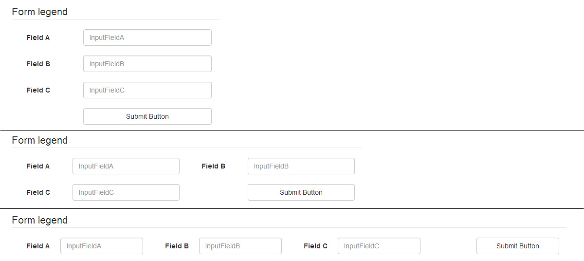
Form-Legend LabelFieldA: InputFieldA LabelFieldB: InputFieldB LabelFieldC: InputFieldC <Submit Button> When the user has a smaller screen:
Form-Legend LabelFieldA: InputFieldA LabelFieldB: InputFieldB LabelFieldC: InputFieldC <Submit Button> The idea is that the design initially puts all the fields in one line and if it doesnt fit the controls would jump to the next line, but maintaining the Label + Field together.
Also if there is a way so the spacing between each Label + Input is greater than the spacing between the Label and its Field.
And lastly if there is a way of having more vertical margin between the Label + Field when it jumps to the next line.
 218
218
You can use a structure mixing col-xs-12, col-sm-6 and col-lg-3 to get 1, 2 or 4 columns. Inside your form-group, remember to fix label/input sizes with col-xs-4 and col-xs-8 :
<div class="container"> <form class="form form-inline" role="form"> <legend>Form legend</legend> <div class="form-group col-xs-12 col-sm-6 col-lg-3"> <label for="InputFieldA" class="col-xs-4">Field A</label> <div class="col-xs-8"> <input type="text" class="form-control" id="InputFieldA" placeholder="InputFieldA"> </div> </div> <div class="form-group col-xs-12 col-sm-6 col-lg-3"> <label for="InputFieldB" class="col-xs-4">Field B</label> <div class="col-xs-8"> <input type="text" class="form-control" id="InputFieldB" placeholder="InputFieldB"> </div> </div> <div class="form-group col-xs-12 col-sm-6 col-lg-3"> <label for="InputFieldC" class="col-xs-4">Field C</label> <div class="col-xs-8"> <input type="text" class="form-control" id="InputFieldC" placeholder="InputFieldC"> </div> </div> <div class="form-group col-xs-12 col-sm-6 col-lg-3"> <button type="submit" class="btn btn-default col-xs-8 col-xs-offset-4">Submit Button</button> </div> </form> </div> You still need a few CSS :
// get a larger input, and align it with submit button .form-inline .form-group > div.col-xs-8 { padding-left: 0; padding-right: 0; } // vertical align label .form-inline label { line-height: 34px; } // force inline control to fit container width // http://getbootstrap.com/css/#forms-inline .form-inline .form-control { width: 100%; } // Reset margin-bottom for our multiline form @media (min-width: 768px) { .form-inline .form-group { margin-bottom: 15px; } } You can add as many inputs as you want.
Bootply
To be able to not care of the number of fields per row, you can use this structure :
<div class="container"> <form class="form form-inline form-multiline" role="form"> <legend>Form legend</legend> <div class="form-group"> <label for="InputFieldA">Field A</label> <input type="text" class="form-control" id="InputFieldA" placeholder="InputFieldA"> </div> <div class="form-group"> <label for="InputFieldB">Very Long Label For Field B</label> <input type="text" class="form-control" id="InputFieldB" placeholder="InputFieldB"> </div> <div class="form-group"> <label for="InputFieldC">F. C</label> <input type="text" class="form-control" id="InputFieldC" placeholder="InputFieldC"> </div> <div class="form-group"> <label for="InputFieldD">Very Long Label For Field D</label> <input type="text" class="form-control" id="InputFieldD" placeholder="InputFieldD"> </div> <div class="form-group"> <label for="InputFieldE">Very Long Label For Field E</label> <input type="text" class="form-control" id="InputFieldE" placeholder="InputFieldE"> </div> <div class="form-group"> <label for="InputFieldF">Field F</label> <input type="text" class="form-control" id="InputFieldF" placeholder="InputFieldF"> </div> <div class="form-group"> <button type="submit" class="btn btn-default">Submit Button</button> </div> </form> </div> And a few CSS lines to fix margins :
.form-multiline .form-group { margin-bottom: 15px; margin-right: 30px; } .form-multiline label, .form-multiline .form-control { margin-right: 15px; } 
Bootply
182
The same as option #1 from @zessx, but without overriding CSS. This one also aligns labels to the right to increase space between label-control pairs. Class "media" is there to add top margin without creating a custom class, but in general case it is better to have a custom one.
<div class="form-horizontal"> <legend>Form legend</legend> <div class="media col-xs-12 col-sm-6 col-lg-3"> <label for="InputFieldA" class="control-label text-right col-xs-4">Field A</label> <div class="input-group col-xs-8"> <input type="text" class="form-control" id="InputFieldA" placeholder="InputFieldA"> </div> </div> <div class="media col-xs-12 col-sm-6 col-lg-3"> <label for="InputFieldB" class="control-label text-right col-xs-4">Field B</label> <div class="input-group col-xs-8"> <input type="text" class="form-control" id="InputFieldB" placeholder="InputFieldB"> </div> </div> <div class="media col-xs-12 col-sm-6 col-lg-3"> <label for="InputFieldC" class="control-label text-right col-xs-4">Field C</label> <div class="input-group col-xs-8"> <input type="text" class="form-control" id="InputFieldC" placeholder="InputFieldC"> </div> </div> <div class="media col-xs-12 col-sm-6 col-lg-3"> <button type="submit" class="btn btn-default col-xs-8 col-xs-offset-4">Submit Button</button> </div> </div> Bootply
30
If you love us? You can donate to us via Paypal or buy me a coffee so we can maintain and grow! Thank you!
Donate Us With


