 Menu
Menu
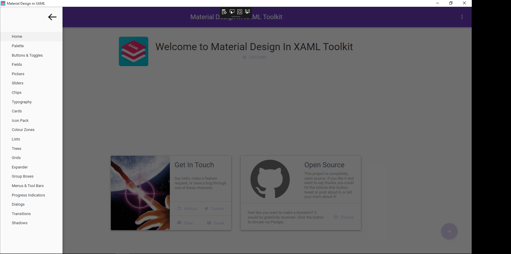
Here's a picture of the overlay from the sample app:
Here's the git page of the Material Design In XAML Toolkit (you can download the demo project here): Toolkit:https://github.com/ButchersBoy/MaterialDesignInXamlToolkit
This is probably property somewhere in the Material Design In XAML Toolkit library and i am asking if anyone knows how to set it (or if the overlay can even be turned off).
<Window x:Class="MaterialDesignColors.WpfExample.MainWindow"
        xmlns="http://schemas.microsoft.com/winfx/2006/xaml/presentation"
        xmlns:x="http://schemas.microsoft.com/winfx/2006/xaml"
        xmlns:wpfExample="clr-namespace:MaterialDesignColors.WpfExample"
        xmlns:domain="clr-namespace:MaterialDesignColors.WpfExample.Domain"
        xmlns:system="clr-namespace:System;assembly=mscorlib"
        xmlns:materialDesign="http://materialdesigninxaml.net/winfx/xaml/themes"
        xmlns:domain1="clr-namespace:MaterialDesignDemo.Domain"
        xmlns:materialDesignDemo="clr-namespace:MaterialDesignDemo"
        Title="Material Design in XAML" Height="800" Width="1100"
        TextElement.Foreground="{DynamicResource MaterialDesignBody}"
        TextElement.FontWeight="Regular"
        TextElement.FontSize="13"
        TextOptions.TextFormattingMode="Ideal"
        TextOptions.TextRenderingMode="Auto"
        Background="{DynamicResource MaterialDesignPaper}"
        FontFamily="{StaticResource MaterialDesignFont}" Icon="favicon.ico">
    <Window.Resources>
        <ResourceDictionary>
            <ResourceDictionary.MergedDictionaries>
                <ResourceDictionary Source="pack://application:,,,/MaterialDesignThemes.Wpf;component/Themes/MaterialDesignTheme.Button.xaml" />
                <ResourceDictionary Source="pack://application:,,,/MaterialDesignThemes.Wpf;component/Themes/MaterialDesignTheme.Shadows.xaml" />
                <ResourceDictionary Source="pack://application:,,,/MaterialDesignThemes.Wpf;component/Themes/MaterialDesignTheme.ToggleButton.xaml" />
            </ResourceDictionary.MergedDictionaries>

            <!-- data template used for the dialogs example, defines a View for a ViewModel of type DateTime  -->
            <DataTemplate DataType="{x:Type system:DateTime}">
                <StackPanel Margin="16">
                    <TextBlock>England win the World Cup:</TextBlock>
                    <TextBlock Margin="0 8 0 0" Text="{Binding }" />
                    <TextBlock Margin="0 8 0 0" >You will never see that again.</TextBlock>
                    <Button  Margin="0 8 0 0" IsDefault="True" Command="{x:Static materialDesign:DialogHost.CloseDialogCommand}" Style="{DynamicResource MaterialDesignFlatButton}">AWESOME</Button>
                </StackPanel>
            </DataTemplate>
        </ResourceDictionary>
    </Window.Resources>

    <materialDesign:DialogHost Identifier="RootDialog">
        <materialDesign:DrawerHost IsLeftDrawerOpen="{Binding ElementName=MenuToggleButton, Path=IsChecked}">
            <materialDesign:DrawerHost.LeftDrawerContent>
                <DockPanel MinWidth="212">
                    <ToggleButton Style="{StaticResource MaterialDesignHamburgerToggleButton}"
                                  DockPanel.Dock="Top"
                                  HorizontalAlignment="Right" Margin="16"
                                  IsChecked="{Binding ElementName=MenuToggleButton, Path=IsChecked, Mode=TwoWay}" />
                    <ListBox x:Name="DemoItemsListBox" Margin="0 16 0 16" SelectedIndex="0"
                             PreviewMouseLeftButtonUp="UIElement_OnPreviewMouseLeftButtonUp">
                        <ListBox.ItemTemplate>
                            <DataTemplate DataType="domain:DemoItem">
                                <TextBlock Text="{Binding Name}" Margin="32 0 32 0" />
                            </DataTemplate>
                        </ListBox.ItemTemplate>
                        <domain:DemoItem Name="Home">
...
                        <domain:DemoItem Name="Shadows">
                            <domain:DemoItem.Content>
                                <wpfExample:Shadows />
                            </domain:DemoItem.Content>
                        </domain:DemoItem>
                    </ListBox>
                </DockPanel>
            </materialDesign:DrawerHost.LeftDrawerContent>
            <DockPanel>
                <materialDesign:ColorZone Padding="16" materialDesign:ShadowAssist.ShadowDepth="Depth2"
                                          Mode="PrimaryMid" DockPanel.Dock="Top">
                    <DockPanel>
                        <ToggleButton Style="{StaticResource MaterialDesignHamburgerToggleButton}" IsChecked="False"
                                      x:Name="MenuToggleButton"/>
                        <materialDesign:PopupBox DockPanel.Dock="Right" PlacementMode="BottomAndAlignRightEdges" StaysOpen="False">
                            <StackPanel>
                                <Button Content="Hello World" Click="MenuPopupButton_OnClick"/>
                                <Button Content="Nice Popup" Click="MenuPopupButton_OnClick"/>
                                <Button Content="Goodbye" Click="MenuPopupButton_OnClick"/>
                            </StackPanel>
                        </materialDesign:PopupBox>
                        <TextBlock HorizontalAlignment="Center" VerticalAlignment="Center" FontSize="22">Material Design In XAML Toolkit</TextBlock>
                    </DockPanel>
                </materialDesign:ColorZone>
                <ContentControl Margin="16" Content="{Binding ElementName=DemoItemsListBox, Path=SelectedItem.Content}" />
            </DockPanel>
        </materialDesign:DrawerHost>
    </materialDesign:DialogHost>
</Window>
 737
737
The black shade is due to a grid defined in Generic.xaml:
<Grid x:Name="PART_ContentCover" Background="{x:Null}" Opacity="0"
      IsHitTestVisible="False" Focusable="False"  />
Which is animated to set the opacity to 0.56 when the drawer is drawn. Unfortunatelly this grid does not belong to any template so you cannot change it in client xaml.
The other option is to change the shade's black brush which is also defined in Generic.xaml:
<SolidColorBrush x:Key="BlackBackground" Color="Black" />
But this is also something I wouldn't know how to change from a client xaml, so the only advice until someone with more WPF skillz gives a better option is to simply recompile the source and change the black brush to:
<SolidColorBrush x:Key="BlackBackground" Color="#00000000" />
Alternatively you can use the flyout control which is shown in the other demo that does not have the dark shade feature but other than that is the same.
Update: I've found one way to solve this. You can subclass DrawerHost like this:
public class DrawerHostEx : DrawerHost
{
    public DrawerHostEx()
    {
    }

    public override void OnApplyTemplate()
    {
        base.OnApplyTemplate();
        var grid = GetTemplateChild(TemplateContentCoverPartName) as System.Windows.Controls.Grid;
        grid.Visibility = System.Windows.Visibility.Collapsed;
    }
}
Then you simply replace DrawerHost with DrawerHostEx in the XAML.
60
If you love us? You can donate to us via Paypal or buy me a coffee so we can maintain and grow! Thank you!
Donate Us With
