 Menu
Menu
How to create trapezoid tabs in WPF tab control?
I'd like to create non rectangular tabs that look like tabs in Google Chrome or like tabs in code editor of VS 2008.
Can it be done with WPF styles or it must be drawn in code?
Is there any example of code available on internet?
Edit:
There is lots of examples that show how to round corners or change colors of tabs, but I could not find any that changes geometry of tab like this two examples:
VS 2008 Code Editor Tabs
Google Chrome tabs
Tabs in this two examples are not rectangles, but trapezes.
 425
425
I tried to find some control templates or solutions for this problem on internet, but I didn’t find any “acceptable” solution for me. So I wrote it in my way and here is an example of my first (and last=)) attempt to do it:
<Window x:Class="TabControlTemplate.Window1"
    xmlns="http://schemas.microsoft.com/winfx/2006/xaml/presentation"
    xmlns:x="http://schemas.microsoft.com/winfx/2006/xaml"
    xmlns:src="clr-namespace:TabControlTemplate"
    Title="Window1" Width="600" Height="400">
<Window.Background>
    <LinearGradientBrush StartPoint="0,0" EndPoint="1,1">
        <GradientStop Color="#FF3164a5" Offset="1"/>
        <GradientStop Color="#FF8AAED4" Offset="0"/>
    </LinearGradientBrush>
</Window.Background>
<Window.Resources>
    <src:ContentToPathConverter x:Key="content2PathConverter"/>
    <src:ContentToMarginConverter x:Key="content2MarginConverter"/>

    <SolidColorBrush x:Key="BorderBrush" Color="#FFFFFFFF"/>
    <SolidColorBrush x:Key="HoverBrush" Color="#FFFF4500"/>
    <LinearGradientBrush x:Key="TabControlBackgroundBrush" EndPoint="0.5,0" StartPoint="0.5,1">
        <GradientStop Color="#FFa9cde7" Offset="0"/>
        <GradientStop Color="#FFe7f4fc" Offset="0.3"/>
        <GradientStop Color="#FFf2fafd" Offset="0.85"/>
        <GradientStop Color="#FFe4f6fa" Offset="1"/>
    </LinearGradientBrush>
    <LinearGradientBrush x:Key="TabItemPathBrush" StartPoint="0,0" EndPoint="0,1">
        <GradientStop Color="#FF3164a5" Offset="0"/>
        <GradientStop Color="#FFe4f6fa" Offset="1"/>
    </LinearGradientBrush>

    <!-- TabControl style -->
    <Style x:Key="TabControlStyle" TargetType="{x:Type TabControl}">
        <Setter Property="BorderThickness" Value="1"/>
        <Setter Property="Template">
            <Setter.Value>
                <ControlTemplate TargetType="TabControl">
                    <Grid>
                        <Grid.RowDefinitions>
                            <RowDefinition Height="Auto"/>
                            <RowDefinition Height="*"/>
                        </Grid.RowDefinitions>
                        <Border Grid.Row="1" BorderThickness="2,0,2,2" Panel.ZIndex="2" CornerRadius="0,0,2,2"
                                BorderBrush="{StaticResource BorderBrush}"
                                Background="{StaticResource TabControlBackgroundBrush}">
                            <ContentPresenter ContentSource="SelectedContent"/>
                        </Border>
                        <StackPanel Orientation="Horizontal" Grid.Row="0" Panel.ZIndex="1" IsItemsHost="true"/>
                        <Rectangle Grid.Row="0" Height="2" VerticalAlignment="Bottom"
                                   Fill="{StaticResource BorderBrush}"/>
                    </Grid>
                </ControlTemplate>
            </Setter.Value>
        </Setter>
    </Style>
    <!-- TabItem style -->
    <Style x:Key="{x:Type TabItem}" TargetType="{x:Type TabItem}">
        <Setter Property="SnapsToDevicePixels" Value="True"/>
        <Setter Property="Template">
            <Setter.Value>
                <ControlTemplate TargetType="TabItem">
                    <Grid x:Name="grd">
                        <Path x:Name="TabPath" StrokeThickness="2"
                              Margin="{Binding ElementName=TabItemContent, Converter={StaticResource content2MarginConverter}}"
                              Stroke="{StaticResource BorderBrush}"
                              Fill="{StaticResource TabItemPathBrush}">
                            <Path.Data>
                                <PathGeometry>
                                    <PathFigure IsClosed="False" StartPoint="1,0"
                                                Segments="{Binding ElementName=TabItemContent, Converter={StaticResource content2PathConverter}}">
                                    </PathFigure>
                                </PathGeometry>
                            </Path.Data>
                            <Path.LayoutTransform>
                                <ScaleTransform ScaleY="-1"/>
                            </Path.LayoutTransform>
                        </Path>
                        <Rectangle x:Name="TabItemTopBorder" Height="2" Visibility="Visible"
                                   VerticalAlignment="Bottom" Fill="{StaticResource BorderBrush}"
                                   Margin="{Binding ElementName=TabItemContent, Converter={StaticResource content2MarginConverter}}" />
                        <ContentPresenter x:Name="TabItemContent" ContentSource="Header"
                                          Margin="10,2,10,2" VerticalAlignment="Center"
                                          TextElement.Foreground="#FF000000"/>
                    </Grid>
                    <ControlTemplate.Triggers>
                        <Trigger Property="IsMouseOver" Value="True" SourceName="grd">
                            <Setter Property="Stroke" Value="{StaticResource HoverBrush}" TargetName="TabPath"/>
                        </Trigger>
                        <Trigger Property="Selector.IsSelected" Value="True">
                            <Setter Property="Fill" TargetName="TabPath">
                                <Setter.Value>
                                    <SolidColorBrush Color="#FFe4f6fa"/>
                                </Setter.Value>
                            </Setter>
                            <Setter Property="BitmapEffect">
                                <Setter.Value>
                                    <DropShadowBitmapEffect Direction="302" Opacity="0.4"
                                                        ShadowDepth="2" Softness="0.5"/>
                                </Setter.Value>
                            </Setter>
                            <Setter Property="Panel.ZIndex" Value="2"/>
                            <Setter Property="Visibility" Value="Hidden" TargetName="TabItemTopBorder"/>
                        </Trigger>
                    </ControlTemplate.Triggers>
                </ControlTemplate>
            </Setter.Value>
        </Setter>
    </Style>
</Window.Resources>
<Grid Margin="20">
    <TabControl Grid.Row="0" Grid.Column="1" Margin="5" TabStripPlacement="Top"
                Style="{StaticResource TabControlStyle}" FontSize="16">
        <TabItem Header="MainTab">
            <Border Margin="10">
                <TextBlock Text="The quick brown fox jumps over the lazy dog."/>
            </Border>
        </TabItem>
        <TabItem Header="VeryVeryLongTab" />
        <TabItem Header="Tab" />
    </TabControl>
</Grid>
using System;
using System.Windows;
using System.Windows.Controls;
using System.Windows.Data;
using System.Windows.Media;

namespace TabControlTemplate
{
public partial class Window1
{
    public Window1()
    {
        InitializeComponent();
    }
}

public class ContentToMarginConverter: IValueConverter
{
    #region IValueConverter Members

    public object Convert(object value, Type targetType, object parameter, System.Globalization.CultureInfo culture)
    {
        return new Thickness(0, 0, -((ContentPresenter)value).ActualHeight, 0);
    }

    public object ConvertBack(object value, Type targetType, object parameter, System.Globalization.CultureInfo culture)
    {
        throw new NotImplementedException();
    }

    #endregion
}

public class ContentToPathConverter: IValueConverter
{
    #region IValueConverter Members

    public object Convert(object value, Type targetType, object parameter, System.Globalization.CultureInfo culture)
    {
        var ps = new PathSegmentCollection(4);
        ContentPresenter cp = (ContentPresenter)value;
        double h = cp.ActualHeight > 10 ? 1.4 * cp.ActualHeight : 10;
        double w = cp.ActualWidth > 10 ? 1.25 * cp.ActualWidth : 10;
        ps.Add(new LineSegment(new Point(1, 0.7 * h), true));
        ps.Add(new BezierSegment(new Point(1, 0.9 * h), new Point(0.1 * h, h), new Point(0.3 * h, h), true));
        ps.Add(new LineSegment(new Point(w, h), true));
        ps.Add(new BezierSegment(new Point(w + 0.6 * h, h), new Point(w + h, 0), new Point(w + h * 1.3, 0), true));
        return ps;
    }

    public object ConvertBack(object value, Type targetType, object parameter, System.Globalization.CultureInfo culture)
    {
        throw new NotImplementedException();
    }

    #endregion
}
}
These two converters I wrote to adjust tab size to its content. Actually, I making Path object depending on content size. If you don’t need tabs with various widths, you can use some modified copy of this:
<Style x:Key="tabPath" TargetType="{x:Type Path}">
      <Setter Property="Stroke" Value="Black"/>
      <Setter Property="Data">
          <Setter.Value>
              <PathGeometry Figures="M 0,0 L 0,14 C 0,18 2,20 6,20 L 60,20 C 70,20 80,0 84,0"/>
          </Setter.Value>
      </Setter>
  </Style>
screen:
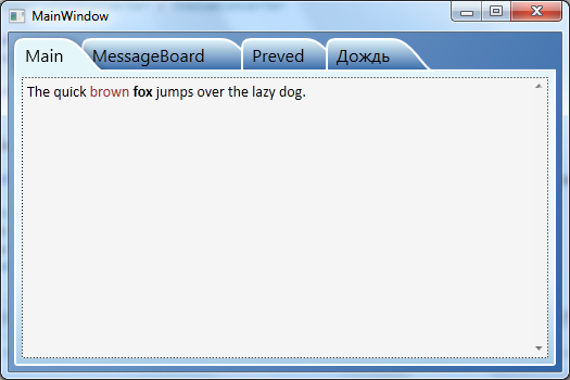
sample project(vs2010)
71
Note: This is only an appendix to rooks' great answer.
While rooks' solution was working perfectly at runtime for me I had some trouble when opening the MainWindow in the VS2010 WPF designer surface: The designer threw exceptions and didn't display the window. Also the whole ControlTemplate for TabItem in TabControl.xaml had a blue squiggle line and a tooltip was telling me that a NullReferenceException occurred. I had the same behaviour when moving the relevant code into my application. The problems were on two different machines so I believe it wasn't related to any problems of my installation.
In case that someone experiences the same issues I've found a fix so that the example works now at runtime and in the designer as well:
First: Replace in the TabControl-XAML code ...
<Path x:Name="TabPath" StrokeThickness="2"
      Margin="{Binding ElementName=TabItemContent,
               Converter={StaticResource content2MarginConverter}}"
      Stroke="{StaticResource BorderBrush}"
      Fill="{StaticResource TabItemPathBrush}">
    <Path.Data>
        <PathGeometry>
            <PathFigure IsClosed="False" StartPoint="1,0"
                 Segments="{Binding ElementName=TabItemContent,
                            Converter={StaticResource content2PathConverter}}">
            </PathFigure>
        </PathGeometry>
    </Path.Data>
    <Path.LayoutTransform>
        <ScaleTransform ScaleY="-1"/>
    </Path.LayoutTransform>
</Path>
... by ...
<Path x:Name="TabPath" StrokeThickness="2"
      Margin="{Binding ElementName=TabItemContent,
               Converter={StaticResource content2MarginConverter}}"
      Stroke="{StaticResource BorderBrush}"
      Fill="{StaticResource TabItemPathBrush}"
      Data="{Binding ElementName=TabItemContent,
             Converter={StaticResource content2PathConverter}}">
    <Path.LayoutTransform>
        <ScaleTransform ScaleY="-1"/>
    </Path.LayoutTransform>
</Path>
Second: Replace at the end of the Convert method of the ContentToPathConverter class ...
return ps;
... by ...
PathFigure figure = new PathFigure(new Point(1, 0), ps, false);
PathGeometry geometry = new PathGeometry();
geometry.Figures.Add(figure);

return geometry;
I have no explanation why this runs stable in the designer but not rooks' original code.
35
I just finished a Google Chrome-like Tab Control for WPF. You can find the project at https://github.com/realistschuckle/wpfchrometabs and blog posts describing it at
Hope that helps you get a better understanding of building a custom tab control from scratch.
12
<Grid>
    <Grid.Resources>
        <Style TargetType="{x:Type TabControl}">
            <Setter Property="ItemContainerStyle">
                <Setter.Value>
                    <Style>
                        <Setter Property="Control.Height" Value="20"></Setter>
                        <Setter Property="Control.Template">
                            <Setter.Value>
                                <ControlTemplate TargetType="{x:Type TabItem}">
                                    <Grid Margin="0 0 -10 0">
                                        <Grid.ColumnDefinitions>
                                            <ColumnDefinition Width="10">
                                            </ColumnDefinition>
                                            <ColumnDefinition></ColumnDefinition>
                                            <ColumnDefinition Width="10"></ColumnDefinition>
                                        </Grid.ColumnDefinitions>
                                        <Path Data="M10 0 L 0 20 L 10 20 " Fill="{TemplateBinding Background}" Stroke="Black"></Path>
                                        <Rectangle Fill="{TemplateBinding Background}" Grid.Column="1"></Rectangle>
                                        <Rectangle VerticalAlignment="Top" Height="1" Fill="Black" Grid.Column="1"></Rectangle>
                                        <Rectangle VerticalAlignment="Bottom" Height="1" Fill="Black" Grid.Column="1"></Rectangle>
                                        <ContentPresenter Grid.Column="1" ContentSource="Header" />
                                       <Path Data="M0 20 L 10 20 L0 0" Fill="{TemplateBinding Background}" Grid.Column="2" Stroke="Black"></Path>
                                    </Grid>
                                    <ControlTemplate.Triggers>
                                        <Trigger Property="IsSelected" Value="True">
                                            <Trigger.Setters>
                                                <Setter Property="Background" Value="Beige"></Setter>
                                                <Setter Property="Panel.ZIndex" Value="1"></Setter>
                                            </Trigger.Setters>
                                        </Trigger>
                                        <Trigger Property="IsSelected" Value="False">
                                            <Trigger.Setters>
                                                <Setter Property="Background" Value="LightGray"></Setter>
                                            </Trigger.Setters>
                                        </Trigger>
                                    </ControlTemplate.Triggers>
                                </ControlTemplate>
                            </Setter.Value>
                        </Setter>
                    </Style>
                </Setter.Value>
            </Setter>
        </Style>
    </Grid.Resources>
    <TabControl>
        <TabItem Header="One" ></TabItem>
        <TabItem Header="Two" ></TabItem>
        <TabItem Header="Three" ></TabItem>
    </TabControl>
</Grid>
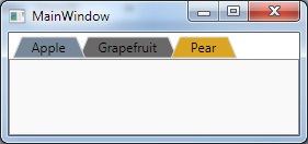
I know this is old but I'd like to propose:
XAML:
    <Window.Resources>

    <ControlTemplate x:Key="trapezoidTab" TargetType="TabItem">
        <Grid>
            <Polygon Name="Polygon_Part" Points="{Binding TabPolygonPoints}" />
            <ContentPresenter Name="TabContent_Part" Margin="{TemplateBinding Margin}" Panel.ZIndex="100" ContentSource="Header" HorizontalAlignment="Center" VerticalAlignment="Center"/>
        </Grid>

        <ControlTemplate.Triggers>

            <Trigger Property="IsMouseOver" Value="False">
                <Setter TargetName="Polygon_Part" Property="Stroke" Value="LightGray"/>
                <Setter TargetName="Polygon_Part" Property="Fill" Value="DimGray" />
            </Trigger>

            <Trigger Property="IsMouseOver" Value="True">
                <Setter TargetName="Polygon_Part" Property="Fill" Value="Goldenrod" />
                <Setter TargetName="Polygon_Part" Property="Stroke" Value="LightGray"/>
            </Trigger>

            <Trigger Property="IsSelected" Value="False">
                <Setter Property="Panel.ZIndex" Value="90"/>
            </Trigger>

            <Trigger Property="IsSelected" Value="True">
                <Setter Property="Panel.ZIndex" Value="100"/>
                <Setter TargetName="Polygon_Part" Property="Stroke" Value="LightGray"/>
                <Setter TargetName="Polygon_Part" Property="Fill" Value="LightSlateGray "/>
            </Trigger>


        </ControlTemplate.Triggers>

    </ControlTemplate>

</Window.Resources>

<!-- Test the tabs-->
<TabControl Name="FruitTab">
    <TabItem Header="Apple" Template="{StaticResource trapezoidTab}" />
    <TabItem Margin="-8,0,0,0" Header="Grapefruit" Template="{StaticResource trapezoidTab}" />
    <TabItem Margin="-16,0,0,0" Header="Pear" Template="{StaticResource trapezoidTab}"/>
</TabControl>
ViewModel:
    using System;
    using System.Collections.Generic;
    using System.Linq;
    using System.Text;
    using System.Threading.Tasks;
    using System.Windows;
    using System.Windows.Shapes;
    using System.ComponentModel;
    using System.Globalization;
    using System.Windows.Media;

    namespace TrapezoidTab
    {
        public class TabHeaderViewModel : INotifyPropertyChanged
        {
            public event PropertyChangedEventHandler PropertyChanged;
            private string _tabHeaderText;
            private List<Point> _polygonPoints;
            private PointCollection _pointCollection;

            public TabHeaderViewModel(string tabHeaderText)
            {
                _tabHeaderText = tabHeaderText;
                TabPolygonPoints = GenPolygon();
            }

            public PointCollection TabPolygonPoints
            {
                get { return _pointCollection; }
                set
                {
                    _pointCollection = value;
                    if (PropertyChanged != null)
                        PropertyChanged(this, new PropertyChangedEventArgs("TabPolygonPoints"));
                }
            }

            public string TabHeaderText
            {
                get { return _tabHeaderText; }
                set
                {
                    _tabHeaderText = value;
                    TabPolygonPoints = GenPolygon();
                    if (PropertyChanged != null)
                        PropertyChanged(this, new PropertyChangedEventArgs("TabHeaderText"));
                }
            }

            private PointCollection GenPolygon()
            {
                var w = new FormattedText(_tabHeaderText, CultureInfo.GetCultureInfo("en-us"), FlowDirection.LeftToRight, new Typeface("Tahoma"), 12, Brushes.Black);
                var width = w.Width + 30;

                _polygonPoints = new List<Point>(4);
                _pointCollection = new PointCollection(4);

                _polygonPoints.Add(new Point(2, 21));
                _polygonPoints.Add(new Point(10, 2));
                _polygonPoints.Add(new Point(width, 2));
                _polygonPoints.Add(new Point(width + 8, 21));

                foreach (var point in _polygonPoints)
                    _pointCollection.Add(point);

                return _pointCollection;
            }
        }
    }
Main:
namespace TrapezoidTab
{
    /// <summary>
    /// Interaction logic for MainWindow.xaml
    /// </summary>
    public partial class MainWindow : Window
    {
        public MainWindow()
        {
            InitializeComponent();

            foreach (var obj in FruitTab.Items)
            {
                var tab = obj as TabItem;
                if (tab == null) continue;
                tab.DataContext = new TabHeaderViewModel(tab.Header.ToString());
            }
        }
    }
}
If you love us? You can donate to us via Paypal or buy me a coffee so we can maintain and grow! Thank you!
Donate Us With


