 Menu
Menu
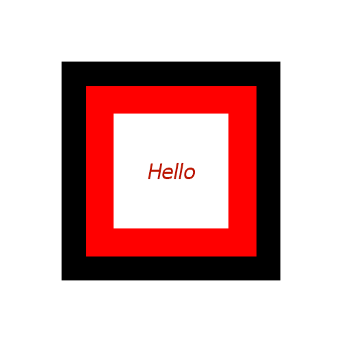
I needed spinning effect on hover of that square, what i can get is written below.
HTML
<div class="mainSquare">
  <div class="firstInnerSquare">
    <div class="lastInnerSquare">
      Hello
    </div>
  </div>
</div>
CSS
.mainSquare{
  width:160px;
  height:160px;
  background:black;
  margin: 50px auto;
  padding:25px;
}
.firstInnerSquare{
  width:110px;
  height:110px;
  background:red;
  padding:25px;
}
.lastInnerSquare{
  text-align:center;
  width:110px;
  padding: 46px 0px;
  background:white;
}
Fiddle
Hope to get help.
 348
348
You can do this by using a single element and two pseudos. Make the 2 pseudo elements larger than the container element, position them behind the container and add a rotate animation to them.
Note: This is only a base sample that would help you get started. I would leave the fine tuning part for you to handle. You can read more about the CSS animation properties in this MDN page.
.shape {
  position: relative; /* used to position the pseudos relative to the parent */
  height: 100px;
  width: 100px;
  background: white;
  border: 1px solid;
  margin: 100px; /* required because children are larger than parent */
}
.shape:after,
.shape:before {
  position: absolute;
  content: '';
}
.shape:before {
  height: 125%; /* make one pseudo 25% larger than parent */
  width: 125%;
  top: -12.5%; /* 25/2 to make sure its center is same as the parent's */
  left: -12.5%; /* 25/2 to make sure its center is same as the parent's */
  background: red;
  z-index: -1; /* send it behind the parent */
}
.shape:after {
  height: 150%; /* make this pseudo larger than the parent and the other pseudo */
  width: 150%;
  top: -25%; /* 50/2 to make sure its center is same as the parent's */
  left: -25%; /* 50/2 to make sure its center is same as the parent's */
  background: black;
  z-index: -2; /* send it behind both the parent and other pseudo */
}

/* add animation when hovering on parent */
.shape:hover:before {
  animation: rotate 3s linear infinite;
}
.shape:hover:after {
  animation: rotate-rev 3s linear infinite;
}
@keyframes rotate {
  to {
    transform: rotate(359deg); /* some browsers don't display spin when it is 360 deg */
  }
}
@keyframes rotate-rev {
  to {
    transform: rotate(-359deg); /* reverse direction rotate */
  }
}
<div class='shape'></div>If you love us? You can donate to us via Paypal or buy me a coffee so we can maintain and grow! Thank you!
Donate Us With

