 Menu
Menu
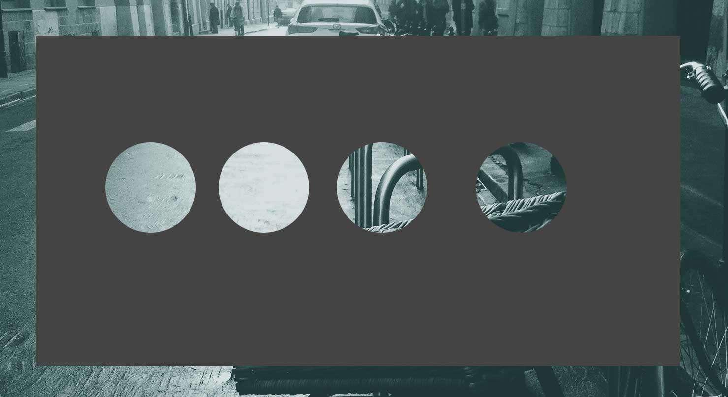
Is there a way to get this effect in CSS ?
I try to play with this css but it cuts only first layer.
div{
    width:300px;
    height:300px;
    position:relative;
    overflow:hidden;
}
div:before{
    content:'';
    position:absolute;
    bottom:50%;
    width:100%;
    height:100%;
    border-radius:100%;
    box-shadow: 0px 300px 0px 300px #448CCB;
}
 819
819
The simplest way is to use a transparent DIV with overflow hidden (the gray one)
than inside simply put a circle with box-shadow with really large spread.
html, body{height:100%;}
body{
    background: url(http://web-vassets.ea.com/Assets/Richmedia/Image/Screenshots/FIFA-Street-London1web.jpg?cb=1330546446) 50% / cover;
}

.hasCircle{
    width:150px;
    height:300px;
    position:relative;
    overflow:hidden;
  float:left;
}
.hasCircle:after{
    content:" ";
    position:absolute;
    left:0; right:0;
    margin:100px auto;
    width:100px;
    height:100px;
    border-radius:50%;
    box-shadow: 0 0 0 1000px #444;
}
<div class="hasCircle"></div>
<div class="hasCircle"></div>
<div class="hasCircle"></div>As you can see above I've used the :after pseudo element which might prevent some text in .hasCircle to be visible (due to the overlapping pseudo-element), but it's just to get an idea, you can do it using a real element like:
<div class="boxTransparentOverflow">
   <div class="theTransparentCircleWithGraySpread"></div>
   Some text
</div>
If you love us? You can donate to us via Paypal or buy me a coffee so we can maintain and grow! Thank you!
Donate Us With

