 Menu
Menu
Okay I apologize if this is a repeat - but I couldn't find any working answers anywhere.
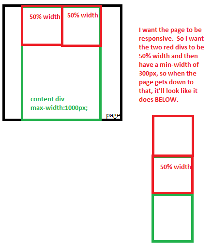
I want to have two divs (50% width each) side by side... so a left and a right - inside of a content div (see photo below).
I want them to have min-widths at 300px and once the page gets smaller than 600px (which is when both divs will reach their mins) I want to divs to wrap.. so one on top the other.
I've tried to do that here: fiddle but am having problems.
Here is EXACTLY what I want:
 990
990
You're making things hard for yourself! This can be done quickly and easily with inline-blocks. Have a nice JSfiddle.
Lets explain the code:
.wrapper
{
    text-align: center;   /* specifies that the inline-blocks (which are treated
        like text here) will be centered. */

    font-size: 0;  /* Explained later */
    max-width: 1000px;  /* Your desired max-width */
    position: relative;  /* These two lines center your wrapper in the page. */
    margin: 0 auto;
}
Now for the inside 50% elements:
.left, .right{
    display: inline-block;  /* This will treat these divs like a text element.
       This will work with the parent's "text-align: center" to center the element. */

    min-width: 300px;
    width: 50%;
    font-size: 16px;  /* Explained below */
    vertical-align: text-top;   /* Explained below */
}
You might be wondering why font-size is included. It is because with this method comes a little quirk - if a font size is kept at default, the div's will have an annoying gap between them that can not be eliminated with margin.

However, adding font-size: 0; to the parent element eliminates this gap. It's weird, and you then have to specify the font-size for your children elements, but it's well worth it for the ease of use.
But there's still a problem - the blue element is pushed down, and isn't flush on the top. This can be remedied with vertical-align: text-top; This will make sure all Div elements are aligned by the tops, so they lay in a more pleasant pattern. This is just another little quirk to remember when using inline-blocks. I know it seems like a lot of things to fix just for something this simple, but compared to your other options using inline-block is the cleanest and easiest way of going about this. (Though if you prefer, jshanley offers a very good alternative using float elements)

Also, because these children are now treated like text, they will automatically reposition themselves when the window gets too small! No media-queries needed. Yay.
Good luck.
166
Instead of using inline-block which causes some sizing quirks, you can use block elements, and float both .left and .right to the left, giving each a width of 50%.
Then to make them stack you need to do a little calculating. Since you specified that the wrapper is 80% of the page width, and the break point for the content is at 600px (each element 300px) the page's breakpoint would be at 750px since 80% of 750 is 600.
You can make a media query that will only apply styles when the page width is less than 750px and set .left and .right to width 100% to make them stack.
@media only screen and (max-width: 750px) {
    .left, .right {
        width: 100%;
    }
}
It's very simple to implement, and gives a good result, here's the fiddle.
22
I think both @jshanley and @emn178's answers do the trick, but I want to point something out:
The display: inline-block; css property doesn't work with float: right nor float: left, since when you use the float property, it ALWAYS automatically set the display property to block.
Since you're doing this:
.right{
   min-width:100px;
   background-color:purple;
   height:100%;
   margin-left:50%;
   display:inline-block;
}
The display: inline-block; property is doing nothing.
1
If you love us? You can donate to us via Paypal or buy me a coffee so we can maintain and grow! Thank you!
Donate Us With