 Menu
Menu
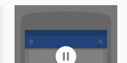
I would like my toolbar to change color using material design radial reaction choreography guideline
I would like to implement this as an angular 2 transition but I dont know exacly how to do it:
It would look like this..
@Component({
 ...
  animations: [
    trigger('heroState', [
    state('inactive', style({
      backgroundColor: '#eee',
      transform: 'scale(1)'
     })),
     state('active',   style({
       backgroundColor: '#cfd8dc',
       transform: 'scale(1.1)'
     })),
     transition('inactive => active', animate('100ms ease-in')),
     transition('active => inactive', animate('100ms ease-out'))
   ])
  ]
})
 922
922
Update: Updated PLUNKER, animation using box-shadow
@Component({
  selector: 'my-app',
  template: `
    <div class="head" [@mtSlide]="activeSlide == 1 ? 'active': 'inactive'">
      <input id="searchBar" type="search" [@mtTranslate]="activeSlide == 2 ? 'active': 'inactive'">

      <i class="fa fa-bars" [@mtRotate]="activeSlide == 1 ? 'active': 'inactive'" (click)="menuOpen()" [style.z-index]="activeSlide == 1 ? 1 : 0"></i>
      <i class="fa fa-arrow-left" [@mtRotate]="activeSlide == 2 ? 'active': 'inactive'" (click)="activeSlide = 1" [style.z-index]="activeSlide == 2 ? 1 : 0"></i>

      <i class="fa fa-search" [@mtScale]="activeSlide == 1 ? 'active': 'inactive'" style="right:10px; left: initial;"  (click)="activeSlide = 2"></i>
    </div>
  `,
  animations: [
    trigger('mtSlide', [
    state('inactive', style({
      'box-shadow': 'rgb(0, 102, 255) 0px 0px 0px 0px inset, rgb(0, 0, 0) 0px 2px 8px -3px'
    })),
    state('active', style({
      'box-shadow': 'rgb(0, 102, 255) 100vw 0px 0px 0px inset, rgb(0, 0, 0) 0px 2px 8px -3px'
    })),
    transition('inactive <=> active', animate('200ms ease-out'))
    ]),

    trigger('mtTranslate', [
    state('inactive', style({
      transform: 'translateX(100%)'
    })),
    state('active', style({
      transform: 'translateX(0)'
    })),
    transition('inactive <=> active', animate('200ms ease-out'))
    ]),

    trigger('mtRotate', [
    state('inactive', style({
      transform: 'rotateZ(-90deg)'
      opacity: 0;
    })),
    state('active', style({
      transform: 'rotateZ(0)';
      opacity: 1;
    })),
    transition('inactive <=> active', animate('300ms ease-out'))
    ]),

    trigger('mtScale', [
    state('inactive', style({
      transform: 'scale(0)'
    })),
    state('active', style({
      transform: 'scale(1)';
    })),
    transition('inactive <=> active', animate('400ms ease-out'))
    ])],

  styles: [`
    * {
      box-sizing: border-box;
    }

    .head {
      position: relative;
      font-size: 18px;
    }

    .head, .color-bar, .head > input {
      width: 100%;
      height: 50px;
    }

    .head i, .head > input{
      position: absolute;
    }

    .head i {
      line-height: 50px;
      cursor: pointer;
      color: white;
      padding: 0 10px;
      width: 50px;
      text-align: center;
      left: 10px;
    }

    .head i.fa-arrow-left {
      color: #111;
    }

    .head > input {
      border: 0;
      outline: 0;
      padding-left: 50px;
    }
  `]
})
export class App {
  activeSlide = 1;

  menuOpen() {
    alert('Menu Clicked');
  }
}
You might be able to mimic this design using CSS, and in particular, a pseudo element. It doesn't use any JS, but it may be required if you were to add multiple colours/etc.
.menu {
  height: 50px;
  width: 100%;
  background: lightgray;
  position: fixed;
  top: 0;
  left: 0;
  overflow: hidden;
}
.menu .button1 {
  position: absolute;
  top: 20%;
  left: 10px;
  height: 30px;
  width: 30px;
  background: tomato;
  cursor: pointer;
}
.menu .button1:before {
  content: "";
  position: absolute;
  top: 50%;
  left: 50%;
  transform: translate(-50%, -50%);
  border-radius: 50%;
  background: tomato;
  transition: all 1s;
  height: 0;
  width: 0;
  cursor: initial;
}
.menu .button1:hover:before {
  height: 300vw;
  width: 300vw;
}
<div class="menu">
<div class="button1"></div>
</div>If you love us? You can donate to us via Paypal or buy me a coffee so we can maintain and grow! Thank you!
Donate Us With