 Menu
Menu
How to stack divs in a circular manner in which last div should come beneath the first div but above the second last div. Is it possible with the css? any helps would be appreciated.
Please find the Codepen. Giving the sample code snippet
<div class="frame">
  <div class="lolly-pop__wrapper">
    <div class="lollypop-top">
      <div class="lollypop-top__item"></div>
      <div class="lollypop-top__item"></div>
      <div class="lollypop-top__item"></div>
      <div class="lollypop-top__item"></div>
      <div class="lollypop-top__item"></div>
      <div class="lollypop-top__item"></div>
      <div class="lollypop-top__item"></div>
      <div class="lollypop-top__item"></div>
      <div class="lollypop-top__item"></div>
      <div class="lollypop-top__item"></div>
      <div class="lollypop-top__item"></div>
      <div class="lollypop-top__item"></div>
    </div>
  </div>
</div>


.frame {
  position: absolute;
  display: flex;
  justify-content: center;
  top: 50%;
  left: 50%;
  width: 400px;
  height: 400px;
  margin-top: -200px;
  margin-left: -200px;
  border-radius: 2px;
  box-shadow: 4px 8px 16px 0 rgba(0,0,0,0.1);
  overflow: hidden;
  background: #F5CE51;
  color: #333;
  font-family: 'Open Sans', Helvetica, sans-serif;
  -webkit-font-smoothing: antialiased;
  -moz-osx-font-smoothing: grayscale;
}

.lollypop-top {
    position: relative;
    height: 150px;
    width: 150px;
    background-color: #fff;
    border-radius: 100%;
    overflow: hidden;

    .lollypop-top__item {
        position: absolute;
        height: 150px;
        width: 150px;
        top: -50%;
        border-radius: 100%;
        transform-origin: bottom;
        background-color: #fff;

        &:nth-child(odd) {
            background-color: #D70606;
        }

        &:nth-child(1) {
            transform: rotate(30deg);
        }

        &:nth-child(2) {
            transform: rotate(60deg);
        }

        &:nth-child(3) {
            transform: rotate(90deg);
        }

        &:nth-child(4) {
            transform: rotate(120deg);
        }

        &:nth-child(5) {
            transform: rotate(150deg);
        }

        &:nth-child(6) {
            transform: rotate(180deg);
        }

        &:nth-child(7) {
            transform: rotate(210deg);
        }

        &:nth-child(8) {
            transform: rotate(240deg);
        }

        &:nth-child(9) {
            transform: rotate(270deg);
        }

        &:nth-child(10) {
            transform: rotate(300deg);
        }

        &:nth-child(11) {
            transform: rotate(330deg);
        }

        &:nth-child(12) {
            transform: rotate(360deg);
        }
      }
    }
.frame {
  position: absolute;
  display: flex;
  justify-content: center;
  top: 50%;
  left: 50%;
  width: 400px;
  height: 400px;
  margin-top: -200px;
  margin-left: -200px;
  border-radius: 2px;
  box-shadow: 4px 8px 16px 0 rgba(0, 0, 0, 0.1);
  overflow: hidden;
  background: #F5CE51;
  color: #333;
  font-family: 'Open Sans', Helvetica, sans-serif;
  -webkit-font-smoothing: antialiased;
  -moz-osx-font-smoothing: grayscale;
}

.lollypop-top {
  position: relative;
  height: 150px;
  width: 150px;
  background-color: #fff;
  border-radius: 100%;
  overflow: hidden;
}

.lollypop-top .lollypop-top__item {
  position: absolute;
  height: 150px;
  width: 150px;
  top: -50%;
  border-radius: 100%;
  transform-origin: bottom;
  background-color: #fff;
}

.lollypop-top .lollypop-top__item:nth-child(odd) {
  background-color: #D70606;
}

.lollypop-top .lollypop-top__item:nth-child(1) {
  transform: rotate(30deg);
}

.lollypop-top .lollypop-top__item:nth-child(2) {
  transform: rotate(60deg);
}

.lollypop-top .lollypop-top__item:nth-child(3) {
  transform: rotate(90deg);
}

.lollypop-top .lollypop-top__item:nth-child(4) {
  transform: rotate(120deg);
}

.lollypop-top .lollypop-top__item:nth-child(5) {
  transform: rotate(150deg);
}

.lollypop-top .lollypop-top__item:nth-child(6) {
  transform: rotate(180deg);
}

.lollypop-top .lollypop-top__item:nth-child(7) {
  transform: rotate(210deg);
}

.lollypop-top .lollypop-top__item:nth-child(8) {
  transform: rotate(240deg);
}

.lollypop-top .lollypop-top__item:nth-child(9) {
  transform: rotate(270deg);
}

.lollypop-top .lollypop-top__item:nth-child(10) {
  transform: rotate(300deg);
}

.lollypop-top .lollypop-top__item:nth-child(11) {
  transform: rotate(330deg);
}

.lollypop-top .lollypop-top__item:nth-child(12) {
  transform: rotate(360deg);
}
<div class="frame">
<div class="lolly-pop__wrapper">
<div class="lollypop-top">
<div class="lollypop-top__item"></div>
<div class="lollypop-top__item"></div>
<div class="lollypop-top__item"></div>
<div class="lollypop-top__item"></div>
<div class="lollypop-top__item"></div>
<div class="lollypop-top__item"></div>
<div class="lollypop-top__item"></div>
<div class="lollypop-top__item"></div>
<div class="lollypop-top__item"></div>
<div class="lollypop-top__item"></div>
<div class="lollypop-top__item"></div>
<div class="lollypop-top__item"></div>
</div>
</div>
</div> 801
801
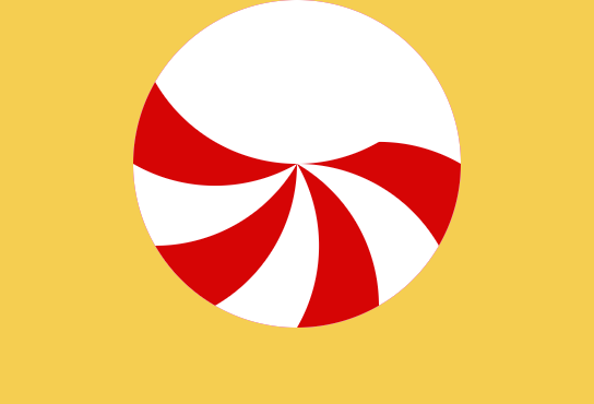
I would create this considering two elements (pseudo elements) and multiple radial gradient. You only need to create half the shape twice and rotate one of them.
.box {
  width:150px;
  height:150px;
  border-radius:100%;
  border:1px solid;
  position:relative;
  overflow:hidden;
}
.box::before,
.box::after{
  content:"";
  position:absolute;
  top:0;
  bottom:0;
  left:0;
  right:50%;
  background:
    /*we rotate by 30deg so will use :
       sin(30deg)*R = 0.5x75px   = 37.5px
       cos(30deg)*R = 0.866x75px = 64.95px
       10.05px = 75px - 64.95px;
       112.5px = 75px + 37.5px
       139.95px = 75px + 64.95px
       37.5px = 75px - 37.5px
       */
    radial-gradient(circle 75px at 139.95px 37.5px,red   98%,transparent 100%),
    radial-gradient(circle 75px at 112.5px 10.05px,white 98%,transparent 100%),
    radial-gradient(circle 75px at 75px    0,      red   98%,transparent 100%),
    radial-gradient(circle 75px at 37.5px  10.05px,white 98%,transparent 100%),
    radial-gradient(circle 75px at 10.05px 37.5px ,red   98%,transparent 100%),
    radial-gradient(circle 75px at 0       75px,   white 98%,transparent 100%),
    radial-gradient(circle 75px at 10.05px 112.5px,red   98%,transparent 100%);
}

.box::after {
 transform:rotate(180deg);
 transform-origin:right;
}
<div class="box">
</div>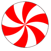
To make things more funny we can add CSS variables to easily control the shape:
.box {
  --R:50px; /*Radius*/
  --c1:red; /*first color*/
  --c2:#fff; /*second color*/

  --g1:var(--c1) 98%, transparent 100%;
  --g2:var(--c2) 98%, transparent 100%;
  width:calc(2*var(--R));
  height:calc(2*var(--R));
  border-radius:100%;
  border:1px solid;
  position:relative;
  overflow:hidden;
  display:inline-block;
  vertical-align:middle;
}
.box::before,
.box::after{
  content:"";
  position:absolute;
  top:0;
  bottom:0;
  left:0;
  right:50%;
  background:
     /*we rotate by 30deg so will use :
       sin(30deg)*R = 0.5xR
       cos(30deg)*R = 0.866xR
     */
    radial-gradient(circle var(--R) at calc(var(--R) + 0.866*var(--R)) calc(var(--R) - 0.5*var(--R))  ,var(--g1)),
    radial-gradient(circle var(--R) at calc(var(--R) + 0.5*var(--R))   calc(var(--R) - 0.866*var(--R)),var(--g2)),
    radial-gradient(circle var(--R) at var(--R)                        0                              ,var(--g1)),
    radial-gradient(circle var(--R) at calc(var(--R) - 0.5*var(--R))   calc(var(--R) - 0.866*var(--R)),var(--g2)),
    radial-gradient(circle var(--R) at calc(var(--R) - 0.866*var(--R)) calc(var(--R) - 0.5*var(--R))  ,var(--g1)),
    radial-gradient(circle var(--R) at 0                               var(--R)                        ,var(--g2)),
    radial-gradient(circle var(--R) at calc(var(--R) - 0.866*var(--R)) calc(var(--R) + 0.5*var(--R))  ,var(--g1));
}

/*the same shape rotated*/
.box::after {
 transform:rotate(180deg);
 transform-origin:right;
}
<div class="box"></div>
<div class="box" style="--R:80px;--c1:blue"></div>
<div class="box" style="--R:100px;--c1:green;--c2:yellow"></div>
<div class="box" style="--R:150px;--c1:white;--c2:pink"></div>Note that Safari doesn't support the syntax with at (explained here How to make radial gradients work in Safari?) so here is anothe syntax:
.box {
  --R:50px; /*Radius*/
  --c1:red; /*first color*/
  --c2:#fff; /*second color*/

  --g1:var(--c1) 98%, transparent 100%;
  --g2:var(--c2) 98%, transparent 100%;
  width:calc(2*var(--R));
  height:calc(2*var(--R));
  border-radius:100%;
  border:1px solid;
  position:relative;
  overflow:hidden;
  display:inline-block;
  vertical-align:middle;
}
.box::before,
.box::after{
  content:"";
  position:absolute;
  top:0;
  bottom:0;
  left:0;
  right:50%;
  background:
     /*we rotate by 30deg so will use :
       sin(30deg)*R = 0.5xR
       cos(30deg)*R = 0.866xR
     */
    radial-gradient(farthest-side,var(--g1)) calc(var(--R) + 0.866*var(--R) - var(--R)) calc(var(--R) - 0.5*var(--R) - var(--R)),

    radial-gradient(farthest-side,var(--g1)) calc(var(--R) + 0.866*var(--R) - var(--R)) calc(var(--R) - 0.5*var(--R) - var(--R)),
    radial-gradient(farthest-side,var(--g2)) calc(var(--R) + 0.5*var(--R) - var(--R))   calc(var(--R) - 0.866*var(--R) - var(--R)),
    radial-gradient(farthest-side,var(--g1)) 0 calc(-1*var(--R)),
    radial-gradient(farthest-side,var(--g2)) calc(var(--R) - 0.5*var(--R) - var(--R))   calc(var(--R) - 0.866*var(--R) - var(--R)),
    radial-gradient(farthest-side,var(--g1)) calc(var(--R) - 0.866*var(--R) - var(--R)) calc(var(--R) - 0.5*var(--R) - var(--R)),
    radial-gradient(farthest-side,var(--g2)) calc(-1*var(--R))  0,
    radial-gradient(farthest-side,var(--g1)) calc(var(--R) - 0.866*var(--R) - var(--R)) calc(var(--R) + 0.5*var(--R) - var(--R));
   background-size:calc(2*var(--R)) calc(2*var(--R));
   background-repeat:no-repeat;
}

/*the same shape rotated*/
.box::after {
 transform:rotate(180deg);
 transform-origin:right center;
}
<div class="box"></div>
<div class="box" style="--R:80px;--c1:blue"></div>
<div class="box" style="--R:100px;--c1:green;--c2:yellow"></div>
<div class="box" style="--R:150px;--c1:white;--c2:pink"></div>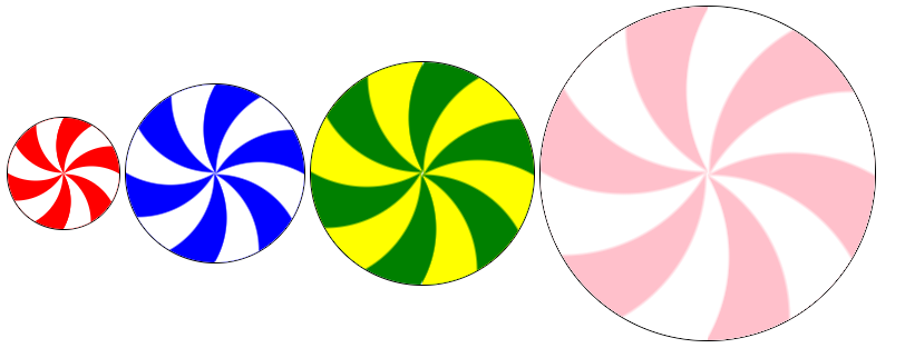
Here is a Codepen demo to play with the code
113
My approach would be a reusable SVG <symbol>, with paths shaped by quadratic-bézier curves:
#svg-lollipop path { transform-origin: 50% 50%; }

#svg-lollipop path:nth-child(2) {  transform: rotateZ(60deg); }
#svg-lollipop path:nth-child(3) {  transform: rotateZ(120deg); }
#svg-lollipop path:nth-child(4) {  transform: rotateZ(180deg); }
#svg-lollipop path:nth-child(5) {  transform: rotateZ(240deg); }
#svg-lollipop path:nth-child(6) {  transform: rotateZ(300deg); }

.lollipop {
  width: 30%;
  display: inline-block;
  overflow: hidden;
  border-radius: 50%;
  position: relative;
  margin: 0 20px;
  aspect-ratio: 1;
}

.lollipop svg {
  position: absolute;
  left: 0;
  top: 0;
  right: 0;
  bottom: 0;
  height: 100%;
  fill: currentColor;
}

.lollipop--animated {
  animation: rotate 10s linear 0s infinite;
}

@keyframes rotate {
  0% { transform: rotateZ(0) }
  100% { transform: rotateZ(1turn) }
}
<svg style="display: none;">
<symbol id="svg-lollipop">
<path d="M150,150 Q75,185 0,150 H0 V63.6 Q75,150 150,150 z" />
<path d="M150,150 Q75,185 0,150 H0 V63.6 Q75,150 150,150 z" />
<path d="M150,150 Q75,185 0,150 H0 V63.6 Q75,150 150,150 z" />
<path d="M150,150 Q75,185 0,150 H0 V63.6 Q75,150 150,150 z" />
<path d="M150,150 Q75,185 0,150 H0 V63.6 Q75,150 150,150 z" />
<path d="M150,150 Q75,185 0,150 H0 V63.6 Q75,150 150,150 z" />
</symbol>
</svg>
<div class="lollipop lollipop--animated"
style="background-color: #FFF; color:#E92120;">
<svg viewBox="0 0 300 300"><use xlink:href="#svg-lollipop"></use></svg>
</div>
<div class="lollipop"
style="background-color: #004991; color:#007BC1;">
<svg viewBox="0 0 300 300"><use xlink:href="#svg-lollipop"></use></svg>
</div>How it works
The same shape was cloned 6 times and rotated in order to fill the whole svg. In this example, every coloured shape has an angle α = 30deg.
Then from trigonometry we can find the coordinates of the origin points for the curves: in the path the y-coordinate 63.6 is obtained as 150 - (150 * tan(α)), so if you need to change the amount of shapes and the angle, you can easily find yourself the origin points (quadratic curves are really easy to draw).
Finally, the outer wrapper has a border-radius and a hidden overflow in order to give a rounded shape.

The final result is also responsive, since the outer wrapper keeps its 1:1 aspect ratio.
The white area can be changed with a background-color set on the container, the coloured area can be changed instead with the color property (the fill property of the svg elements is set to currentColor for your convenience).
something I've noticed later
if you add a box-shadow: inset 0 0 20px #aaa; to the wrapper the image looks like an inflatable beach balloon than a lollipop.
Serendipity.
29
If you love us? You can donate to us via Paypal or buy me a coffee so we can maintain and grow! Thank you!
Donate Us With