 Menu
Menu
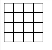
I have a grid made of DIV's with a fixed width and a border of 1 px. Now where two DIV's touch each other, the border becomes 2px, obviously.
How can I just get a 1px border in the whole grid?
This is what I mean:
http://jsfiddle.net/Before/4uPtj/
HTML:
<div class="gridcontainer">
  <div class="griditem"></div>
  <!-- 15 more times -->
</div>
CSS:
div.gridcontainer
{
  width: 80px;
  line-height: 0;
}

div.griditem
{
  display: inline-block;
  border: 1px solid black;
  width: 18px;
  height: 18px;
}
 693
693
The border-collapse property in CSS is used to set the borders of the cell present inside the table and tells whether these cells will share a common border or not. Syntax: border-collapse: separate|collapse|initial|inherit; Default Value : Its default value is separate.
When borders are “collapsed”, adjacent table cells share borders, and the cells at the edges of the table share their borders with the borders of the table itself. The two tables in the image are identical, except that their border model is specified using the border-collapse property.
Try this:
div.griditem
{
    display: inline-block;
    border: 1px solid black;
    width: 18px;
    height: 18px;
    margin-left: -1px;
    margin-bottom: -1px;
}
Hi you define you your gridcontainer with according to your griditem div
as like this
css
   div.gridcontainer
    {
        width: 76px;
        line-height: 0;
        border: solid black;
        border-width: 0 1px 1px 0;
    }

    div.griditem
    {
        display:inline-block;
        border: solid black;
        border-width: 1px 0 0 1px;
        width: 18px;
        height: 18px;
    }
HTML
<div class="gridcontainer">
    <div class="griditem"></div><div class="griditem"></div><div class="griditem"></div><div class="griditem"></div><div class="griditem"></div><div class="griditem"></div><div class="griditem"></div><div class="griditem"></div><div class="griditem"></div><div class="griditem"></div><div class="griditem"></div><div class="griditem"></div><div class="griditem"></div><div class="griditem"></div><div class="griditem"></div><div class="griditem"></div>
</div>
Live demo here http://jsfiddle.net/rohitazad/4uPtj/1/
17
Because of the title probably many ppl will end up here looking for solution for an actual css grid layout problem like myself. For them here's a workaround using a combination of grid-gap and box-shadow
.bar {
    max-width: 200px;
    display: grid;
    grid-template-columns: 1fr 1fr 1fr 1fr;
    grid-gap: 1px;
}
.foo {
  box-shadow: 0 0 0 1px #000;
}
<div class="bar">
<div class="foo">1</div>
<div class="foo">2</div>
<div class="foo">3</div>
<div class="foo">4</div>
<div class="foo">5</div>
<div class="foo">6</div>
<div class="foo">7</div>
<div class="foo">8</div>
<div class="foo">9</div>
</div>If you love us? You can donate to us via Paypal or buy me a coffee so we can maintain and grow! Thank you!
Donate Us With