 Menu
Menu
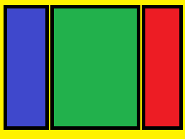
I have three divs in content div, When browser resizing
I also tried this in css
.yellow{
    height: 100%;
    width: 100%;
}
.red{
    height: 100%;
    width:200px;
    display:inline-block;
    background-color: red;
}
.green{
    height: 100%;
    min-width:400px;
    display:inline-block;
    background-color:green;
}
.blue{
    height: 100%;
    width:400px;
    display:inline-block;
    background-color: blue;
}
This code does not resize green div, In some browsers red panel not showing
I also tried float: left and
    display: -webkit-flex;
    display: flex;
but not working correctly. How to do this?
 672
672
Use flex-grow. Set it to 0 for the blue and red container, and something big for the green one:
.red{
    height: 100%;
    width:200px;
    flex-grow: 0;
    display:inline-block;
    background-color: red;
}
.green{
    height: 100%;
    min-width:400px;
    flex-grow: 1000;
    display:inline-block;
    background-color:green;
}
.blue{
    height: 100%;
    width:400px;
    flex-grow: 0;
    display:inline-block;
    background-color: blue;
}
A very good cheat sheet can be found here: https://css-tricks.com/snippets/css/a-guide-to-flexbox/
Also, don't forget the other properties like display: flex;and justify-content: space-between. It's perfectly explained in the above link.
Note, however, that you don't have to use flexbox. you can achieve the same with float, which makes it compatible with older browsers (To do so, just use display: block; and add float: left to the blue div and float: right; to the red one.)
96
If you love us? You can donate to us via Paypal or buy me a coffee so we can maintain and grow! Thank you!
Donate Us With