 Menu
Menu
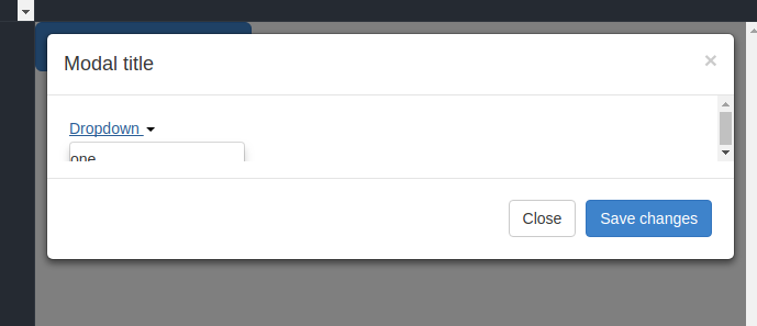
I am using Bootstrap modal with several dropdown into it due to bunch of stuff I set overflow: auto CSS property to have a scroll bar in modal.
Problem is when I open any of the dropdown it does not appear out of the modal (due to that CSS property overflow: auto) it hides under the modal (see image).
I want to appear that dropdown out of that modal I tried everything z-index: 999999; position: absolute etc but does not seems to work.
I googled and all solutions I found was to remove that overflow: auto property and to put overflow:visible but as I mentioned due to bunch of dropdowns (around 150) I must need to put scroll bar for overflow otherwise modal height mess the page.
CSS (mandatory)
.modal-body {
  max-height: 100px;
  overflow: auto;
}
The simple solution is you just replace that overflow:auto to visible and it works, but I need solution with keeping overflow:auto;
here is the working example on JSFiddle
Thanks in advance.
 209
209
You can do this, however not without breaking bootstraps responsiveness.
reset the position: relative; back to its initial position: static;
.modal-body,
.modal-body .dropdown {
   position: static;
}
The problem with it is that the dropdown doesn't know at which position it should be. So you have to position it yourself
.modal-body .dropdown-menu {
  top: 100px;
  left: 20px;
}
I woudn't recommend this solution, but just stick to the way bootstrap handles elements.
.modal-body {
  max-height: 100px;
  overflow: auto;
}

.modal-body,
.modal-body .dropdown {
  position: static !important;
}

.modal-body .dropdown-menu {
  top: 100px;
  left: 20px;
}
<link rel="stylesheet" type="text/css" href="https://netdna.bootstrapcdn.com/bootstrap/3.0.2/css/bootstrap.min.css">
<script src="https://ajax.googleapis.com/ajax/libs/jquery/2.1.1/jquery.min.js"></script>
<script src="https://netdna.bootstrapcdn.com/bootstrap/3.0.2/js/bootstrap.min.js"></script>
<!-- Button trigger modal -->
<button class="btn btn-primary btn-lg" data-toggle="modal" data-target="#myModal">
Launch demo modal
</button>
<!-- Modal -->
<div class="modal fade" id="myModal" tabindex="-1" role="dialog" aria-labelledby="myModalLabel" aria-hidden="true">
<div class="modal-dialog">
<div class="modal-content">
<div class="modal-header">
<button type="button" class="close" data-dismiss="modal" aria-hidden="true">×</button>
<h4 class="modal-title" id="myModalLabel">Modal title</h4>
</div>
<div class="modal-body">
<div class="dropdown">
<a id="dLabel" role="button" data-toggle="dropdown" data-target="#" href="#">
Dropdown <span class="caret"></span>
</a>
<br>
<ul class="dropdown-menu" role="menu" aria-labelledby="dLabel">
<li>one</li>
<li>two</li>
<li>three</li>
<li>four</li>
<li>five</li>
<li>six</li>
<li>seven</li>
<li>eight</li>
</ul>
</div>
</div>
<div class="modal-footer">
<button type="button" class="btn btn-primary" data-dismiss="modal">Done</button>
</div>
</div>
<!-- /.modal-content -->
</div>
<!-- /.modal-dialog -->
</div>
<!-- /.modal -->If you love us? You can donate to us via Paypal or buy me a coffee so we can maintain and grow! Thank you!
Donate Us With