 Menu
Menu
No hacks please
no hard coding. The idea is not solving it for one case, e.g. for the case that there is 4 columns, but solving it for dynamic content and for responsive screen sizes.
The problem to me is that it is basically not direct children, but the content of it
codepen here:
https://codepen.io/anon/pen/OxzrzV
HTML
<h1>disclaimer: resize the window. Make the blue headers in a row match height</h1>
<div class="row mycontainer">
  <div class="col-12 col-md-4 col-lg-3">
    <div class="item">
       <div class="header">bippo</div>
        <div class="content">some content lala some content lala </div>
    </div>
  </div>
    <div class="col-12 col-md-4 col-lg-3">
    <div class="item">
       <div class="header">bippo</div>
        <div class="content">some content lala </div>
    </div>
  </div>
    <div class="col-12 col-md-4 col-lg-3">
      <div class="item">
       <div class="header">bippo</div>
        <div class="content">some content lala </div>
      </div>
  </div>
  <div class="col-12 col-md-4 col-lg-3">
    <div class="item">
       <div class="header">bippo</div>
        <div class="content">some content lala </div>
    </div>
  </div>
    <div class="col-12 col-md-4 col-lg-3">
    <div class="item">
       <div class="header">bippo</div>
        <div class="content">some content lala some content lala some content lala </div>
    </div>
  </div>
    <div class="col-12 col-md-4 col-lg-3">
      <div class="item">
       <div class="header">oh no this header wraps</div>
        <div class="content">some content lala </div>
      </div>
  </div>
</div>
CSS
 body{
  padding: 20px;
}

.item{
  height: 100%;
  padding-right: 20px;
  padding-top: 20px;
  display: flex;
  flex-direction: column
}

.header{
  background-color: cornflowerblue;
}

.content{
  background-color: salmon;
  flex-grow: 1;
}

.mycontainer{
  max-width: 500px;
}
what do I want?
the blue headers to always have the same size like all elements in the current row.
a solid jquery solution is fine too... but it must be fool proof and work on resize as well. General change of structure of html is fine too. But must be responsive right.
so this (achieved by hard coding and not responsive):
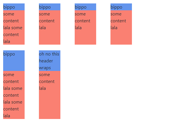
 835
835
There are basically 2 ways to accomplish this, the CSS way,
and the script way, here using jQuery.
The first script sample shows how to set equal height on all items.
Second sample set equal height per row, and the way to make that work is to check the item's top value (it changes for a new row) and set the height for each processed range/row.
I also added a couple of optimizations, preload items and so it won't process them if there is only 1 item or column.
Updated codepen 1
Stack snippet 1
(function ($) {

  // preload object array to gain performance
  var $headers = $('.header')

  // run at resize
  $( window ).resize(function() {
    $.fn.setHeaderHeight(0);
  });

  $.fn.setHeaderHeight = function(height) {

    // reset to auto or else we can't check height
    $($headers).css({ 'height': 'auto' });

    // get highest value
    $($headers).each(function(i, obj) {
      height = Math.max(height, $(obj).outerHeight())
    });

    // set the height
    $($headers).css({ 'height': height + 'px' });
  }

  // run at load
  $.fn.setHeaderHeight(0);

}(jQuery));
body{
padding: 20px;
}
.item{
height: 100%;
padding-right: 20px;
padding-top: 20px;
display: flex;
flex-direction: column
}
.header{
background-color: cornflowerblue;
}
.content{
background-color: salmon;
flex-grow: 1;
}
.mycontainer{
max-width: 500px;
}<script src="https://cdnjs.cloudflare.com/ajax/libs/jquery/3.2.1/jquery.min.js"></script>
<link href="https://maxcdn.bootstrapcdn.com/bootstrap/4.0.0-beta/css/bootstrap.css" rel="stylesheet"/>
<div class="row mycontainer">
<div class="col-12 col-md-4 col-lg-3">
<div class="item">
<div class="header">bippo</div>
<div class="content">some content lala some content lala </div>
</div>
</div>
<div class="col-12 col-md-4 col-lg-3">
<div class="item">
<div class="header">bippo</div>
<div class="content">some content lala </div>
</div>
</div>
<div class="col-12 col-md-4 col-lg-3">
<div class="item">
<div class="header">bippo</div>
<div class="content">some content lala </div>
</div>
</div>
<div class="col-12 col-md-4 col-lg-3">
<div class="item">
<div class="header">bippo</div>
<div class="content">some content lala </div>
</div>
</div>
<div class="col-12 col-md-4 col-lg-3">
<div class="item">
<div class="header">bippo</div>
<div class="content">some content lala some content lala some content lala </div>
</div>
</div>
<div class="col-12 col-md-4 col-lg-3">
<div class="item">
<div class="header">oh no this header wraps</div>
<div class="content">some content lala </div>
</div>
</div>
</div>Updated codepen 2
Stack snippet 2
(function ($) {
  //  preload object array to gain performance
  var $headers = $('.header')

  // only do this if there is more than 1 item
  if ($headers.length < 2) { return; }

  //  run at resize
  $( window ).resize(function() {
    $.fn.setHeaderHeight(0,0);
  });

  $.fn.setHeaderHeight = function(height, idx) {
    // reset to auto or else we can't check height
    $($headers).css({ 'height': 'auto' });

    $($headers).each(function(i, obj) {

      // only continue if there is more than 1 column
      if ($($headers).eq(0).offset().top !== $($headers).eq(1).offset().top  ) {
        return false;
      }

      // get highest value
      height = Math.max(height, $(obj).outerHeight())

      // did top value changed or are we at last item
      if (i != 0 && $($headers).eq(i - 1).offset().top != $(obj).offset().top) {

        // set height for row
        $($headers).slice(idx, i).css({ 'height': height + 'px' });

        // reset height and startIndex
        height = 0;
        idx = i;
      } else if ($headers.length - 1 == i) {

        // last row
        $($headers).slice(idx, i + 1).css({ 'height': height + 'px' });
      }

    });
  }

  //  run at load
  $.fn.setHeaderHeight(0,0);

}(jQuery));
body{
padding: 20px;
}
.item{
height: 100%;
padding-right: 20px;
padding-top: 20px;
display: flex;
flex-direction: column
}
.header{
background-color: cornflowerblue;
}
.content{
background-color: salmon;
flex-grow: 1;
}
.mycontainer{
max-width: 500px;
}<script src="https://cdnjs.cloudflare.com/ajax/libs/jquery/3.2.1/jquery.min.js"></script>
<link href="https://maxcdn.bootstrapcdn.com/bootstrap/4.0.0-beta/css/bootstrap.css" rel="stylesheet"/>
<div class="row mycontainer">
<div class="col-12 col-md-4 col-lg-3">
<div class="item">
<div class="header">bippo</div>
<div class="content">some content lala some content lala </div>
</div>
</div>
<div class="col-12 col-md-4 col-lg-3">
<div class="item">
<div class="header">bippo</div>
<div class="content">some content lala </div>
</div>
</div>
<div class="col-12 col-md-4 col-lg-3">
<div class="item">
<div class="header">bippo</div>
<div class="content">some content lala </div>
</div>
</div>
<div class="col-12 col-md-4 col-lg-3">
<div class="item">
<div class="header">bippo</div>
<div class="content">some content lala </div>
</div>
</div>
<div class="col-12 col-md-4 col-lg-3">
<div class="item">
<div class="header">bippo</div>
<div class="content">some content lala some content lala some content lala </div>
</div>
</div>
<div class="col-12 col-md-4 col-lg-3">
<div class="item">
<div class="header">oh no this header wraps</div>
<div class="content">some content lala </div>
</div>
</div>
</div>As some prefer plain javascript, I updated with such sample as well (setting equal height on all items), which apply/add a class dynamically, with the computed height value.
Stack snippet
(function(d,t,h) {
  /*  preload some variables  */
  h = (d.head || d.getElementsByTagName('head')[0]);
  var items = d.querySelectorAll('.header');

  function resized() {
    var heights = [], i = 0, css;
    /*  delete set style so we get proper value  */
    removeElement('head_dynamic_css');
    for (i = 0; i < items.length; i++) {
      heights.push(parseFloat(window.getComputedStyle(items[i], null).getPropertyValue("height")));
    }
    css = ".header { height: " + Math.max.apply(null, heights) + "px; }";
    /*  create and add style with height  */
    var s = d.createElement('style');
    s.type = 'text/css';
    s.id = 'head_dynamic_css';
    if (s.styleSheet) {
      s.styleSheet.cssText = css
    } else {
      s.appendChild(d.createTextNode(css));
    }
    h.appendChild(s);
  }

  window.addEventListener("load", resized, false);
  window.addEventListener("resize", resizer, false);
  function resizer() {
    if (!t) {
      t = setTimeout(function() {
        t = null;
        resized();
       }, 66);
    }
  }
  function removeElement(el) {
    var el = document.getElementById(el);
    if (el) {
      el.parentElement.removeChild(el);
    }
  }
}(document,null));
body {
padding: 20px;
}
.item {
height: 100%;
padding-right: 20px;
padding-top: 20px;
display: flex;
flex-direction: column
}
.header {
background-color: cornflowerblue;
}
.content {
background-color: salmon;
flex-grow: 1;
}
.mycontainer {
max-width: 500px;
}<script src="https://cdnjs.cloudflare.com/ajax/libs/jquery/3.2.1/jquery.min.js"></script>
<link href="https://maxcdn.bootstrapcdn.com/bootstrap/4.0.0-beta/css/bootstrap.css" rel="stylesheet"/>
<div class="row mycontainer">
<div class="col-12 col-md-4 col-lg-3">
<div class="item">
<div class="header">bippo</div>
<div class="content">some content lala some content lala </div>
</div>
</div>
<div class="col-12 col-md-4 col-lg-3">
<div class="item">
<div class="header">bippo</div>
<div class="content">some content lala </div>
</div>
</div>
<div class="col-12 col-md-4 col-lg-3">
<div class="item">
<div class="header">bippo</div>
<div class="content">some content lala </div>
</div>
</div>
<div class="col-12 col-md-4 col-lg-3">
<div class="item">
<div class="header">bippo</div>
<div class="content">some content lala </div>
</div>
</div>
<div class="col-12 col-md-4 col-lg-3">
<div class="item">
<div class="header">bippo</div>
<div class="content">some content lala some content lala some content lala </div>
</div>
</div>
<div class="col-12 col-md-4 col-lg-3">
<div class="item">
<div class="header">oh no this header wraps</div>
<div class="content">some content lala </div>
</div>
</div>
</div>If you love us? You can donate to us via Paypal or buy me a coffee so we can maintain and grow! Thank you!
Donate Us With