 Menu
Menu
I have a project here where I require customizing the context menu in my WPF application in which a button would be placed at the bottom of all the menuitems.
However, if I were to add the button through the XAML, it would appear as another item in the collection in the context menu and the mouse-over highlight would act on it.
I would like to have the context menu tuned to a grid-like style whereby I could customize the style underneath it.
Any idea how I can achieve this (preferably in the XAML)?
 788
788
It's actually pretty straightforward in the XAML. Just define it under the element for which you want to have the context menu.
        <Border>
            <Border.ContextMenu>
                <ContextMenu>
                    <ContextMenu.Template>
                        <ControlTemplate>
                            <Grid>
                                <!--Put anything you want in here.-->
                            </Grid>
                        </ControlTemplate>
                    </ContextMenu.Template>
                </ContextMenu>
            </Border.ContextMenu>
        </Border>
For your menu item style with the button in the item you can use the following code:
Note - Adding items to the Header will keep it in the same MenuItem, but if added to the MenuItem only it will be regarded as a new MenuItem.
<ContextMenu>
    <ContextMenu.Items>
       <MenuItem>
          <MenuItem.Header>
             <StackPanel>
                <TextBlock Text="Item 1"/>
                <Button Content="Button 1" Margin="5"/>
             </StackPanel>
          </MenuItem.Header>
        </MenuItem>
        <MenuItem>
          <MenuItem.Header>
             <StackPanel>
                <TextBlock Text="Item 2"/>
                <Button Content="Button 2" Margin="5"/>
              </StackPanel>
           </MenuItem.Header>
          </MenuItem>
     </ContextMenu.Items>
 </ContextMenu>
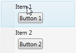
This will be the resulting ContextMenu:
From there you can style the MenuItem or Button etc.
Hope it helps!
28
You can start with the example style/template (from here) for ContextMenu and adjust it to your needs.
<Style TargetType="{x:Type ContextMenu}">
  <Setter Property="SnapsToDevicePixels" Value="True" />
  <Setter Property="OverridesDefaultStyle" Value="True" />
  <Setter Property="Grid.IsSharedSizeScope" Value="true" />
  <Setter Property="HasDropShadow" Value="True" />
  <Setter Property="Template">
    <Setter.Value>
      <ControlTemplate TargetType="{x:Type ContextMenu}">
        <Border x:Name="Border"
                Background="{StaticResource MenuPopupBrush}"
                BorderThickness="1">
          <Border.BorderBrush>
            <SolidColorBrush Color="{StaticResource BorderMediumColor}" />
          </Border.BorderBrush>
          <StackPanel IsItemsHost="True"
                      KeyboardNavigation.DirectionalNavigation="Cycle" />
        </Border>
        <ControlTemplate.Triggers>
          <Trigger Property="HasDropShadow" Value="true">
            <Setter TargetName="Border" Property="Padding" Value="0,3,0,3" />
            <Setter TargetName="Border" Property="CornerRadius" Value="4" />
          </Trigger>
        </ControlTemplate.Triggers>
      </ControlTemplate>
    </Setter.Value>
  </Setter>
</Style>
If you love us? You can donate to us via Paypal or buy me a coffee so we can maintain and grow! Thank you!
Donate Us With


