 Menu
Menu
I've recently been looking into improving the animations on my website - more specifically of the navigation dropdown on mobile devices.
In this connection I stumbled upon the following case, which I'm hoping to get some more in-depth knowledge about.
The case is that when transitioning/animating transform: translate3d() it seems that the browser requires more calculations when it's applied using % rather than px. E.g. in my tests it seems that transitioning from transform: translate3d(0, 500px, 0) to transform: translate3d(0,0,0) requires less computations and runs smoother than transitioning from transform: translate3d(0, 100%, 0).
Update: Upon testing further I've found that using 100vh/100vw bypasses/mitigates the issue of using percentages. This can be usefyk in cases where the element has a known percentage width of the window or is full-width, and thereby improve the performance. Actually it seems that using this value behaves as if it was assigned with px value in Chrome.
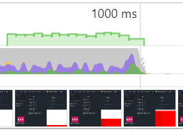
Here is a couple of pictures of the timeline from each animation. The timelines are obtained using Google Dev tools under "Performance". To better show the difference the performance has been limited in Chrome Dev Tools to "low-end mobile" (6x CPU slowdown).
Transform using percent:
Transform using pixel (px):

As can be seen from the images it seems that alot more rendering and painting is going on when using % rather than px to determine the transformation. It makes great sense that the browser has to calculate the percentage values for each frame (I guess?), but I'm surprised that it takes that much more, compared to using a pixel value.
Also please note that the framerates in the picture showing the timeline of percentage never reaches ~60 fps, but is rather averaging around 40 fps.
Below is snippets to replicate the case. There's one using percent and one using px.
$(document).on("click", function(){
$(".bb").toggleClass("active");
});
.aa{
height:50px;
background:blue;
position:fixed;
top:0;
width:100%;
}
.bb{
position:fixed;
top:0px;
background:none;
height:100%;
width:100%;
left:0;
transform:translateZ(0);
overflow:hidden;
pointer-events:none;
}
.cc{
height:100%;
transform:translate3d(0,500px,0);
width:100%;
transition:transform .5s ease-in;
background:red;
}
.bb.active .cc{
transform:none;
}<script src="https://ajax.googleapis.com/ajax/libs/jquery/2.1.1/jquery.min.js"></script>
<p>Click the document to start animation<p>
<div class="bb">
<div class="cc">
<ul>
<li>Point one</li>
<li>Point two</li>
<li>Point three</li>
<li>Point four</li>
<li>Point five</li>
<li>Point six</li>
<li>Point seven</li>
</ul><ul>
<li>Point one</li>
<li>Point two</li>
<li>Point three</li>
<li>Point four</li>
<li>Point five</li>
<li>Point six</li>
<li>Point seven</li>
</ul>
</div>
</div>$(document).on("click", function(){
$(".bb").toggleClass("active");
});.aa{
height:50px;
background:blue;
position:fixed;
top:0;
width:100%;
}
.bb{
position:fixed;
top:0px;
background:none;
height:100%;
width:100%;
left:0;
transform:translateZ(0);
overflow:hidden;
pointer-events:none;
}
.cc{
height:100%;
transform:translate3d(0,100%,0);
width:100%;
transition:transform .5s ease-in;
background:red;
}
.bb.active .cc{
transform:none;
}<script src="https://ajax.googleapis.com/ajax/libs/jquery/2.1.1/jquery.min.js"></script>
<p>Click the document to start animation<p>
<div class="bb">
<div class="cc">
<ul>
<li>Point one</li>
<li>Point two</li>
<li>Point three</li>
<li>Point four</li>
<li>Point five</li>
<li>Point six</li>
<li>Point seven</li>
</ul><ul>
<li>Point one</li>
<li>Point two</li>
<li>Point three</li>
<li>Point four</li>
<li>Point five</li>
<li>Point six</li>
<li>Point seven</li>
</ul>
</div>
</div>To solve this "issue" in which using percentages in transform possibly causes worsened animation performance, I've made the following suggestion, which might improve the performance. However, I'm interested in hearing other opinions as I'm not quite sure whether this should be necessary and why(?).
What I'm doing is basically just using jQuery to apply the transform value in pixels rather than percentage. For production cases this will naturally require to be updated on window resizes.
The resulting timeline for this approach is:

$(document).ready(function(){
var bbWidth = $("#bb .cc").css('transform').split(',')[5].slice(0,-1);

$("#bb .cc").css("transform", "translate3d(0," + bbWidth + "px,0");
$(document).on("click", function(){
$("#bb").toggleClass("active");
});
});
.aa{
height:50px;
background:blue;
position:fixed;
top:0;
width:100%;
}
#bb{
position:fixed;
top:0px;
background:none;
height:100%;
width:100%;
left:0;
transform:translateZ(0);
overflow:hidden;
}
.cc{
height:100%;
transform:translate3d(0,100%,0);
width:100%;
transition:transform .5s ease-in;
background:red;
position:absolute;
top:0;
}
#bb.active .cc{
transform:none!important;
}<script src="https://ajax.googleapis.com/ajax/libs/jquery/2.1.1/jquery.min.js"></script>
<div id="bb">
<div class="cc">
<ul>
<li>Point one</li>
<li>Point two</li>
<li>Point three</li>
<li>Point four</li>
<li>Point five</li>
<li>Point six</li>
<li>Point seven</li>
</ul><ul>
<li>Point one</li>
<li>Point two</li>
<li>Point three</li>
<li>Point four</li>
<li>Point five</li>
<li>Point six</li>
<li>Point seven</li>
</ul>
</div>
</div>Question:
px performs better than %) and if so, why is this happening? As mentioned earlier it kinda makes sense to me that it should, but I'm really lacking some technological/in-depth explanation. transform: translate() to e.g. hide navigations off-screen is very circumstantial if you "can't" use % and if you want smooth animations at the same time.  294
294
Compared with animating elements using JavaScript, CSS animations can be easier to create. They can also give better performance, as they give the browser more control over when to render frames, and to drop frames if necessary.
The requestAnimationFrame() API provides an efficient way to make animations in JavaScript. The callback function of the method is called by the browser before the next repaint on each frame.
Is it correct that I'm experiencing this behaviour (assigning value in px performs better than %) and if so, why is this happening? As mentioned earlier it kinda makes sense to me that it should, but I'm really lacking some technological/in-depth explanation.
It's correct indeed. Pixels are absolute values (i.e. are not dependent on anything and represented ‘as is’). Percentages are relative values, which means they have to depend on some other value in order to produce result. So every time you assign a percentage value it has to get it's relative value to perform a calculation. When doing a translation with pixels you only have to change the translation values, but with percentages you have to get element's dimensions first and then apply the translation. And that has to be done for every animation frame.
To mitigate this issue you have to recalculate element's dimensions only once before the animation. Then use !important to override what's set in the style attribute. The code in the snippet does exactly that.
Also notice that I've added a resize listener. That's required if the window gets resized, so your element becomes hidden.
$(function(){
var $el = $("#bb");
$(document).on("click", function(){
  var height = $el.outerHeight();
  $el
    .css('transform', 'translateY(' + height + 'px)')
    .toggleClass("active");
});
$(window).on('resize', function() {
  $el.removeClass('active').removeAttr('style');
});
});
#bb{
position:fixed;
top:0px;
background-color: red;
height:100%;
width:100%;
left:0;
overflow:hidden;
transform: translateY(100%);
transition: transform .5s ease-in;
}
#bb.active
{
transform: translateY(0px) !important;
}<script src="https://ajax.googleapis.com/ajax/libs/jquery/2.1.1/jquery.min.js"></script>
<div id="bb">
<div class="cc">
<ul>
<li>Point one</li>
<li>Point two</li>
<li>Point three</li>
<li>Point four</li>
<li>Point five</li>
<li>Point six</li>
<li>Point seven</li>
</ul><ul>
<li>Point one</li>
<li>Point two</li>
<li>Point three</li>
<li>Point four</li>
<li>Point five</li>
<li>Point six</li>
<li>Point seven</li>
</ul>
</div>
</div>If you love us? You can donate to us via Paypal or buy me a coffee so we can maintain and grow! Thank you!
Donate Us With

