 Menu
Menu
What I'd like to do:
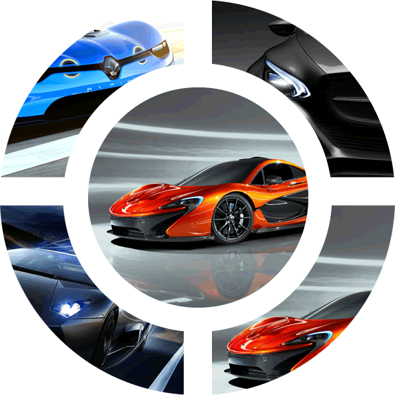
I would like to create a radial menu as shown below, considering all elements in the picture interactive, i.e the image in centre as well as the four quarters around it. It's important that the solution is cross-browser compatible. This is just a simple example as the parts dont really have to be quarters, they can be any possible number of parts :
Solutions Tried So Far :
I have tried using CSS3 round div with border , where the border have these images as background, but doesnt really work well, as each element has to be a stand-alone element.
I heard about css-shapes, but I don't know how to use it to create the radial menu.
EDIT: Maybe there is also a way to add a text caption to each of these images...
Thank you for help!
 603
603
I made this pen with a css radial menu. The circular menu appears on hover :
Demo : CSS radial menu
The radial shape is made with border radius and the overflow property. The hover animation is handled with CSS transition (scale and oapcity).
For a version with menu titles, see this DEMO
Full Code for the radial menu :
HTML :
<span><span></span></span>
<div class="wrap">
  <a href="#"><div></div></a>
  <a href="#"><div></div></a>
  <a href="#"><div></div></a>
  <a href="#"><div></div></a>
  <a href="#"><div></div></a>
</div>
CSS :
body,html{margin:0;padding:0;height:100%;}
body{background:#E3DFD2;box-shadow: inset 0 0 20vmin 0 #585247;}
.wrap{
  position:relative;
  width:80vmin; height:80vmin;
  margin:0 auto;
  background:inherit;
  transform:scale(0.2) translatez(0px);
  opacity:0;
  transition:transform .5s, opacity .5s;
}
a{
  position:absolute;
  left:0; top:0;
  width:47.5%; height:47.5%;
  overflow:hidden;
  transform:scale(.5) translateZ(0px);
  background:#585247;
}
a div{
  height:100%;
  background-size:cover;
  opacity:.5;
  transition:opacity .5s;
  border-radius:inherit;
}
a:nth-child(1){
  border-radius:40vmin 0 0 0;
  transform-origin: 110% 110%;
  transition:transform .4s .15s;
}
a:nth-child(1) div{
  background-image:url('https://farm3.staticflickr.com/2827/10384422264_d9c7299146.jpg');
}
a:nth-child(2){
  border-radius:0 40vmin 0 0;
  left:52.5%;
  transform-origin: -10% 110%;
  transition:transform .4s .2s;
}
a:nth-child(2) div{
  background-image:url('https://farm7.staticflickr.com/6083/6055581292_d94c2d90e3.jpg');
}
a:nth-child(3){
  border-radius:0 0 0 40vmin;
  top:52.5%;
  transform-origin: 110% -10%;
  transition:transform .4s .25s;
}
a:nth-child(3) div{
  background-image:url('https://farm7.staticflickr.com/6092/6227418584_d5883b0948.jpg');
}
a:nth-child(4){
  border-radius:0 0 40vmin 0;
  top:52.5%; left:52.5%;
  transform-origin: -10% -10%;
  transition:transform .4s .3s;
}
a:nth-child(4) div{
  background-image: url('https://farm8.staticflickr.com/7187/6895047173_d4b1a0d798.jpg');
}
a:nth-child(5){
  width:55%;height:55%;
  left:22.5%; top:22.5%;
  border-radius:50vmin;
  box-shadow:0 0 0 5vmin #E3DFD2;
  transform:scale(1);
}
a:nth-child(5) div{
  background-image: url('https://farm4.staticflickr.com/3766/12953056854_b8cdf14f21.jpg');
}
span{
  position:relative;
  display:block;
  margin:0 auto;
  top:45vmin;
  width:10vmin; height:10vmin;
  border-radius:100%;
  background:#585247;
  transform:translateZ(0px);
}
span span{
  position:absolute;
  width:60%;height:3px;
  background:#ACA696;
  left:20%; top:50%;
  border-radius:0;
}
span span:after, span span:before{
  content:'';
  position:absolute;
  left:0; top:-1.5vmin;
  width:100%; height:100%;
  background:inherit;
}
span span:after{
  top:1.5vmin;
}
span:hover + .wrap, .wrap:hover{
  transform:scale(.8) translateZ(0px);
  opacity:1;
}
span:hover + .wrap a, .wrap:hover a{
  transform:scale(1) translatez(0px);
}
a:hover div{
  opacity:1;
  transform:translatez(0px);
}
Here's an alternative, less fancy, have to get clever with img opacity + div background-color to preserve the hover.
/* CSS */
* {
  box-sizing: border-box;
}
div {
  background: white;
}
img {
  width: 100%;
  -webkit-transition: opacity .2s;
}
div:hover > img {
  opacity: .5;
}
.wrap,
.wrap div:first-child{
  width: 500px;
  height: 500px;
  margin: auto;
  position: absolute;
  top: 0;
  right: 0;
  bottom: 0;
  left: 0;
}
.wrap div:first-child {
  float: none;
  z-index: 2;
  width: 50%;
  height: 50%;
  border-radius: 100%;
  border: 30px solid white;
}
div div {
  float: left;
  overflow: hidden;
  width: 50%;
  height: 50%;
  border: 15px solid white;
}
div div:nth-child(2) img {
  border-radius: 100% 0 0 0;
}
div div:nth-child(3) img {
  border-radius: 0 100% 0 0;
}
div div:nth-child(4) img {
  border-radius: 0 0 0 100%;
}
div div:nth-child(5) img{
  border-radius: 0 0 100% 0;
}
<!-- HTML -->
<div class="wrap">
<div><img src="http://placehold.it/300x300&text=Center" /></div>
<div><img src="http://placehold.it/300x300&text=Top Left" /></div>
<div><img src="http://placehold.it/300x300&text=Top Right" /></div>
<div><img src="http://placehold.it/300x300&text=Bottom Left" /></div>
<div><img src="http://placehold.it/300x300&text=Bottom Right" /></div>
</div>If you love us? You can donate to us via Paypal or buy me a coffee so we can maintain and grow! Thank you!
Donate Us With